
Schwartau THE JAM: Red Dot Award-winning packaging design for Gen Z
The Situation: A Traditional Category Seeks to Connect with Gen Z
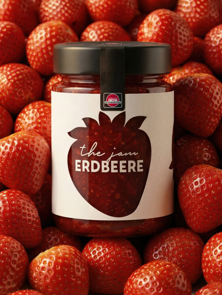
Jam is a classic product with a traditional problem: The category is considered reliable but outdated, especially among consumers under 30. Schwartauer Werke, a Hero Group company, wanted to win back this very target group. In preliminary consumer tests, one concept had emerged as the winner: “Marmelade Pur.” Simply really good jam in a beautifully simple jar, without any frills, and with the potential for secondary use. Purist, honest, minimalist.
The briefing for us: to holistically develop this concept further and make it market- and technically viable in terms of brand, graphic and structural design, technical feasibility, and sustainability. And all under tough real-world conditions: The jar had to be suitable for industrial filling on existing production lines, seal airtight and comply with food safety regulations, and be completely emptyable with a teaspoon. And it had to be so beautiful that you wouldn’t want to throw it away.
Strategic Approach: First the Requirements Profile, Then the Design
It didn’t start with a layout, but with a requirements profile. During an initial phase that included a joint workshop, we explored all relevant aspects: brand architecture and brand foundations, the competitive landscape on the jam shelf, the Hero Group’s sustainability strategy (including 100% recyclable packaging and an increased proportion of recycled materials in glass and metal closures), production and procurement specifications, as well as insights from target audience research.
The key strategic decision: to break category conventions, but subtly. No loud, attention-grabbing design, but rather a “delightful oasis of calm on the shelf.” Maximum product visibility instead of label dominance; minimalism as a signal of premium quality. The brand deliberately presents itself as a standalone entity, while Schwartau remains in the background as the manufacturer.
Market Research: What Gen Z Really Expects from Brands, Sustainability, and Packaging
The project was based on qualitative research with the target group. In a five-day online community with 35 young jam buyers (ages 18–30), attitudes, purchasing behavior, and sustainability expectations were examined, and concepts and packaging approaches were evaluated. The findings were clear: Gen Z values clear, honest language over marketing hyperbole and relies on gut instinct rather than fact-checking when it comes to sustainability. Above all, however, packaging design is a decisive factor in purchasing decisions for this target group. Glass is considered the most credible material for jam; unique shapes, embossing, and printing make it desirable.
Over the course of the project, the developed glass shape and design concepts were also retested in market research. The market research winner—the 200-ml format with a clear, clean-lined silhouette—was then systematically refined, and the findings were incorporated into the construction and layout.
Concept & Naming: How “Marmelade Pur” Became the Brand THE JAM
“Marmelade Pur” had to become a brand. In a structured naming process, we developed, refined, and evaluated naming concepts against the brand concept—ranging from tongue-in-cheek approaches inspired by Northern Germany (“No frills, lots of flavor!”) to a radically simple solution. The most consistent option won out: THE JAM. A name that turns the product into a statement—as natural and minimalist as the jar itself. In parallel with “the jam,” a fully-fledged alternative name was developed to the point of being ready for final artwork and secured in accordance with food regulations.
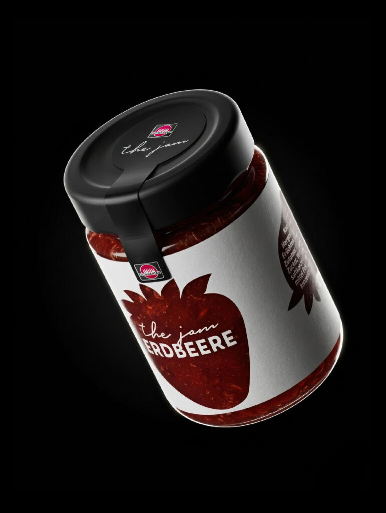
Design: Directly printed glass instead of a label—the fruit becomes the key visual
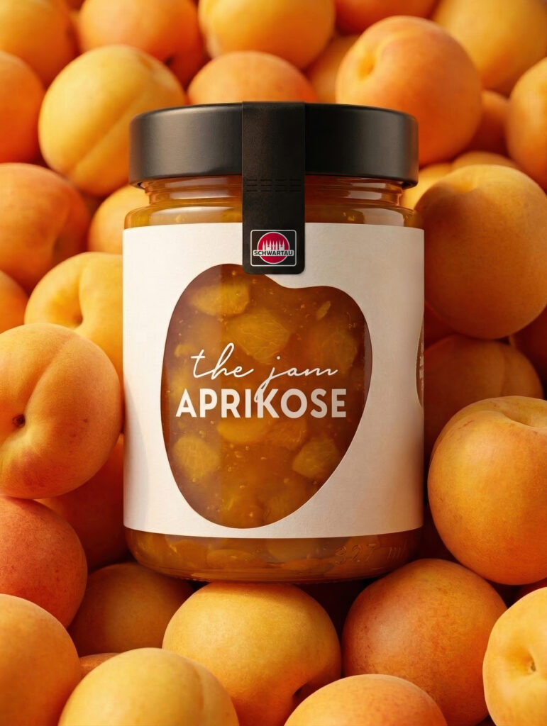
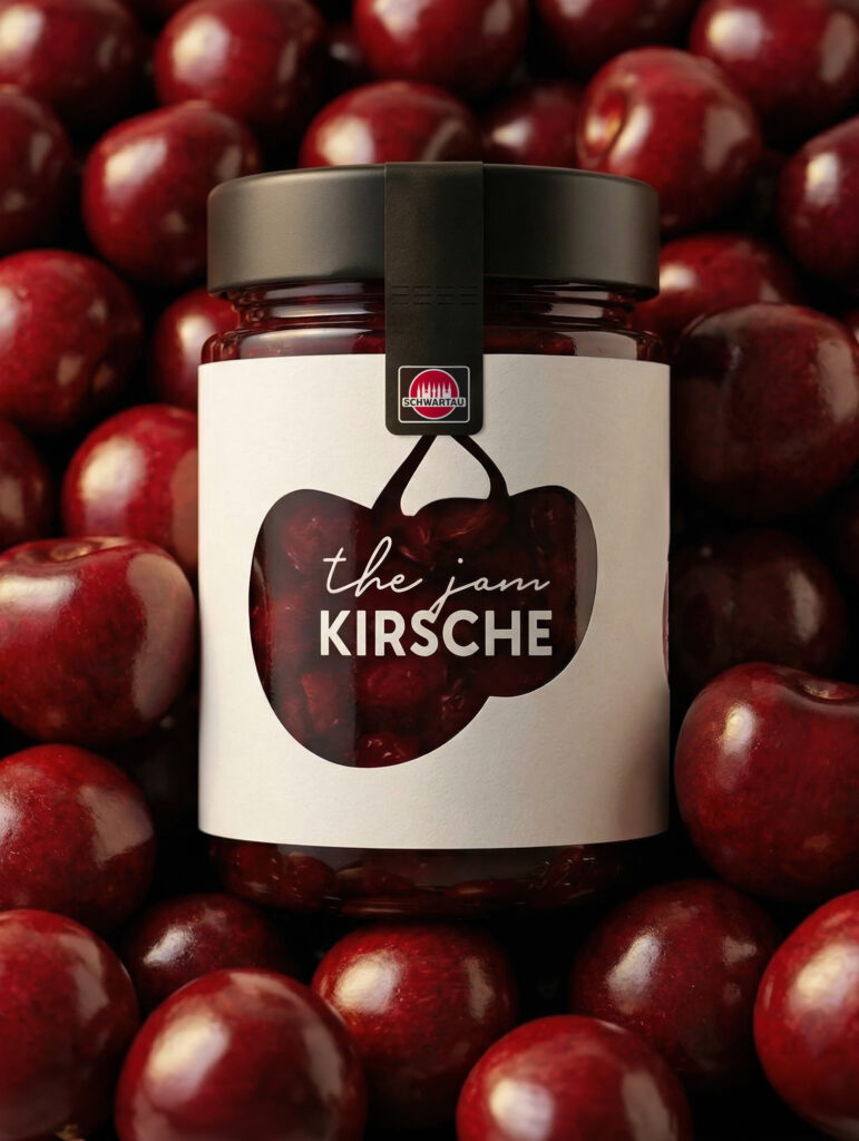
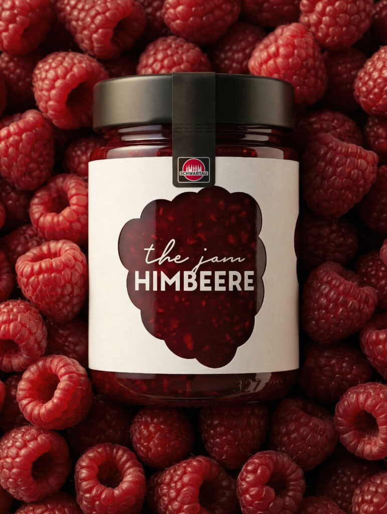
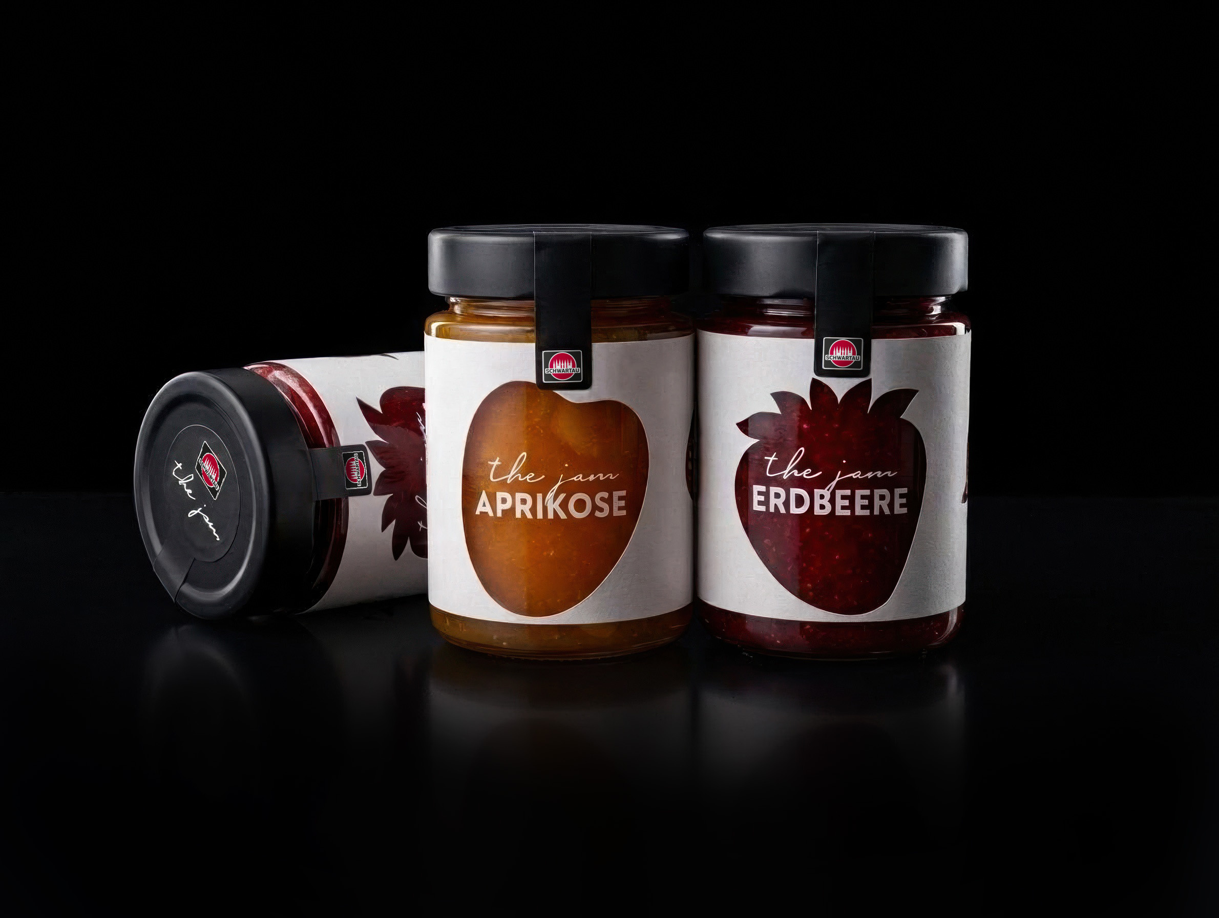
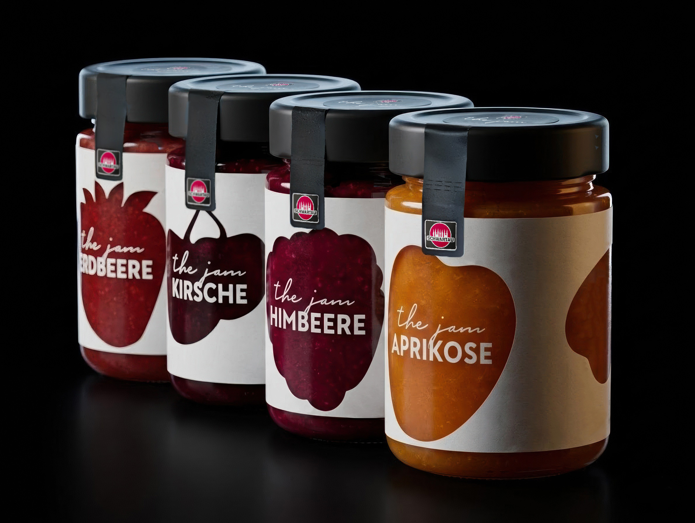
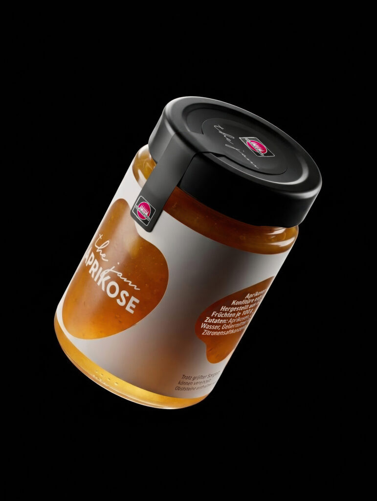
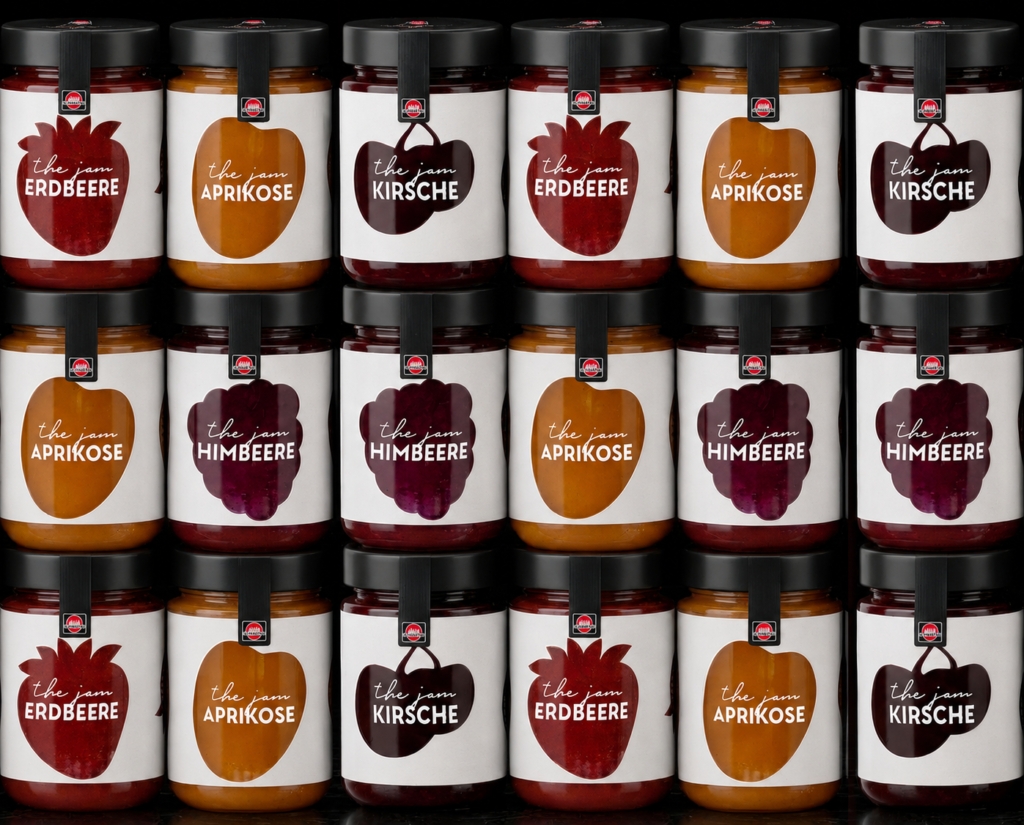
The centerpiece of the design is the glass itself. Instead of a paper label, THE JAM uses direct printing with large display windows: the fruit is the key visual. Through agile sprint cycles, we developed several design and graphic concepts, each featuring logo variations, variety-specific adaptations, and shelf simulations (shelf tests) to evaluate their impact in a real competitive environment. The final design: a surprisingly simple iconography, typographically clean, with maximum visibility on the shelf and an aesthetic that serves a secondary purpose at home.
Design: A glass form that breaks category codes yet still stays on track
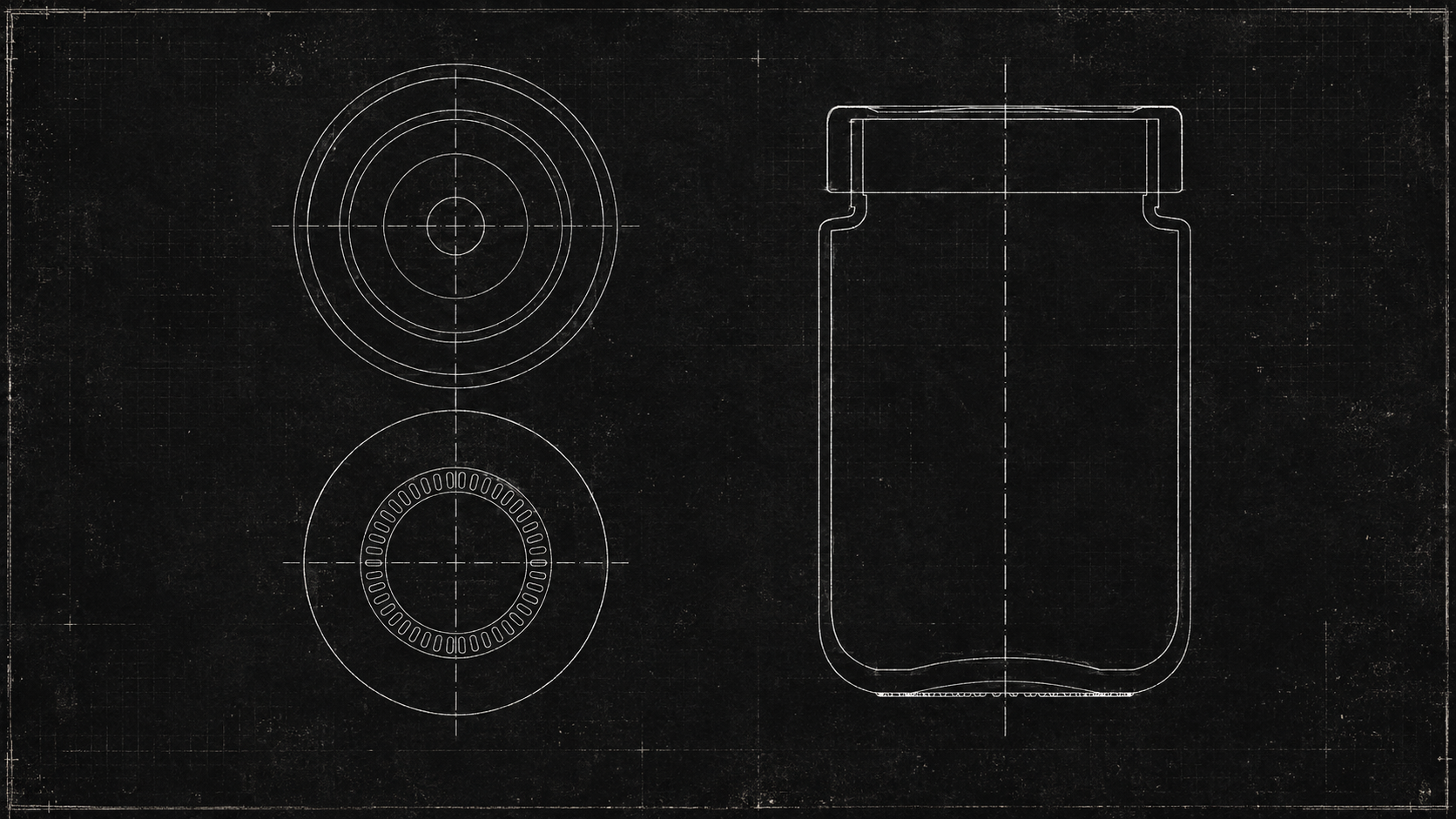
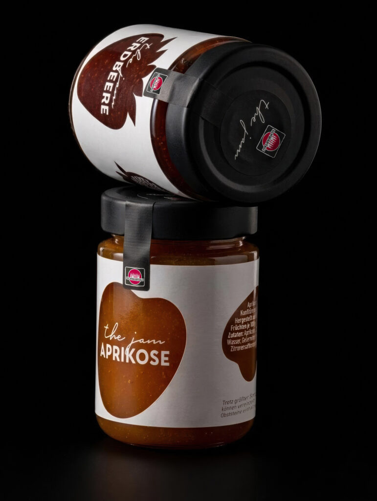
Beauty must be manufacturable. We designed the glass container from scratch and technically validated it in close collaboration with a glass manufacturer: shoulder angles and minimum radii for demolding, minimized distance between the lid rim and the glass shoulder, grip slots, and mouth geometry in accordance with DIN EN ISO 9100-7. At the same time, we evaluated various lid options (diameters, heights, twist-off systems, and even wooden lid options) and designed the thread to fit the final lid format. The result: a striking, clean-lined glass container that runs on existing filling lines. A category breakthrough without a disruption to investment.
Prototyping, Print Testing & Final Artwork: From Rendering to a Production-Ready Print File
From rendering to reality: Through several prototype development stages, the glass design was brought to life and refined iteratively. Print tests with all four launch varieties (strawberry, apricot, raspberry, cherry) validated the color effect and print image directly on the glass. Based on the final measured maximum print area, we adapted the master design, developed the wrap-around designs for all varieties, and delivered them ready for final artwork, including registration marks for production and final 3D visualizations for retail and communications.
The result: a 2026 market launch and the Red Dot Award
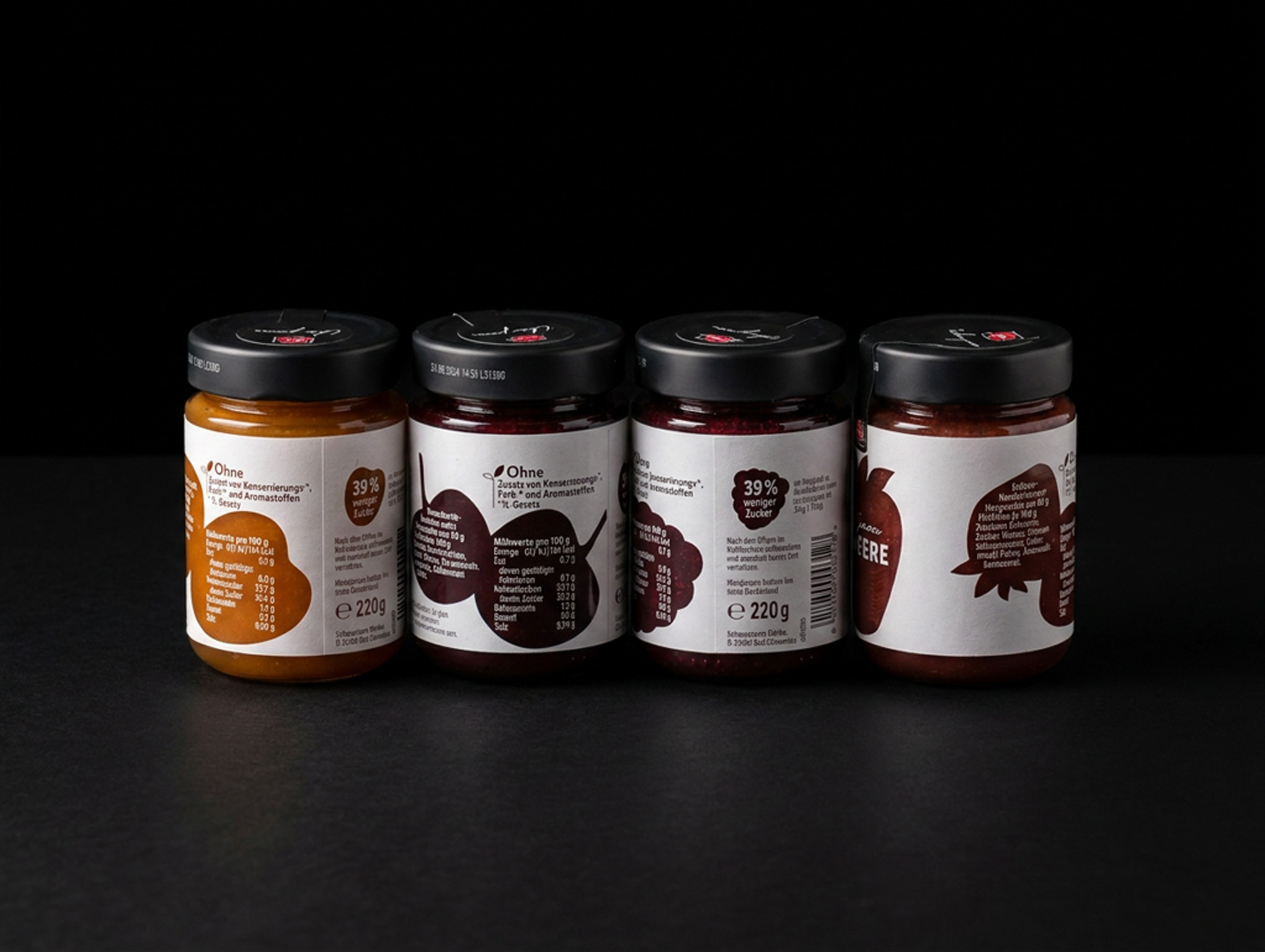
In June 2026, THE JAM hit the shelves: four varieties in 220-gram jars, 60% fruit content, and about 39% less sugar than traditional jam. And a packaging design that deliberately breaks away from all the design conventions of the category. The recognition followed promptly: THE JAM was honored with the Red Dot Award.
From the first sketch to the store shelf and on to the award: THE JAM demonstrates what’s possible when strategy, design, and engineering come from a single source.
An Overview of Our Services
- Strategic Development & Requirements Profile
- Market Research (qualitative Gen Z target audience research, concept and design testing)
- Concept Development, including Naming
- Layout & Graphic Design (design paths, product variant adaptations, master design)
- Glass and Lid Design (including coordination with manufacturer Ardagh)
- Prototyping
- Shelf tests / shelf simulations
- Final artwork & print data finalization
Other projects

Maggi Korean-Style Noodles: Spiciness That Stands Out
