
Store Check: Croatia – Diversity with a Local Flavor
This time, our store tour took us to Croatia, one of the most interesting countries in the Balkans—and not just from a tourist’s perspective. The historic home of the “kravata” and the Dalmatian dog is known internationally above all for its breathtaking Adriatic coastline and a rich UNESCO World Heritage site. The exciting blend of Mediterranean and Central European influences, as well as a healthy sense of national pride, are also reflected in the Croatian retail landscape. We visited the local supermarket Konzum as well as the drugstores dm and Müller—which are also well-known in Germany—with the goal of covering the entire spectrum: from food and beverages to supplements, cosmetics, and household cleaning products.
General Impressions
We were quite surprised by the enormous variety of products on offer—especially the presence of local brands. Many of these brands are well-known not only in Croatia but also in neighboring countries in the Western Balkans, and are often the first choice. These traditional brands, some of which are over 100 years old, are clearly preferred by the population—so much so that international giants like Nivea or our client Maggi visibly struggle to hold their own on the shelves alongside the “local” brands. It’s also interesting to note that some German brands offer significantly more varieties in Croatia than they do here in Germany. Our client Zott, for example, offers products and product lines that don’t exist at all in Germany, including Jogobella fruit yogurt varieties and protein yogurts that you won’t find here. In addition, there are several products from Poland, Italy, and France—especially in the cosmetics section—that aren’t available in German stores. Our hypothesis: Established corporations like Beiersdorf or Nestlé go to great lengths in Germany to keep competitors off the shelves—less so in Croatia, which is why the range of brands there is correspondingly broader.
The second big surprise concerns the quality of the design. In Croatian stores, we saw impressive, beautiful packaging designs for a wide variety of products. It’s clear that great emphasis is placed on a precisely defined brand identity and a well-thought-out brand architecture. Product differentiation is usually very clear, and even the color-blocking on the shelves works flawlessly. Overall, we came away with extremely positive impressions from our store visit in Croatia. Below, we summarize what stood out and what we consider outstanding, using both words and images.
Beverages: Premium Products as Far as the Eye Can See
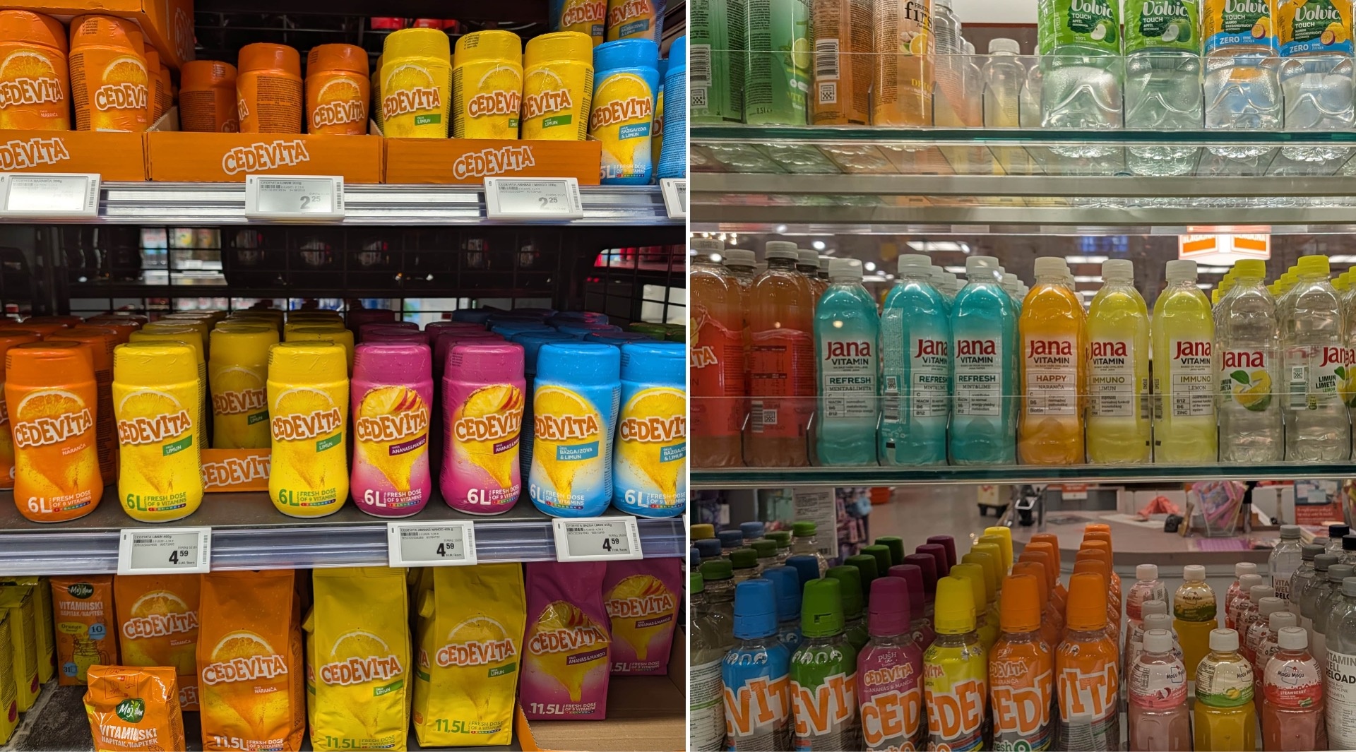
Let’s start with the one true elixir of life: water. Here, the Jana brand dominates—even ahead of international giants like Volvic or Vitamin Well. It has long been the undisputed market leader. Particularly interesting are the colorful, semi-transparent sleeves, which give the bottles a unique aesthetic that the competition has yet to match. Named after former ski superstar Janica Kostelić, Jana also has a special background that naturally resonates well with the traditionally sports-loving Croatian population.
Speaking of tradition: Cedevita, the vitamin drink whose name is derived from vitamins C and D, has been found in virtually every household in Croatia and its neighboring countries since the Yugoslav era. The brand has since modernized and massively expanded its range of flavors and sizes—notably the to-go format in very eye-catching packaging—without losing any of its brand recognition.
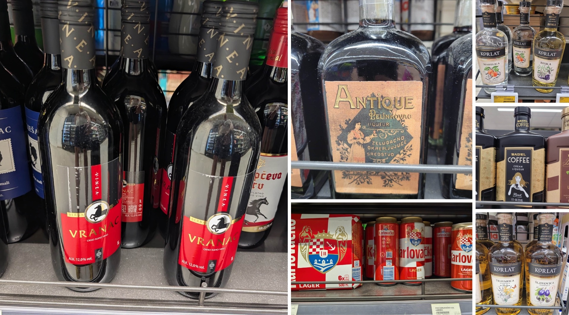
The alcoholic beverage lineup features stunning designs—such as those on Badel’s liqueurs, particularly the Cream Liqueur for coffee lovers and the nearly legendary herbal liqueur Antique Pelinkovac, whose Art Nouveau-inspired label is executed with great style. Alongside these are modern Croatian wines with minimalist designs, complemented by strategically placed gold accents and a touch of shimmer. And let’s not forget Karlovačko: This traditional beer from Karlovac has been given a fresh new look. The heraldic background, of course, remains an unmistakable feature, but now appears in a reinterpreted version—and it’s very well done.
Vegetables: Locality as a Design Element
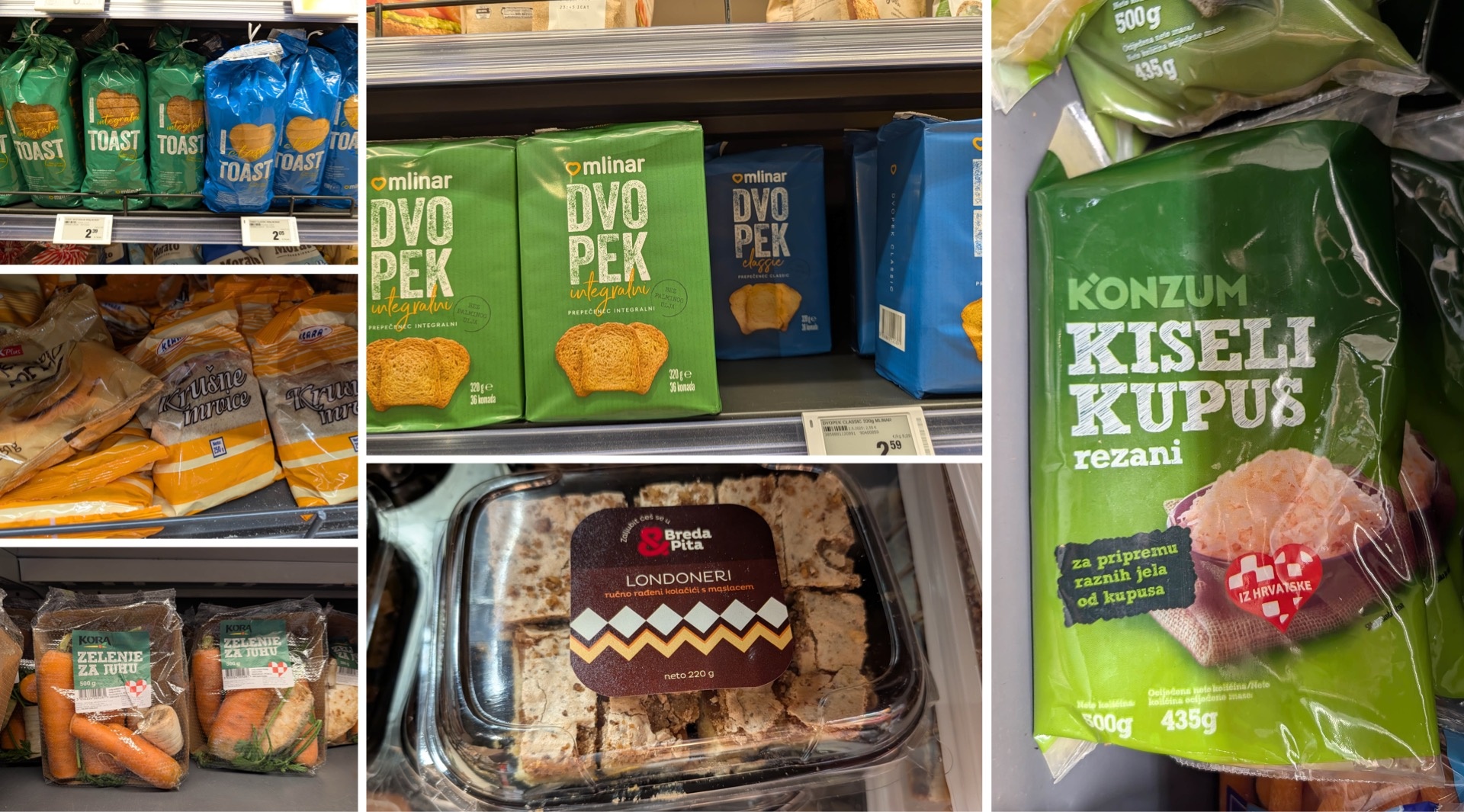
A glance at the produce aisle makes it clear just how important local sourcing is in the Croatian retail sector. The national flag appears repeatedly as a design element, sending an unmistakable message: These products come from our country. This approach appears to be successful, as “local” seems to be highly valued by consumers.
In addition, a modern design language prevails, and it’s by no means limited to major brands; even private-label products, such as iceberg lettuce or arugula, demonstrate that even seemingly simple items can win customers over with a well-thought-out presentation.
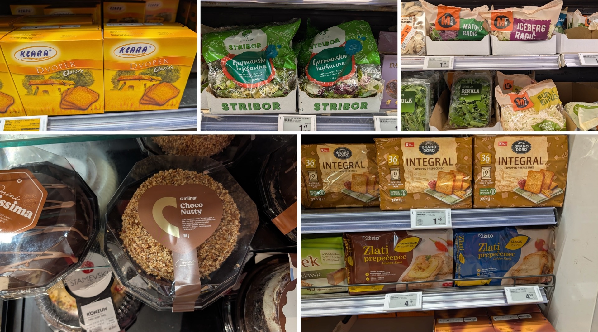
Bread: Not Much of a Spectacle, But Plenty of Mlinar
Although things are relatively quiet in the bread aisle, one thing stands out: the ubiquity of Mlinar. The Croatian bakery chain has long since moved beyond producing just traditional bread to also making its own cakes and other ready-to-eat baked goods—all of which are attractively designed.
Muesli and Porridge: A Powerhouse of Energy
On the granola shelf, Boombox really stood out to us—with high-protein granolas and porridges in a wide variety of flavors. The brand deliberately plays with contrasts in its design: The logo has a distinctly playful look that draws the eye, while the rhomboid shape at the bottom serves as a consistent design element that provides visual guidance. This creates a strong brand identity despite the varying colors of the individual varieties.
There are also more classic designs. Dobra’s porridge, for example, appears much more understated in a direct comparison and is therefore less visually exciting.
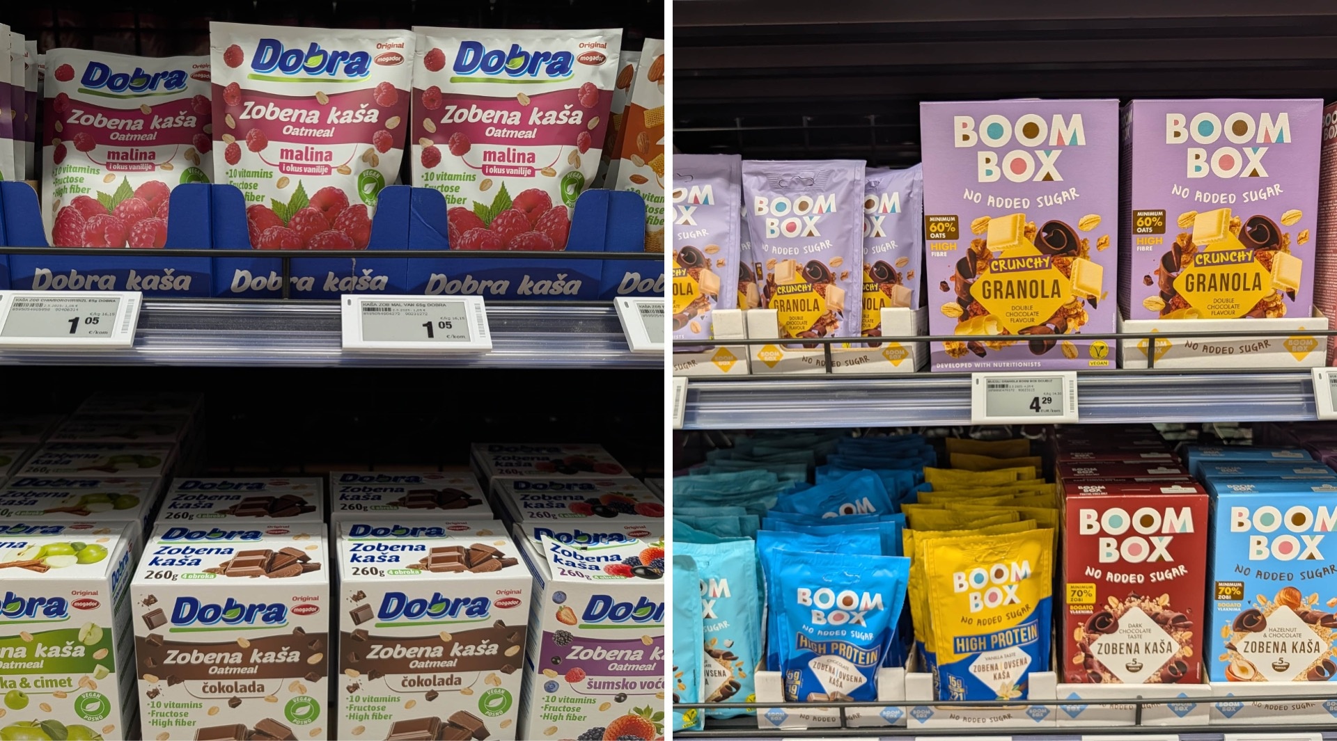
Pasta: Premium Pasta
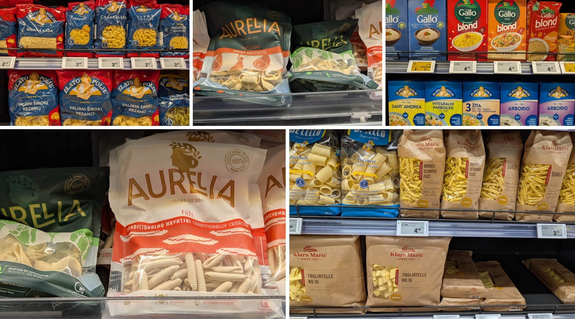
We were also captivated by the pasta aisle. The selection is huge, ranging from countless traditional local brands like Zlato Polje to Italian brands like Barilla. What they all have in common is an exceptionally high standard of design: a modern, clean aesthetic, skillful minimalism, and a look that conveys quality. Pasta is definitely not treated superficially here.
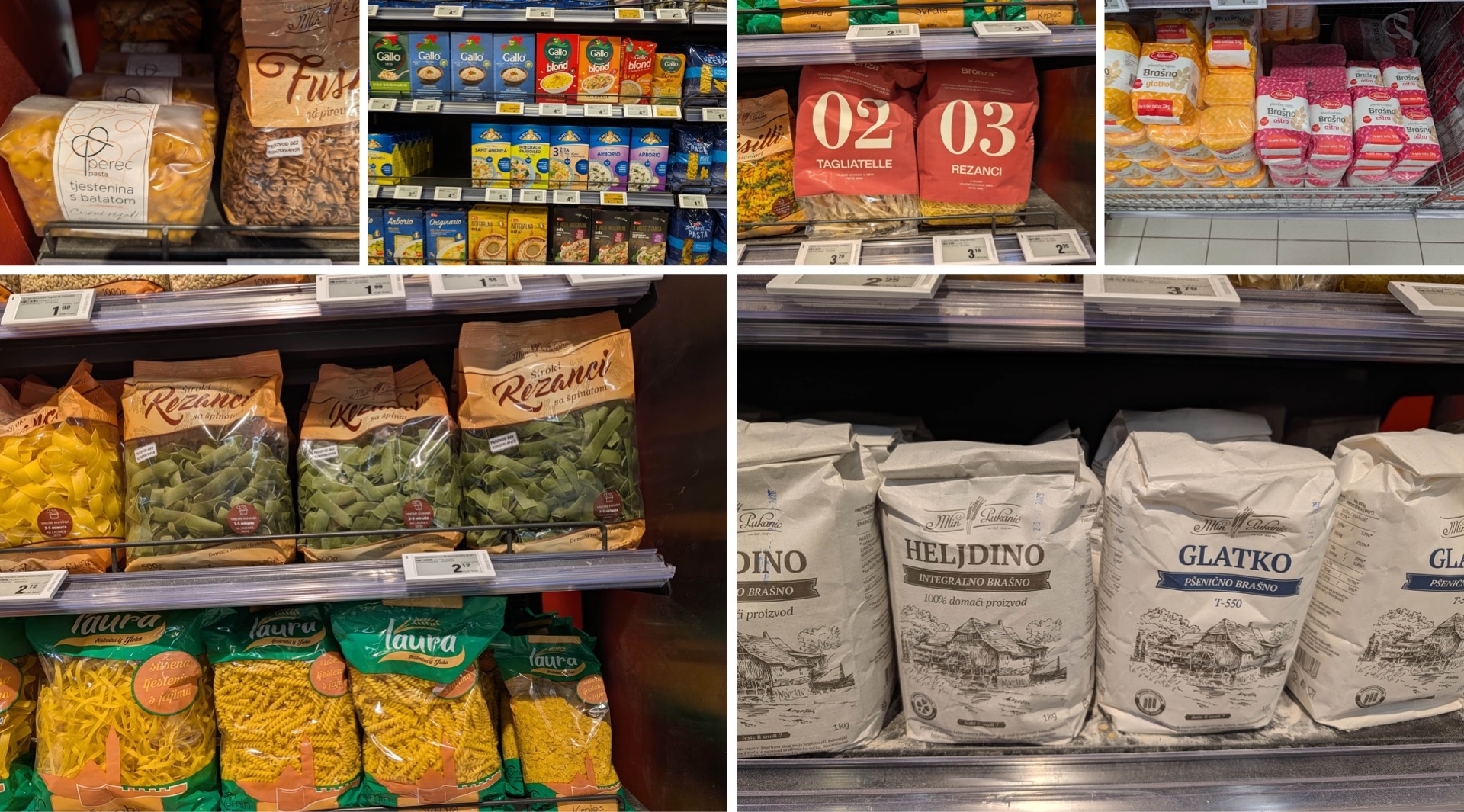
Particularly interesting are packages featuring so-called “milky transparency”—that slightly hazy transparency we’re already familiar with from Asian grocery stores in Berlin. It gives the pasta an elegant touch while simultaneously turning the product itself into a design element.
It’s also remarkable how consistently even decades-old brands have continued to evolve. Whether it’s flour, rice, to-go products, or ready-to-cook mixes: everywhere, the design has clearly been elevated to a new level.
Among the semi-prepared products, alongside private labels, you’ll also find the aforementioned Zlato Polje brand as well as the Italian rice brand Riso Gallo, both of which target a different audience with a colorful, playful design language.
The traditional pasta brands, on the other hand, are clearly positioning themselves as competitors to Barilla with their branding. Bold typography, the aforementioned “Milky Transparency,” and illustrations reminiscent of historic copperplate engravings create a high-quality look.
Sauces, spices, and soups: the red wall on the shelf
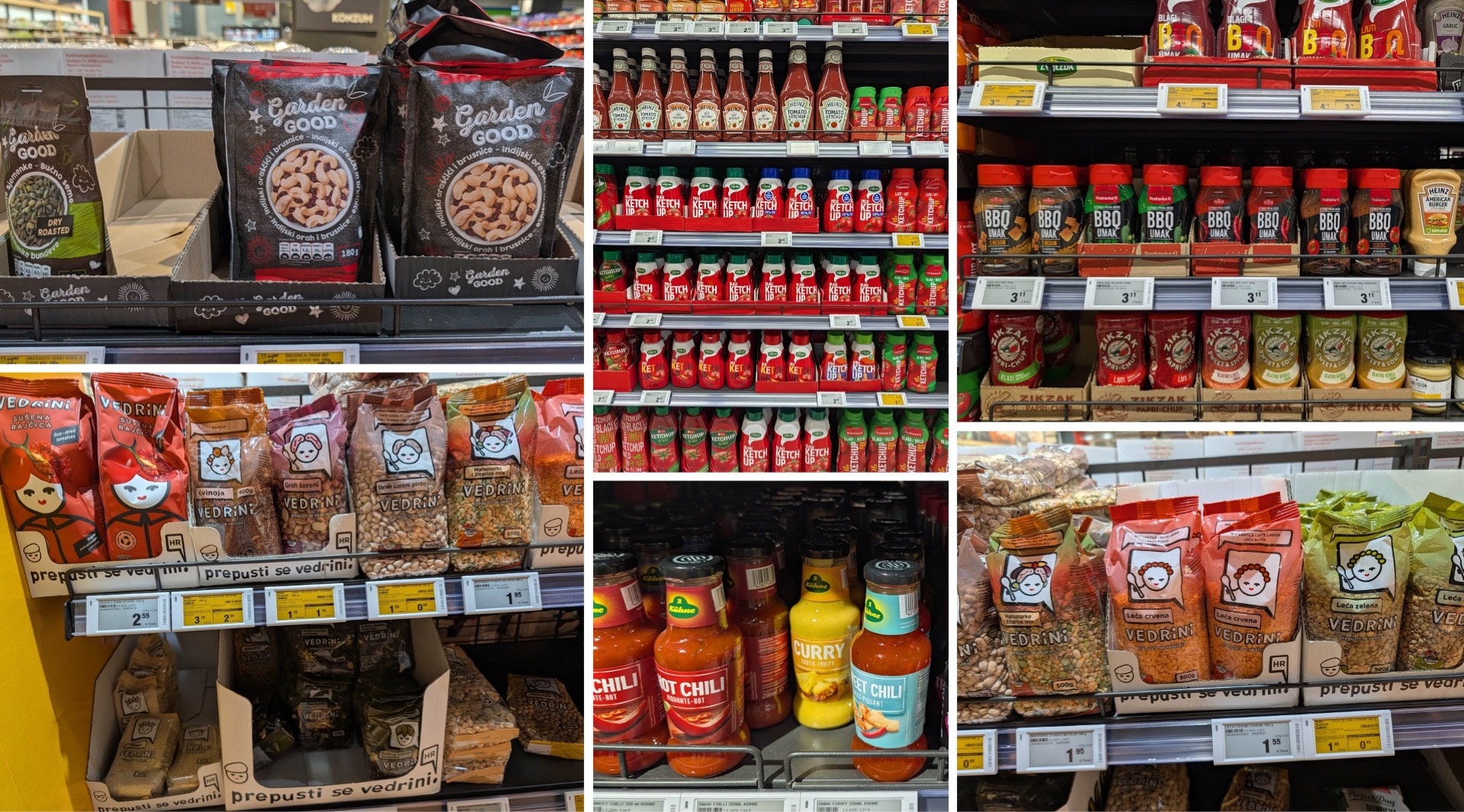
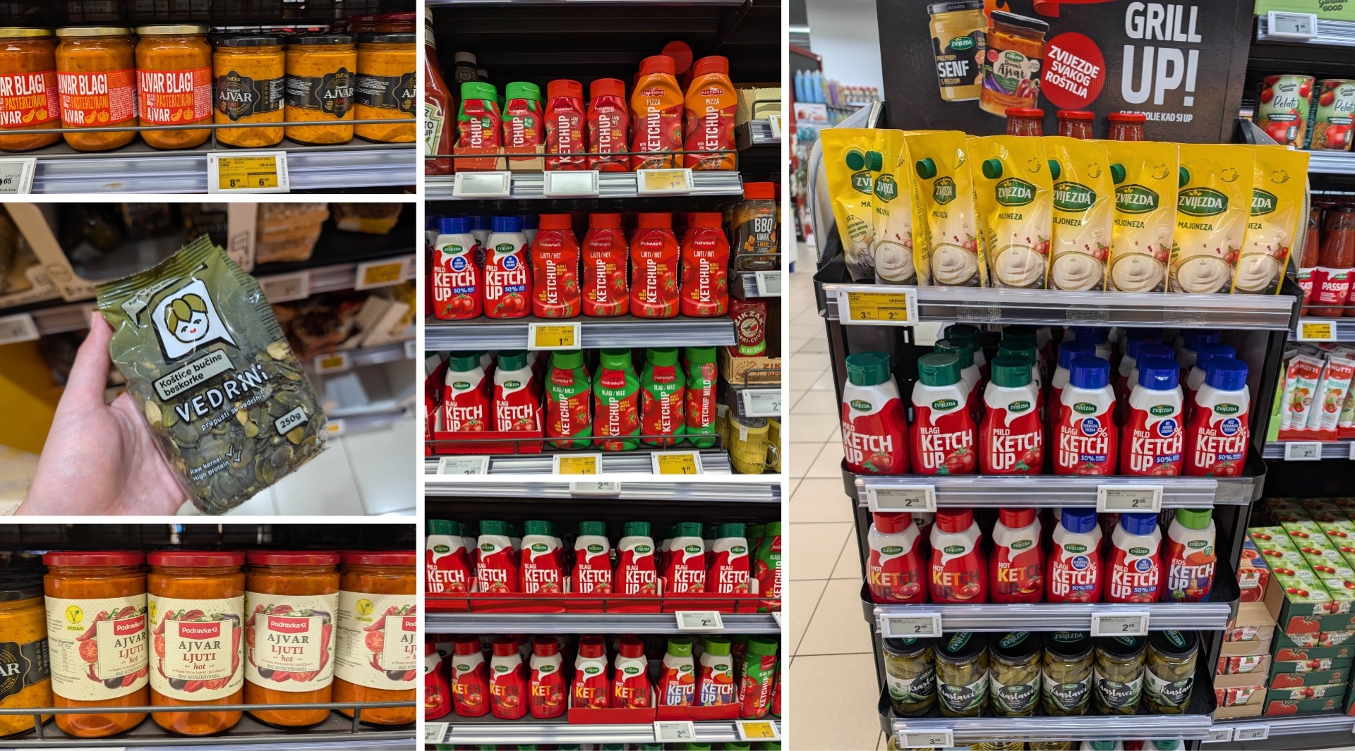
When it comes to ketchup, sauces, and ajvar, local brands clearly set the tone—above all, Podravka and Zvijezda. International giants like Heinz, on the other hand, tend to play second fiddle. Whether in stand-up pouches or classic ketchup bottles, the products feature clearly recognizable shapes and a consistently modern design. The same applies to BBQ and other sauces. Ajvar, a very traditional product, is sometimes completely reinterpreted here—partly through typography and partly through visibility: Instead of appetizing food shots, the focus is on transparency, letting the product speak for itself. The branding features a color gradient rising upward, atop which the brand elements are placed—a design concept that can also be found, for example, with Vedrini in the snacking category.
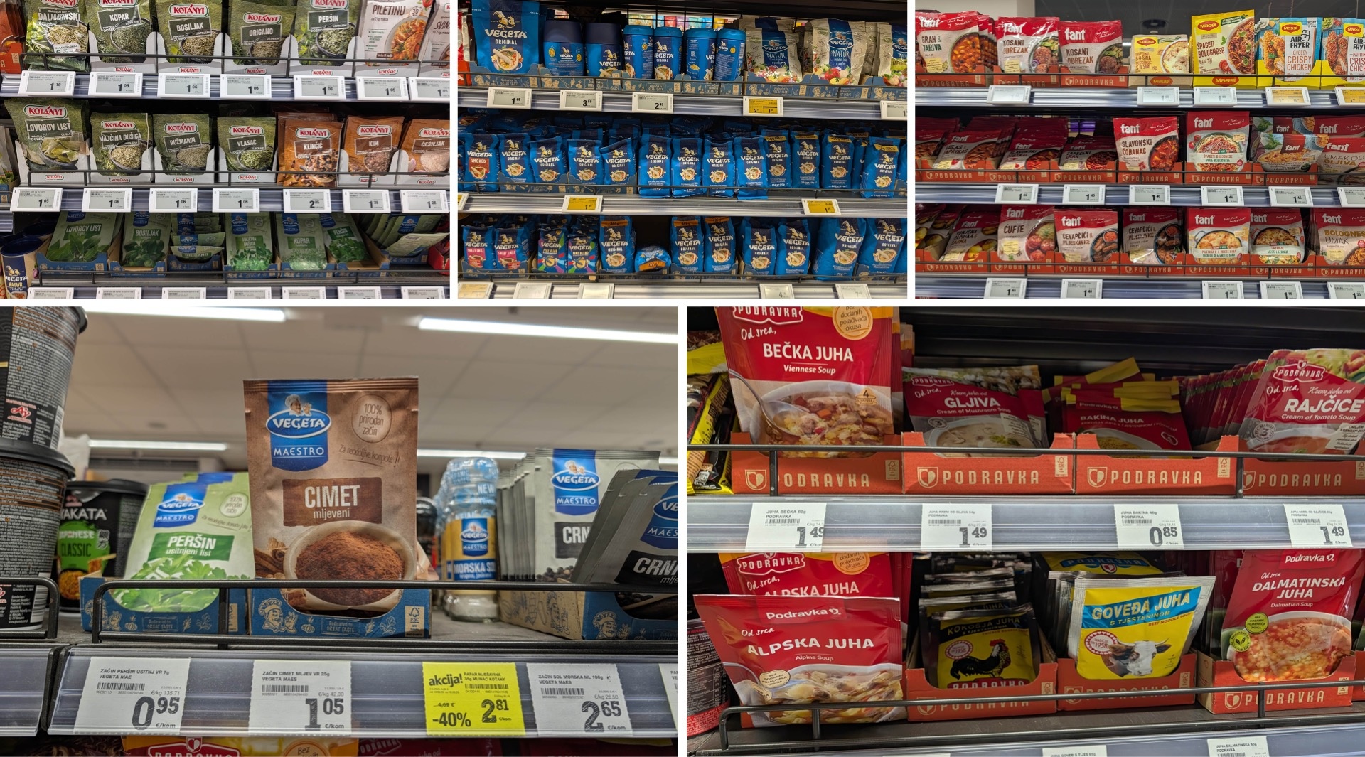
On the spice and soup aisle, we also came across Kotányi—a former client of ours—as well as the Balkan institution Vegeta, alongside Podravka and Fant. For Maggi, this market is clearly not easy terrain: the time-tested local brands enjoy high acceptance and literally dominate the shelf as a “red wall.” Interestingly, their design language isn’t all that different from Maggi’s, but Croatian consumers simply associate the soup range with red—perhaps complemented by green—while in Germany, Maggi yellow or Knorr green serve as the corresponding color codes.
One more word about Vegeta. The success of this seasoning blend would actually be worth a study of its own—not least because the brand uses blue, a color that’s highly unusual for seasonings. You’d expect to see blue on the dairy or cheese aisle. This is precisely how Vegeta has created a distinctive USP: a brand element that’s now deeply anchored in consumers’ minds and is virtually impossible to copy successfully.
Canned fish and meat: anything but outdated
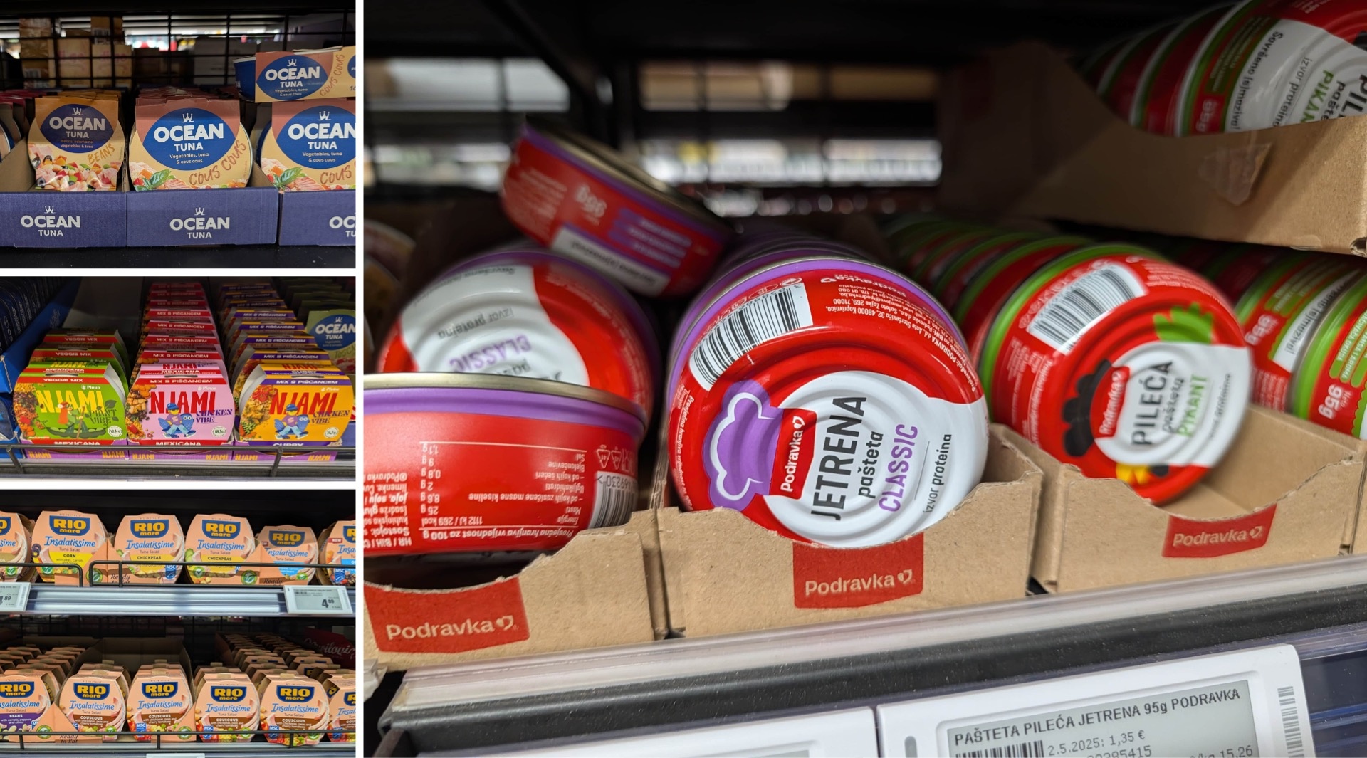
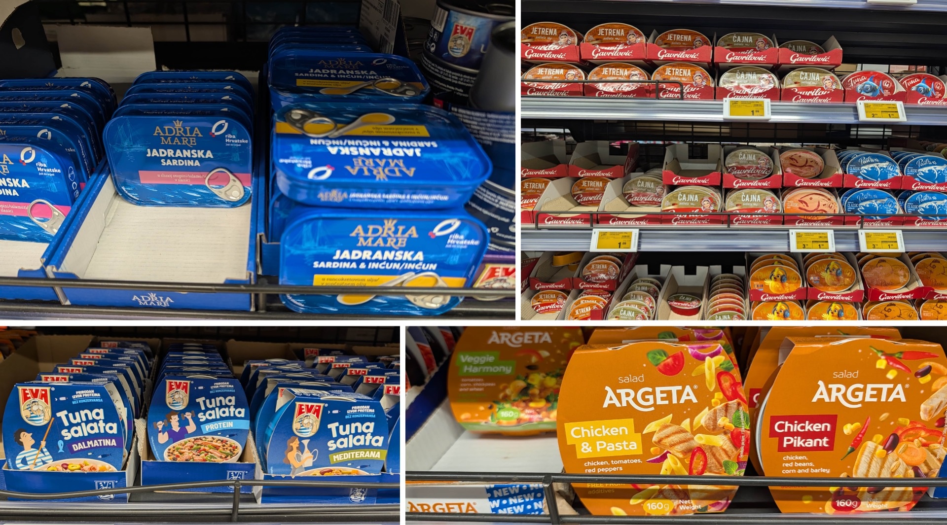
We also consider this shelf a pleasant surprise—for several reasons. It’s not just fish here: In addition to classic canned goods, you’ll find vegan alternatives and even chicken products. The design makes it even more exciting. A category that often seems rather outdated in German retail takes on a decidedly modern look in Croatia. Minimalist fonts, playful illustrations, and outstanding typography down to the smallest detail—including precise kerning—give the shelf a completely different look.
Among the dominant brands are Adria Mare, Argeta, and Nyami—which offer tuna and chicken alternatives—as well as Eva and other local providers. We must highlight Argeta: The Slovenian brand has truly revolutionized pâtés and meat spreads with its modern design language. In contrast, traditional Croatian brands like Gavrilović seem almost out of step with the times.
The relaunch of Rio Mare is also interesting. We found the previous design significantly more modern; now, the brand is placing greater emphasis on Italian tradition and positioning the logo so prominently that the individual varieties are barely distinguishable from one another. The selection of varieties, however, is significantly larger than in Germany.
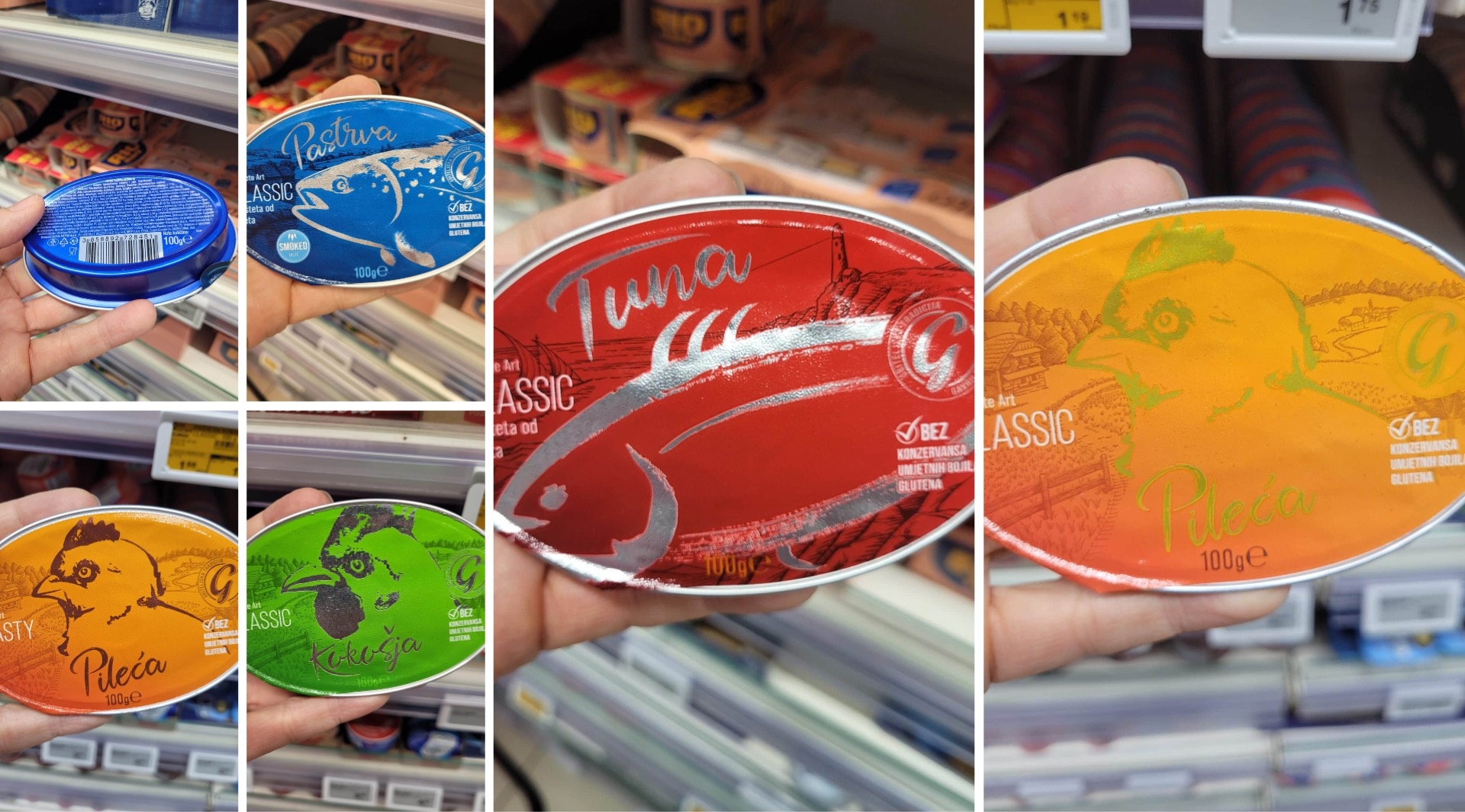
Finally, we did discover one special highlight at Gavrilović—the brand whose other products tend to seem rather old-fashioned. A line of pâtés featuring tuna and chicken varieties like Picante, Roasted, and Classic doesn’t simply use the silver foil as packaging material, but deliberately as a design element—along with a bold color palette and an interesting visual language.
Yogurt and Other Dairy Products: The Popularity of Fermented Foods
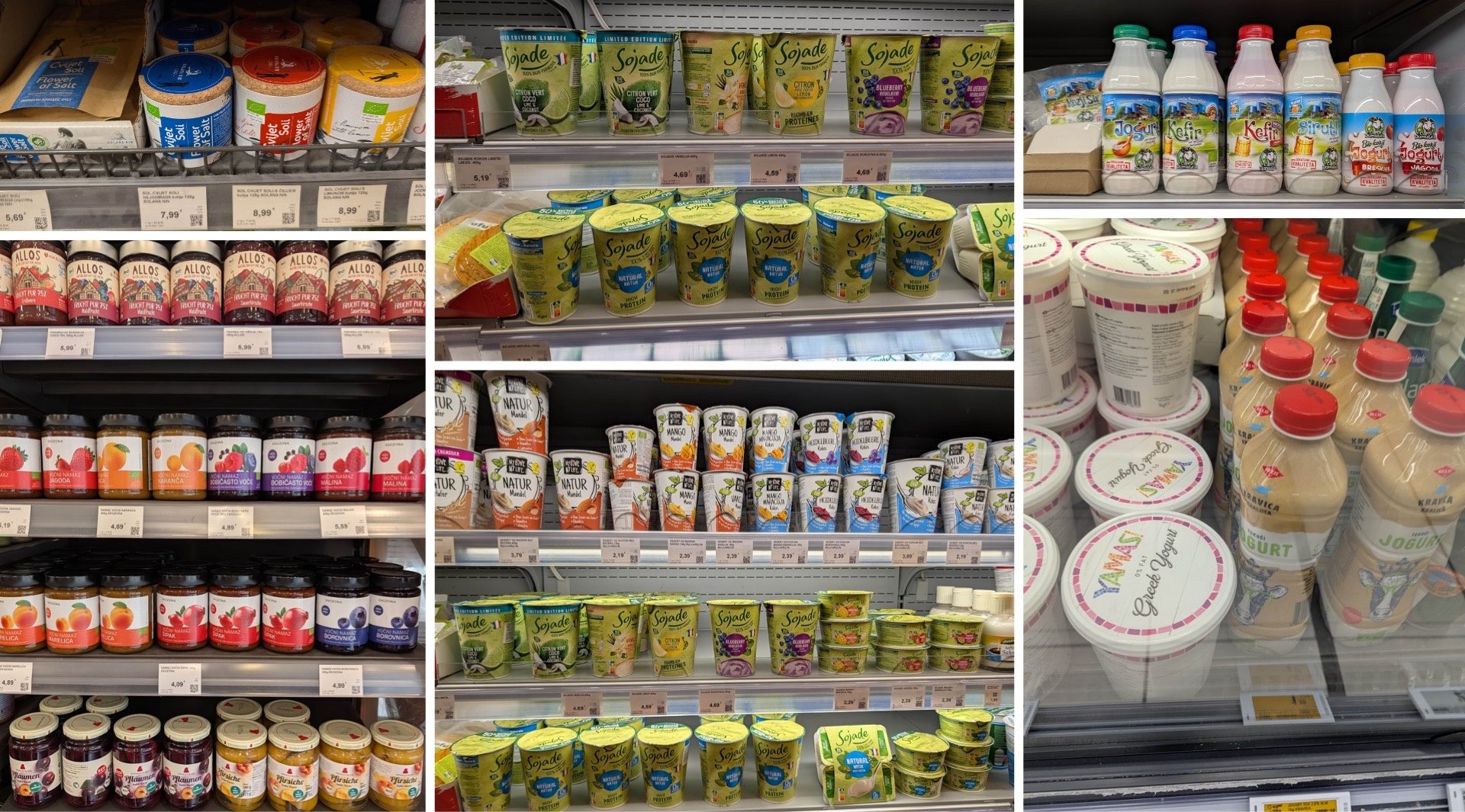
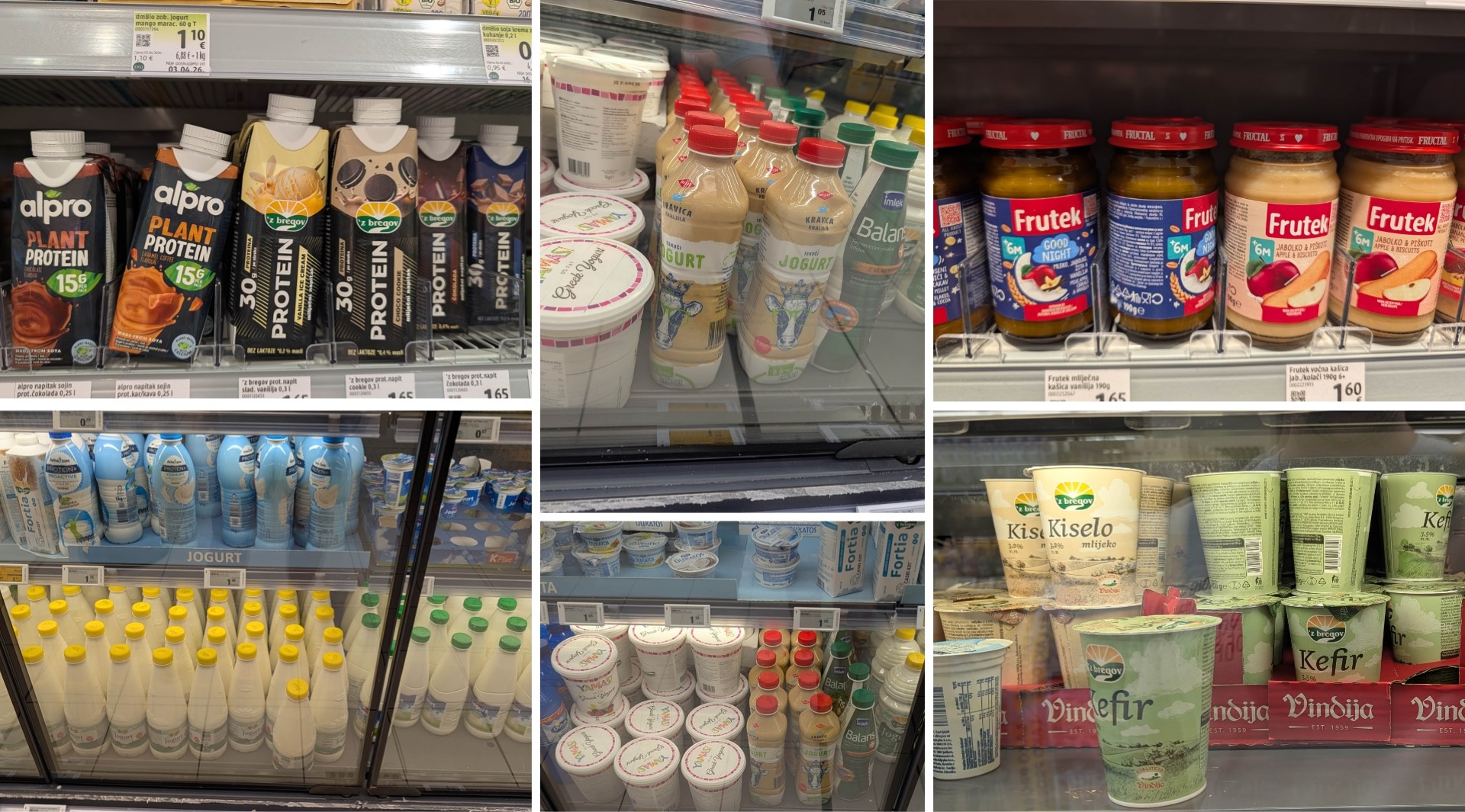
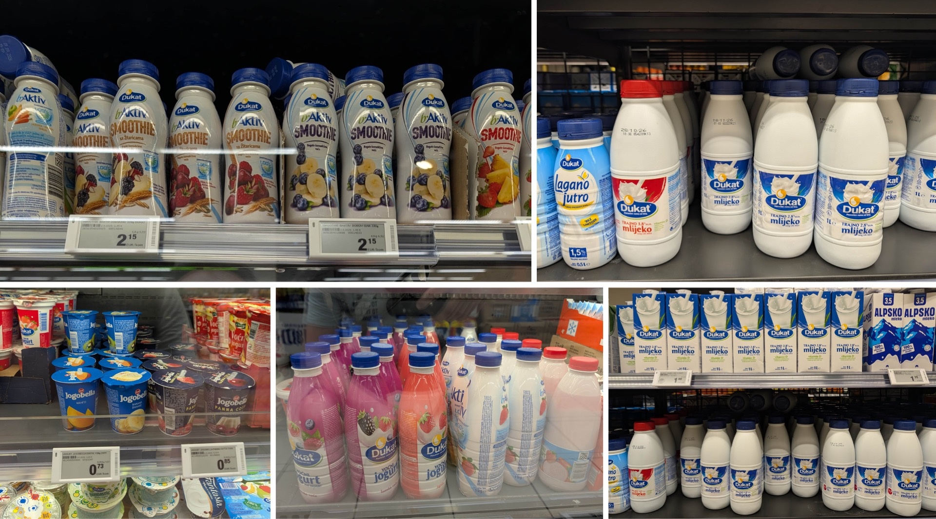
Anyone accustomed to German supermarkets is likely to be surprised at first glance at the yogurt aisle. The selection is significantly more diverse: fruit yogurts sit alongside soy and protein varieties, complemented by an impressive selection of kefir. And that’s not all: numerous drinkable yogurts, acidophilus milk, and bifidus drinks show just how popular fermented milk products apparently are in Croatia. The products come in a wide variety of bottle shapes and sizes—kefir, for example, is even available in liter-sized containers and larger. Plant-based alternatives are also available, though to a lesser extent than in Germany, where this segment has grown significantly in recent years.
An interesting aspect of Dukat, Croatia’s best-known dairy brand: the color-coding system for milk that is so well-established in Germany—red for whole milk, blue for regular milk, light blue or green for low-fat varieties—plays hardly any role in Croatia. Instead, different packaging shapes are the primary way to distinguish between products. The wide variety of bottles for drinkable yogurt and kefir is particularly impressive.
As mentioned at the beginning, Zott is also represented with a significantly broader range than in Germany. In the category of refrigerated products for children, a true traditional brand holds its own: Frutek. The packaging features interesting designs, doesn’t look outdated at all, and has helped the brand maintain its position as the market leader in this segment for many years.
Salami and Cheese: Tradition on a Plate
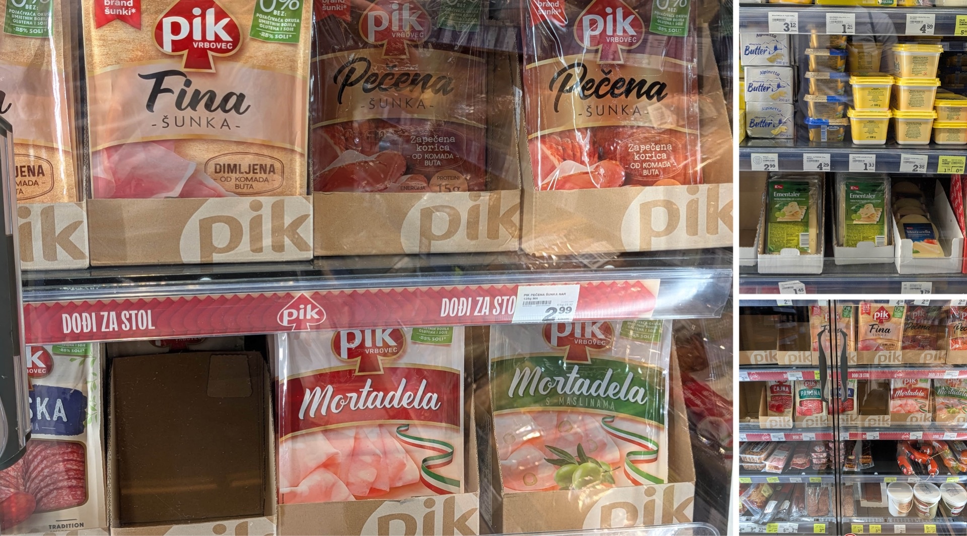
In the sausage section—especially on the salami shelf—the trend is clearly swinging back toward tradition. Classic rustic patterns and design elements that at times border on the heraldic have a rather conservative feel—apparently well-suited to a target audience that values familiarity and familiar aesthetics when it comes to sausage products.
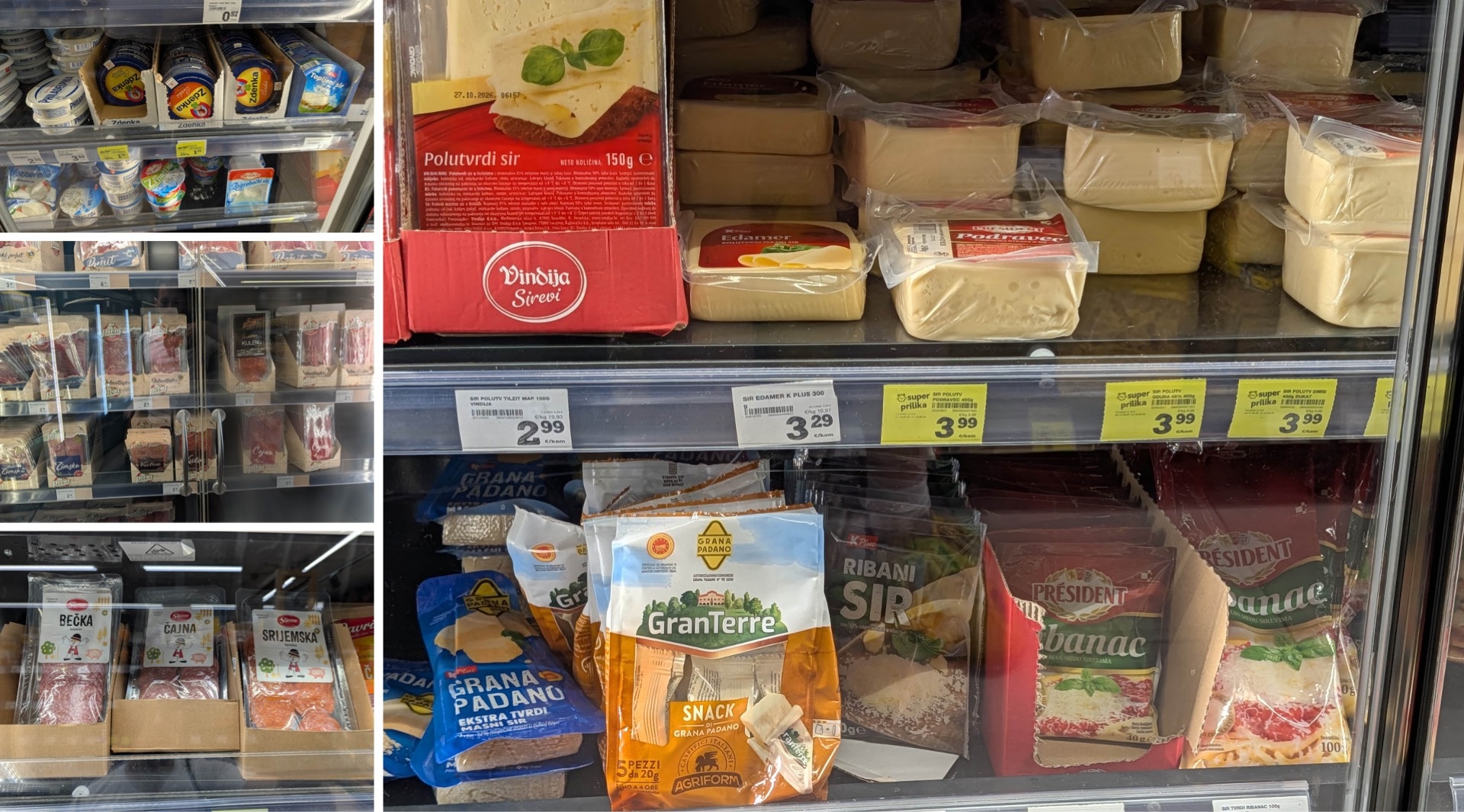
A glance at the cheese aisle reveals a true icon in Zdenka. The brand has endured for decades and become deeply rooted in everyday Croatian life—perhaps comparable to Maggi seasoning in Germany. It’s a fine example of how long-standing brand loyalty can endure even in a constantly changing market.
Ice Cream and Frozen Foods: Ledo Has Something for Everyone
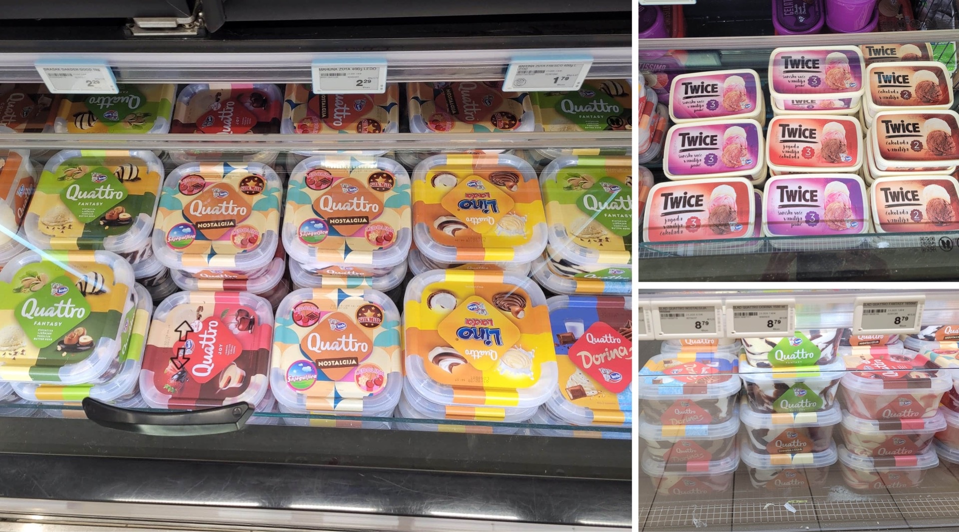
In the frozen food aisle, there’s no getting around Ledo. Launched in 1958 as an ice cream brand—“led” means “ice cream,” and Ledo is the name of the polar bear in the logo—the company has branched out into other frozen food categories over the years and evolved into a true all-around heavyweight. Today, Ledo is the number one brand in Croatia and beyond, not only in the ice cream business but in the frozen food sector as a whole. The brand also impresses with its design: its visual identity is playful and, for the most part, decidedly modern. Not every product line reaches the same level, however—Twice, for example, falls a bit short in comparison. The Quattro line, on the other hand, impressively demonstrates the brand’s design capabilities.
Confectionery: Classic Brands, New Designs
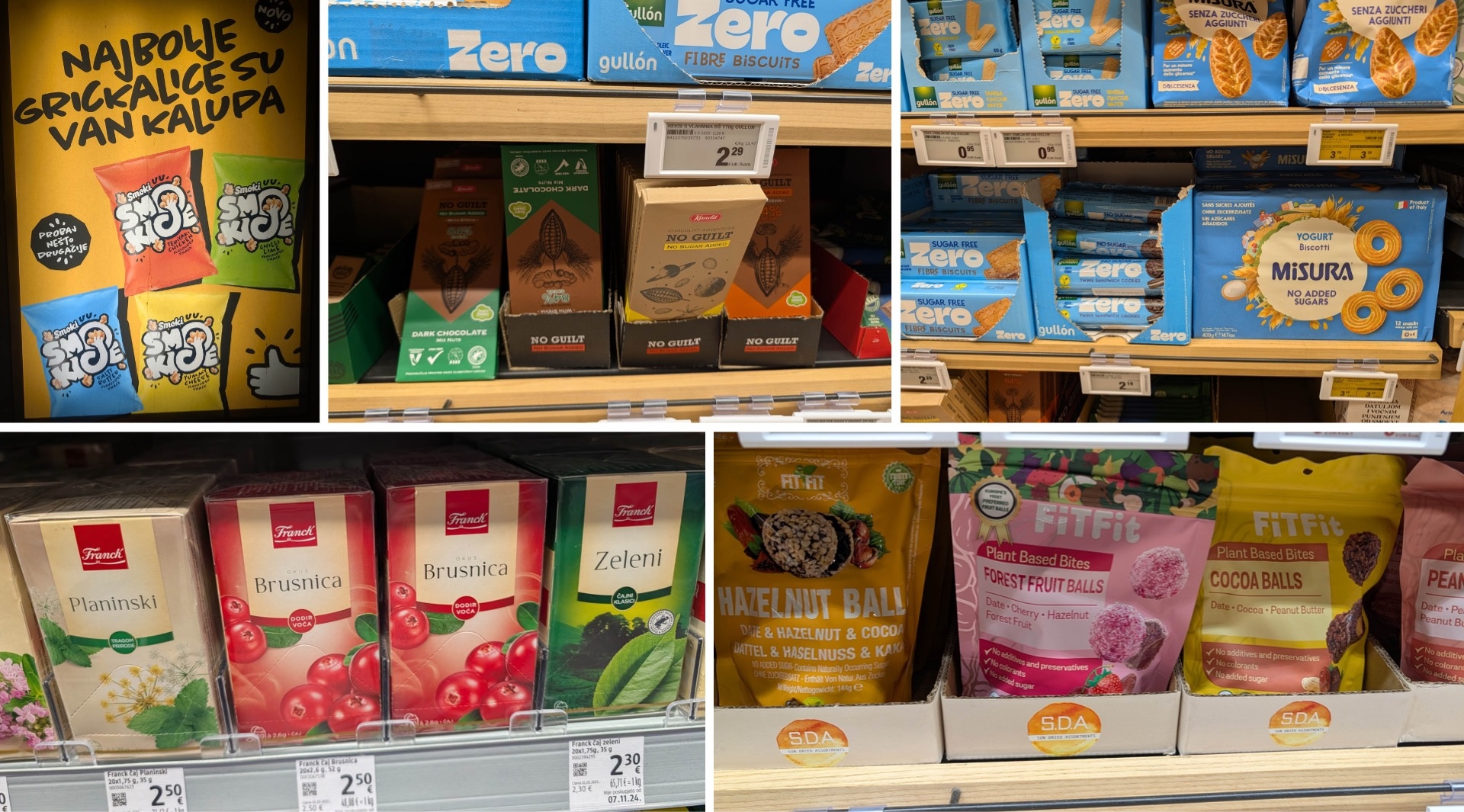
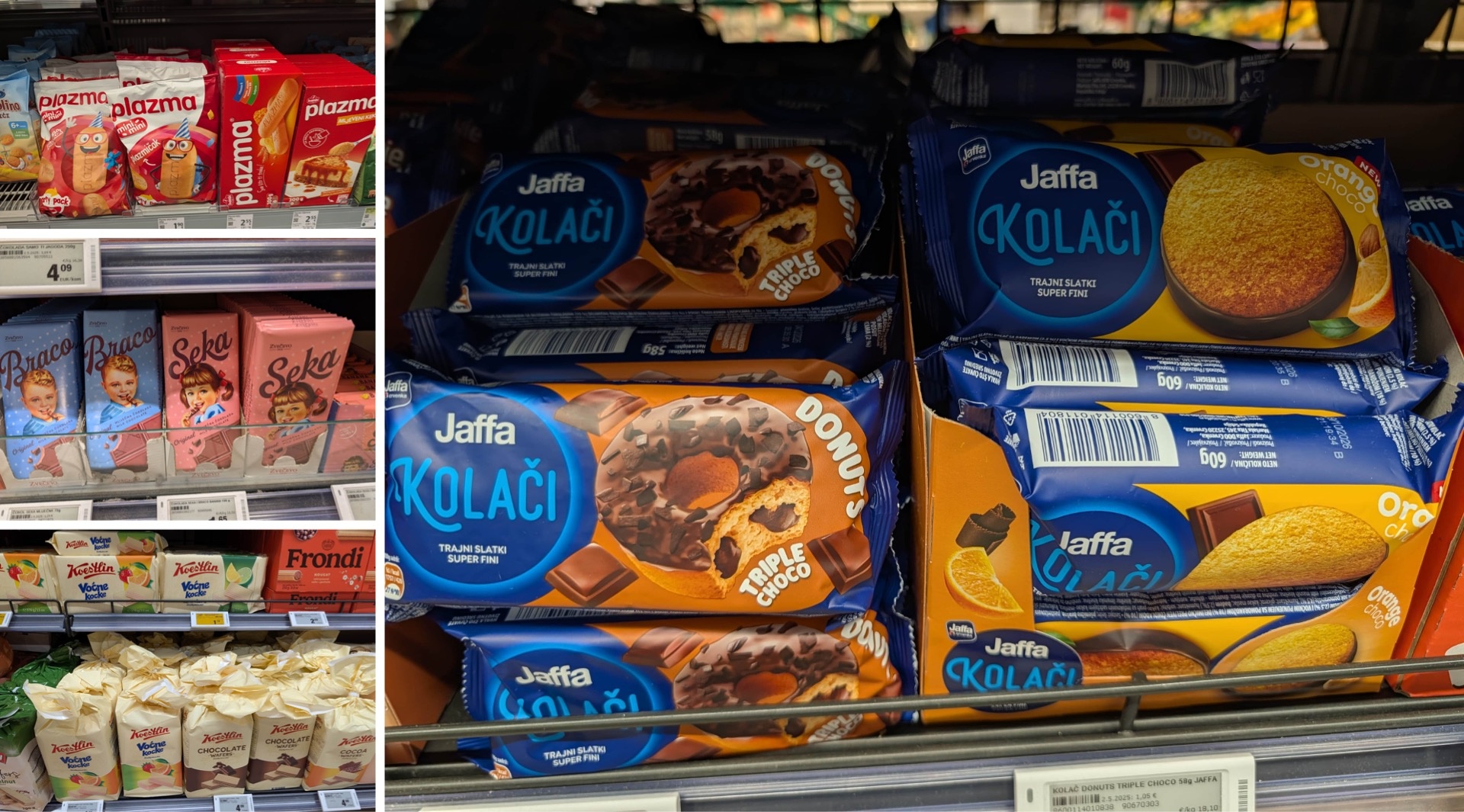
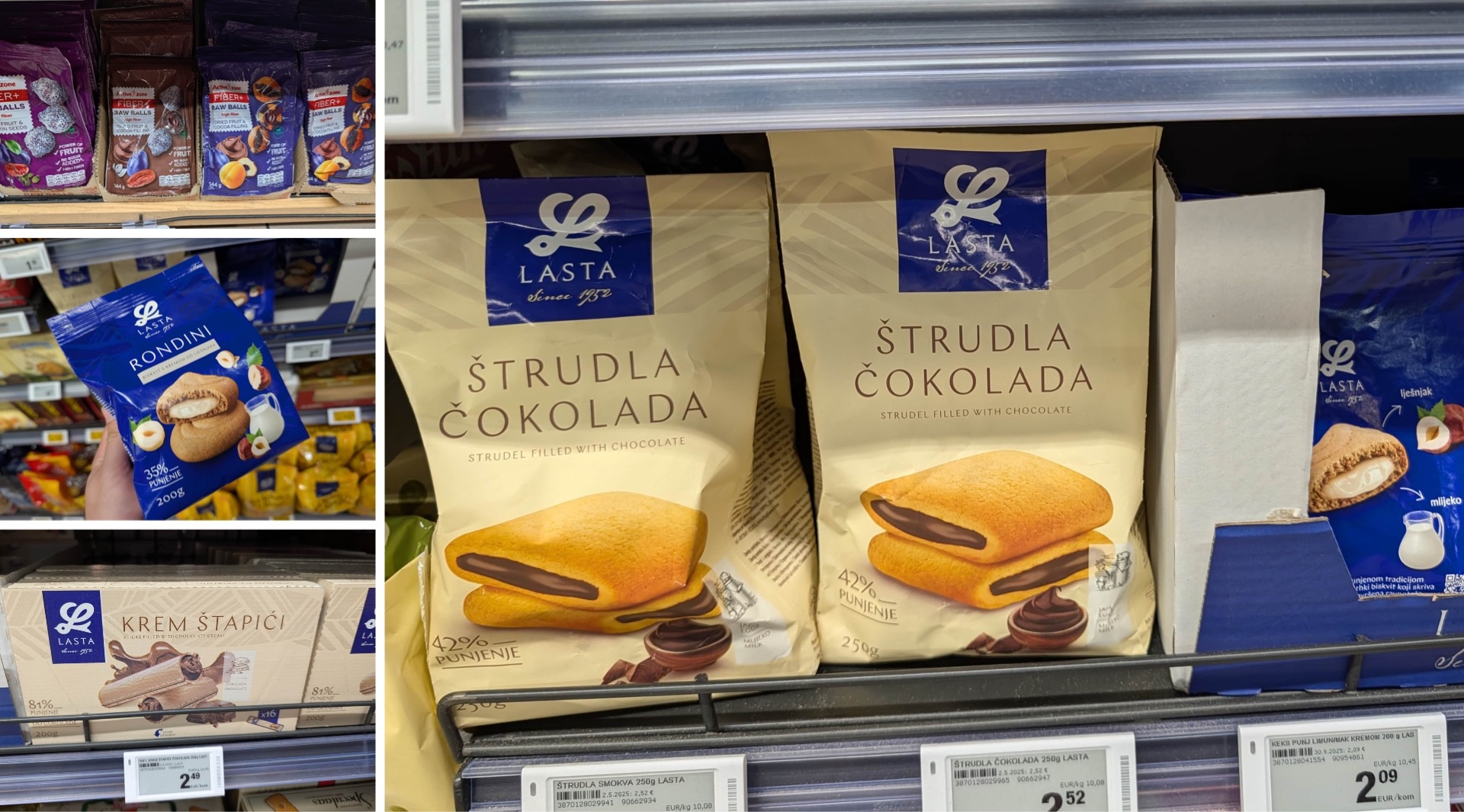
The selection of cookies in Croatia is huge. In addition to the Kraš brand, which we’ll discuss in more detail below, the shelves are stocked with long-established brands like Plazma and Lasta, some of which have a history dating back more than 100 years. Many Croatians enjoy pairing these crispy treats with coffee or tea from Franck, Croatia’s largest producer in this segment, whose products are also available at the Slavic grocery store in Berlin. In addition to the local brands, the cookie aisle at Konzum features several Italian brands, such as Misura.
Alongside traditional offerings, a trend is emerging that is also familiar from other markets: functional snacks. Fiber-Plus Raw Balls, chocolate-covered apricots, Plant-Based Bites, and Cocoa Balls combine health and indulgence, bringing fresh momentum to the confectionery section.
But there’s also a lot happening with the classics. The Braco i Seka chocolate—“Little Brother and Little Sister”—may come in a new design, but it remains true to its traditional character. What’s impressive here isn’t so much the individual innovations as the overall development of the established brands. Lasta, Plazma & Co. have comprehensively modernized their branding: more contemporary typefaces, improved kerning, and new illustrations give the products a significantly fresher look. Tradition isn’t being discarded here, but rather consistently adapted to the present—and they’ve done it exceptionally well.
Snacking: Have the Courage to Develop Your Own Visual Language
While exploring nut snacks, we came across a particularly interesting brand: Vedrini. Here, faces are composed of illustrations of seeds and nuts—an unusual graphic concept that really catches the eye. Together with the colors, this visual style serves to differentiate between varieties while ensuring the brand remains recognizable as a unified whole. This is particularly noteworthy when compared to the German market. There, the nut segment often presents itself in a decidedly classic and functional way—think “student mix.” Vedrini, on the other hand, dares to try something new and demonstrates just how much originality is possible even in a supposedly established category.
Protein and Dietary Supplements: A Real Powerhouse
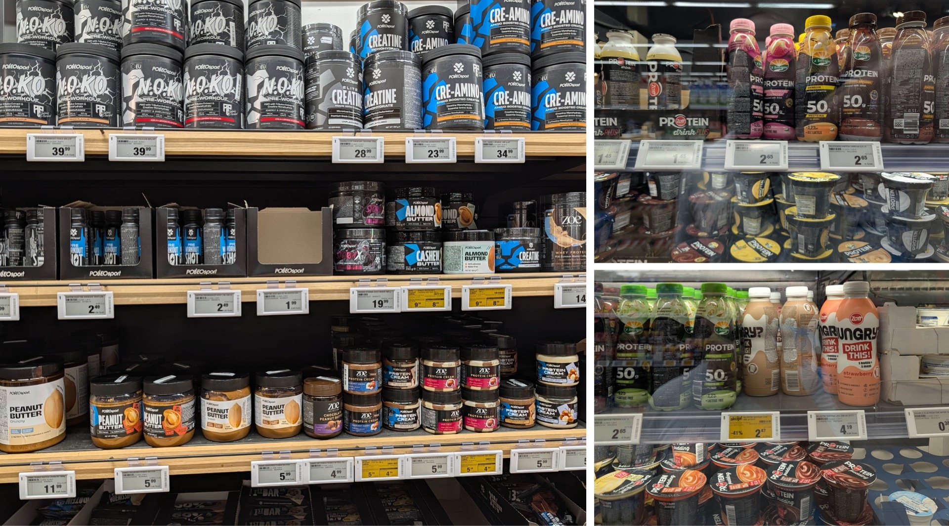
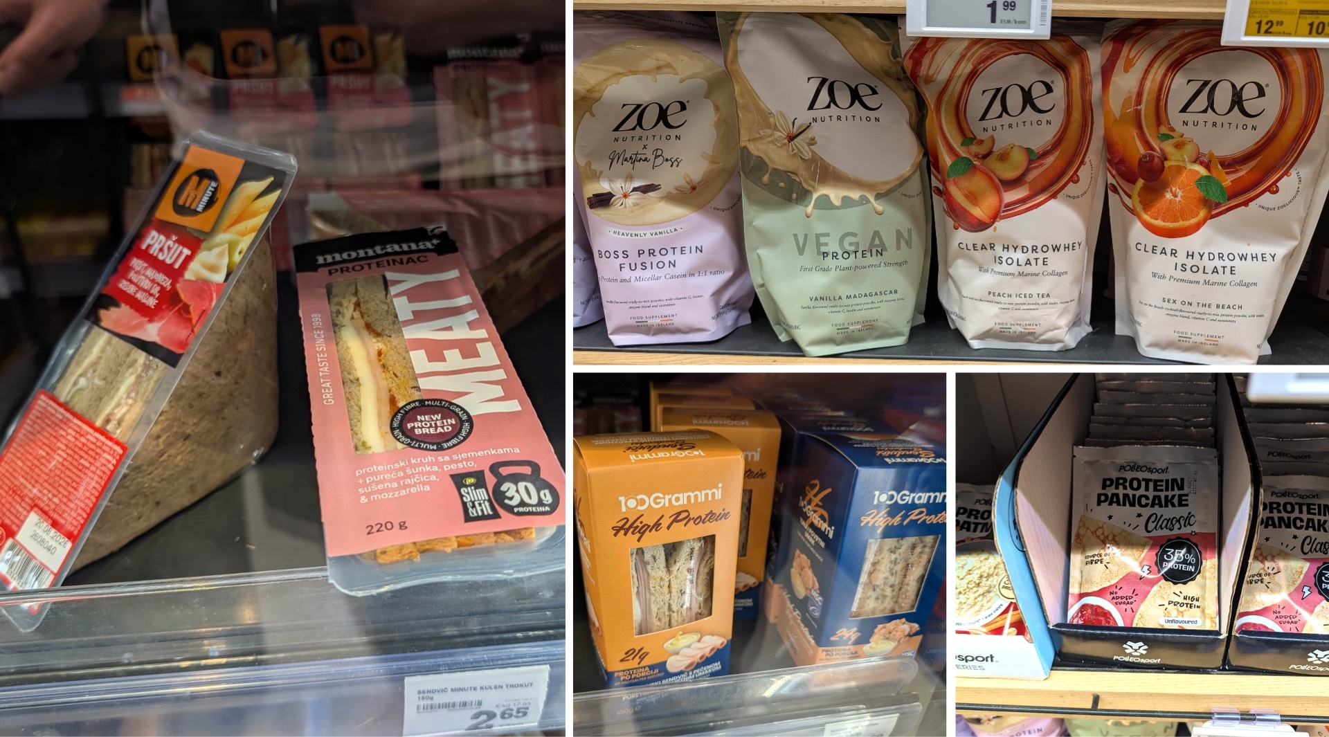
We were quite surprised by just how prominent the topic of protein is in Croatian retail. It’s no longer just about traditional protein supplements: high-protein sandwiches for on the go, dietary supplements, and even protein pancakes—the section now features an incredibly diverse range of products.
Black dominates the design here as well—though by no means exclusively. The difference from the German market is particularly interesting: While vegan alternatives attract a great deal of attention here, in Croatia a brand like Meaty confidently features meat and prominently highlights its exorbitant protein content on a promotional display.
And when it comes to protein drinks, Croatian brands clearly like to go all out. While we’ve seen a maximum of 30 grams of protein per drink in Germany, Konzum carries products with an impressive 50 grams from ‘z bregov,’ a Vindija brand.
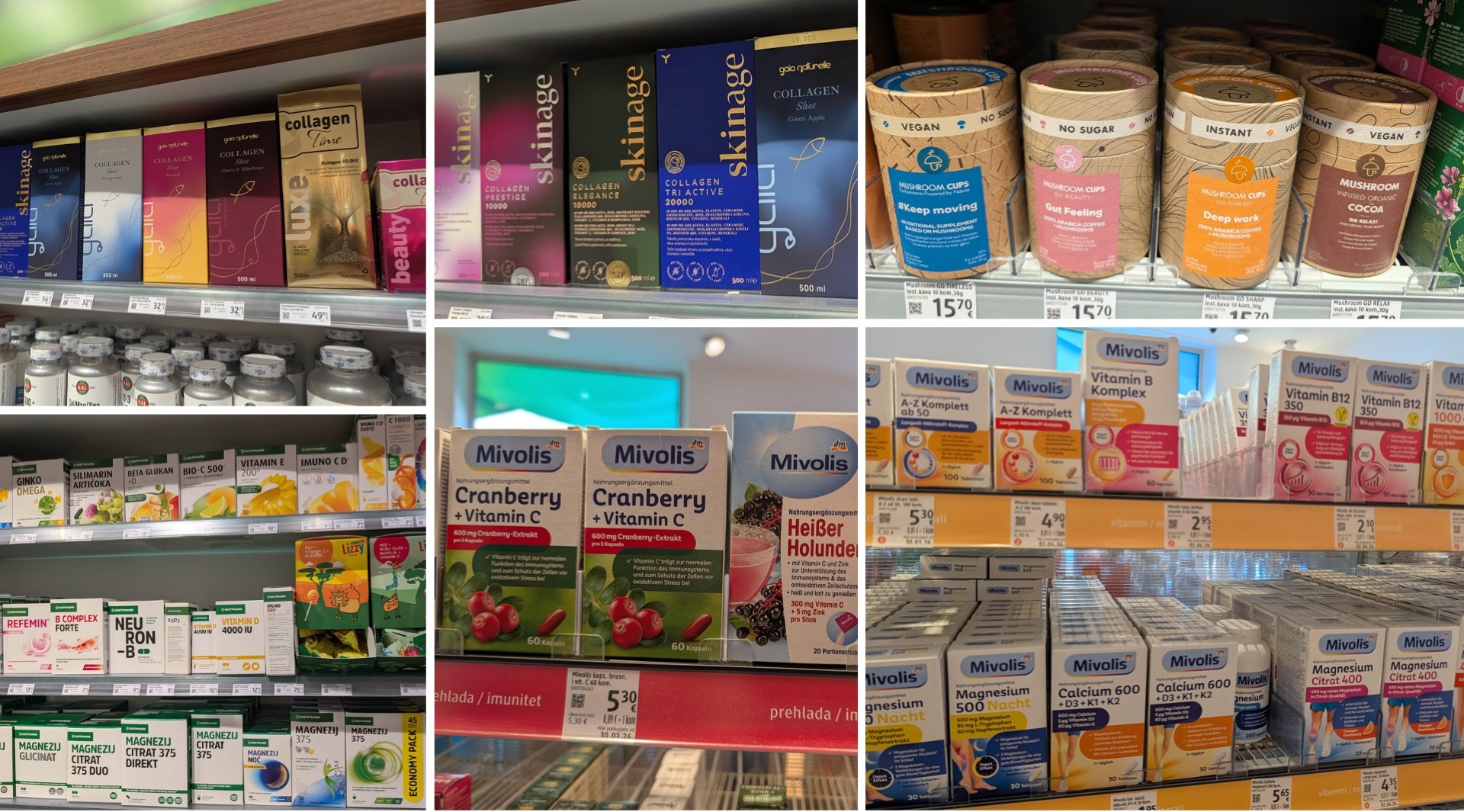
When it comes to dietary supplements, Gaia Naturel stands out. The brand’s collagen products feature exceptionally sophisticated packaging and, with their presentation, are almost reminiscent of high-end luxury cosmetics. Yasenka Skin Age Collagen takes a similarly elegant approach.
Another exciting offering is a line of functional mushroom supplements. The names alone make their respective positioning clear: “go tireless,” “go beauty,” “go sharp,” and “go relax” address different bodily functions and needs.
The long-established local brand Dietpharm, known for medications and dietary supplements, takes a completely different approach. Here, the brand largely avoids the usual abstract visualizations of active ingredients, body graphics, or flying pills. Instead, the design relies primarily on typography—an extremely minimalist and, as a result, very clean solution.
And then there was a little bonus for us right at the point of sale: We were able to observe the Mivolis relaunch live on the shelf. Old and new products stood side by side, allowing for an immediate before-and-after comparison—there’s hardly a more impressive way to experience a design change in a real-world retail setting.
Food Brands in the Spotlight: Kraš and Lino
Kraš: A Tradition That's Reinventing Itself
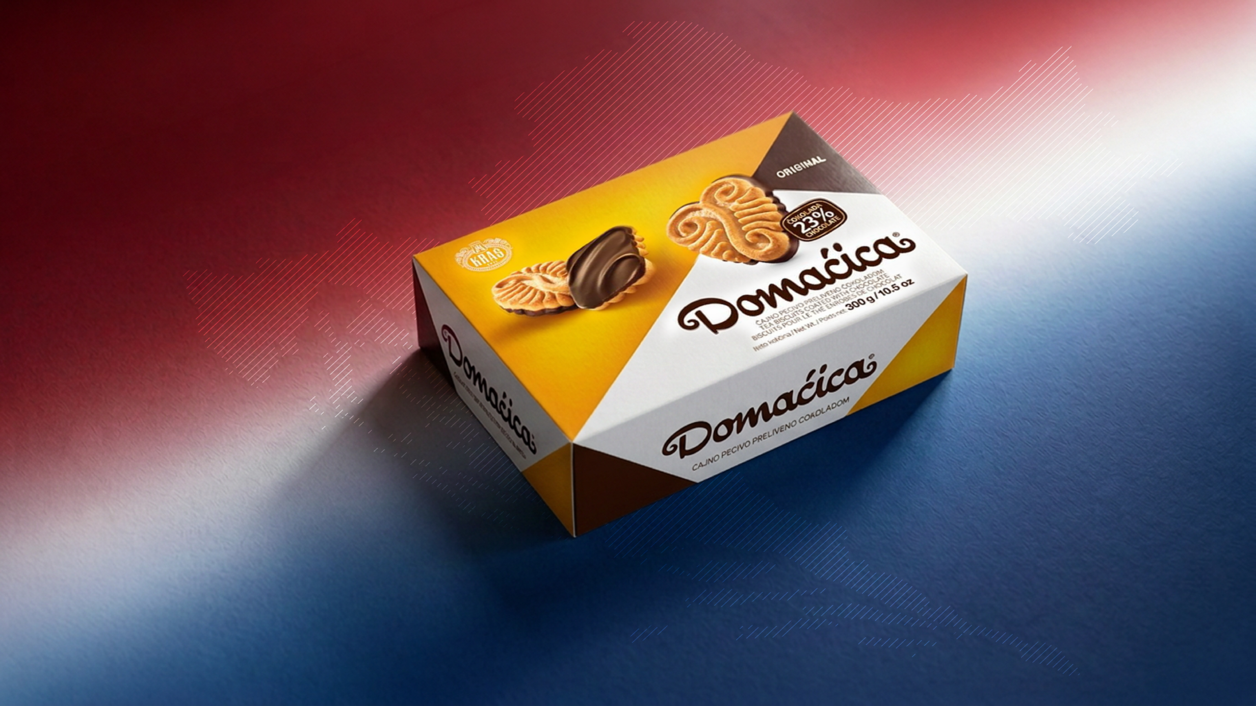
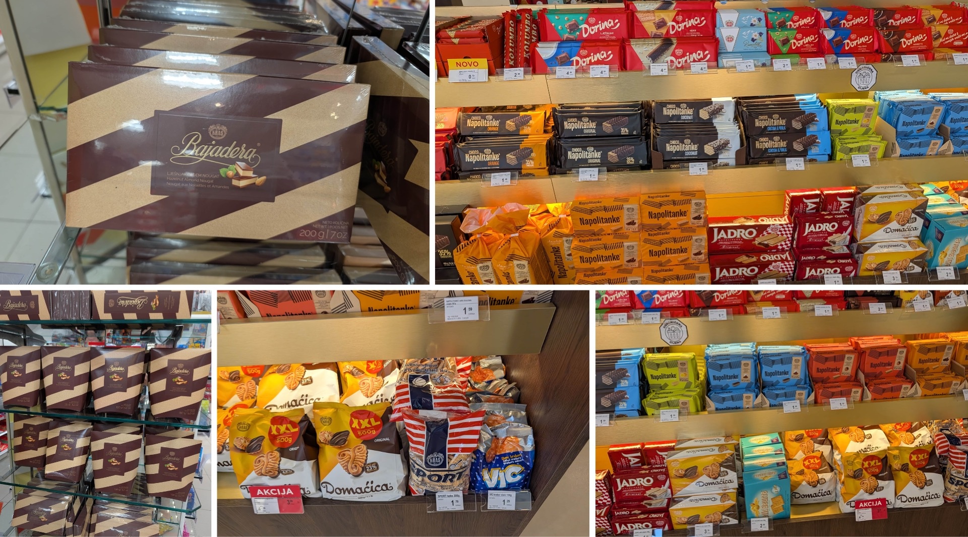
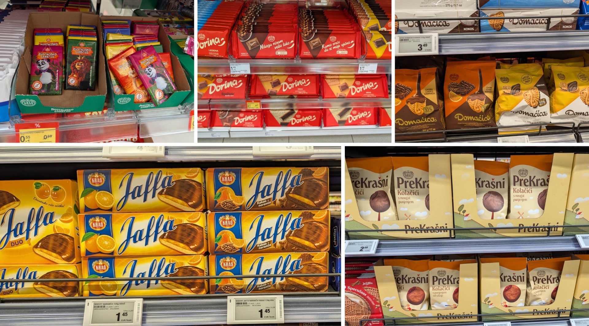
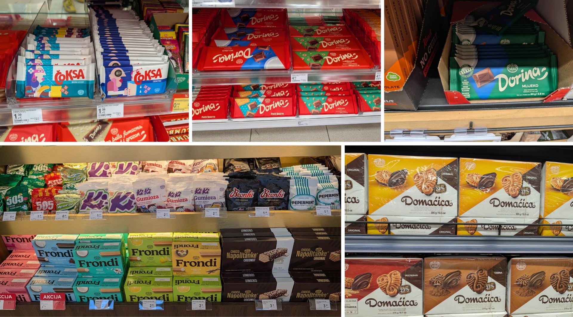
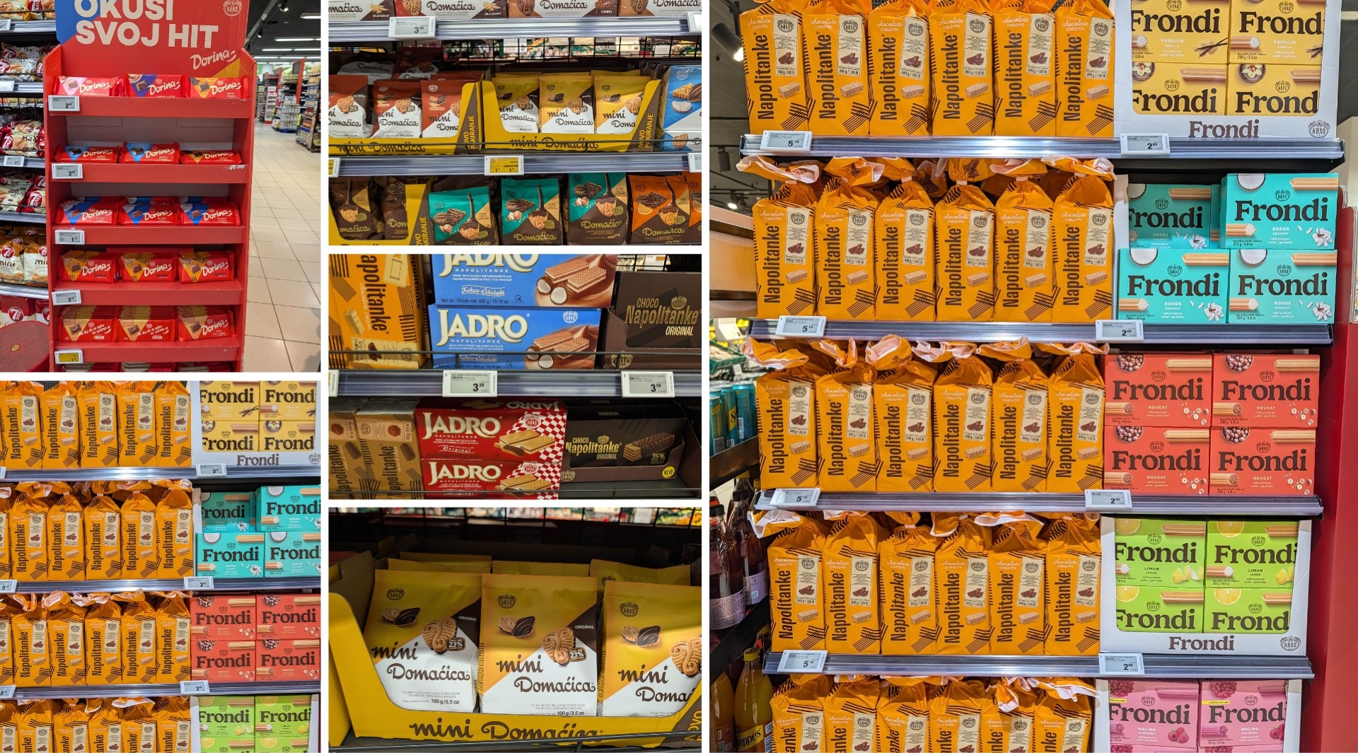
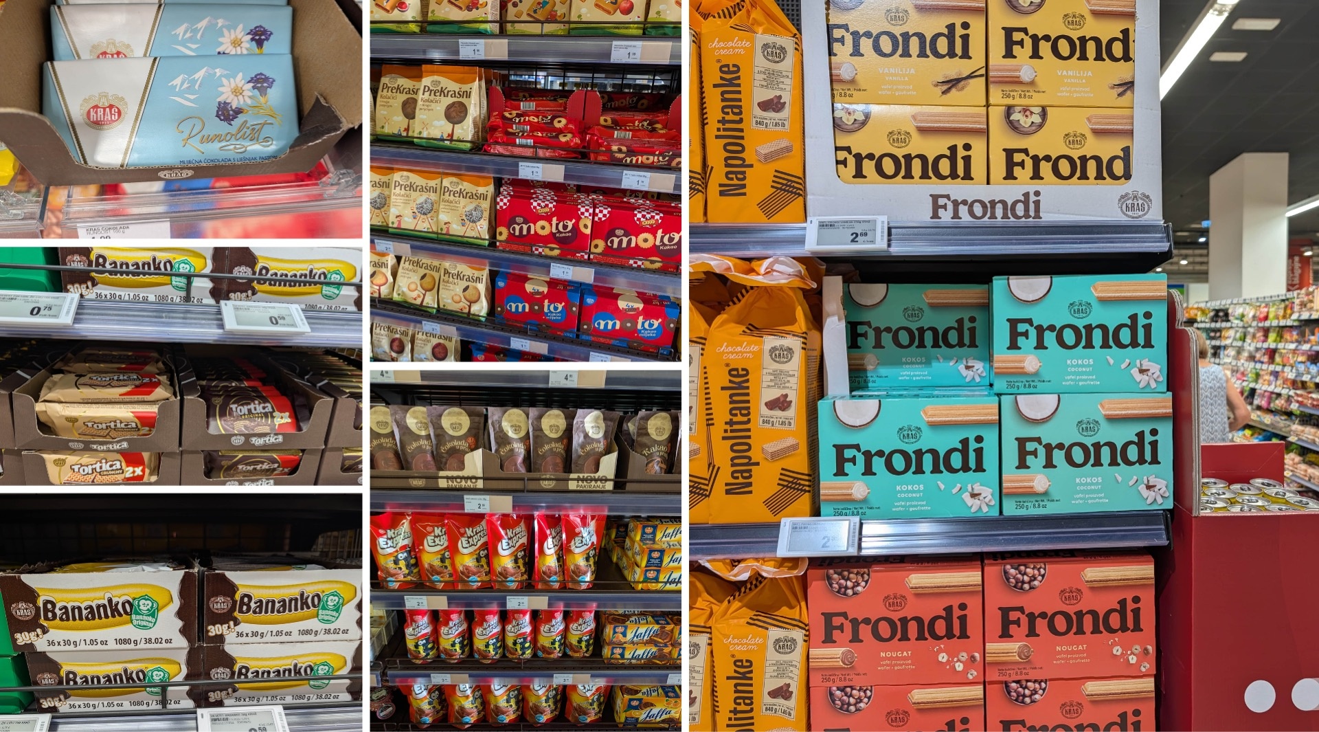
Kraš is a true institution on Croatian candy store shelves. Behind the name lies a vast brand universe with numerous sub-brands, some of which still feel quite fresh, while others have been well-known for generations. Bajadera is one of the classics, as are Jadro, Bananko, and Jaffa—these popular cookies have retained their familiar character, even in their appearance. In contrast, Dorina chocolate, Fontana, Domaćica, and Čoksa—especially the products aimed at younger target groups—have a distinctly more contemporary look.
In any case, each of these sub-brands follows its own design language, is constantly evolving, and yet manages to remain clearly recognizable as part of the Kraš family. The blend of tradition and strides toward modernity, coupled with consistent brand recognition across the entire product range, is Kraš’s greatest strength. Furthermore, the design generally reflects a great attention to detail—from spacing and color harmony to food shots, illustrations, and the corresponding advertising concepts.
Lino: From Baby Food to a Vast Brand Portfolio
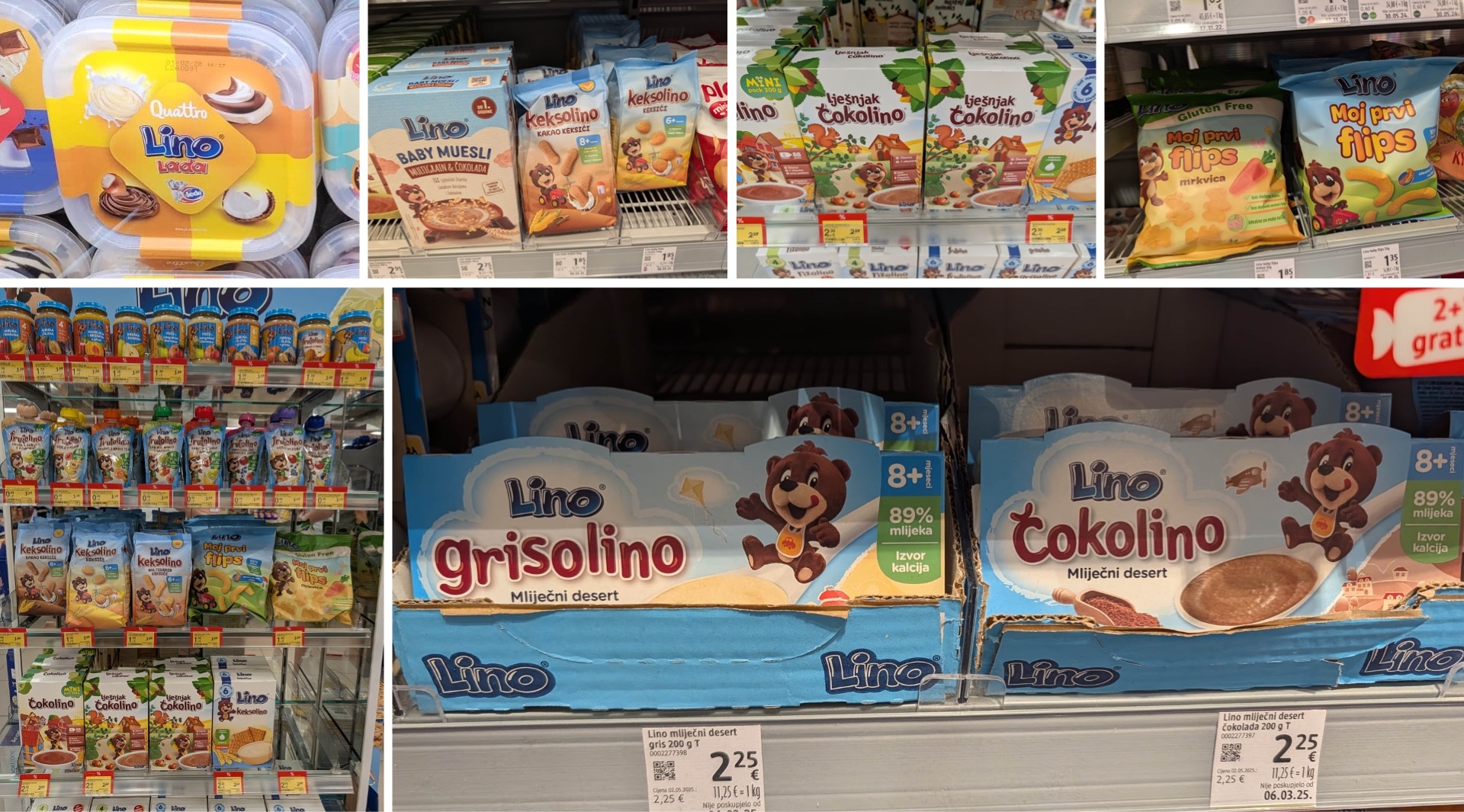
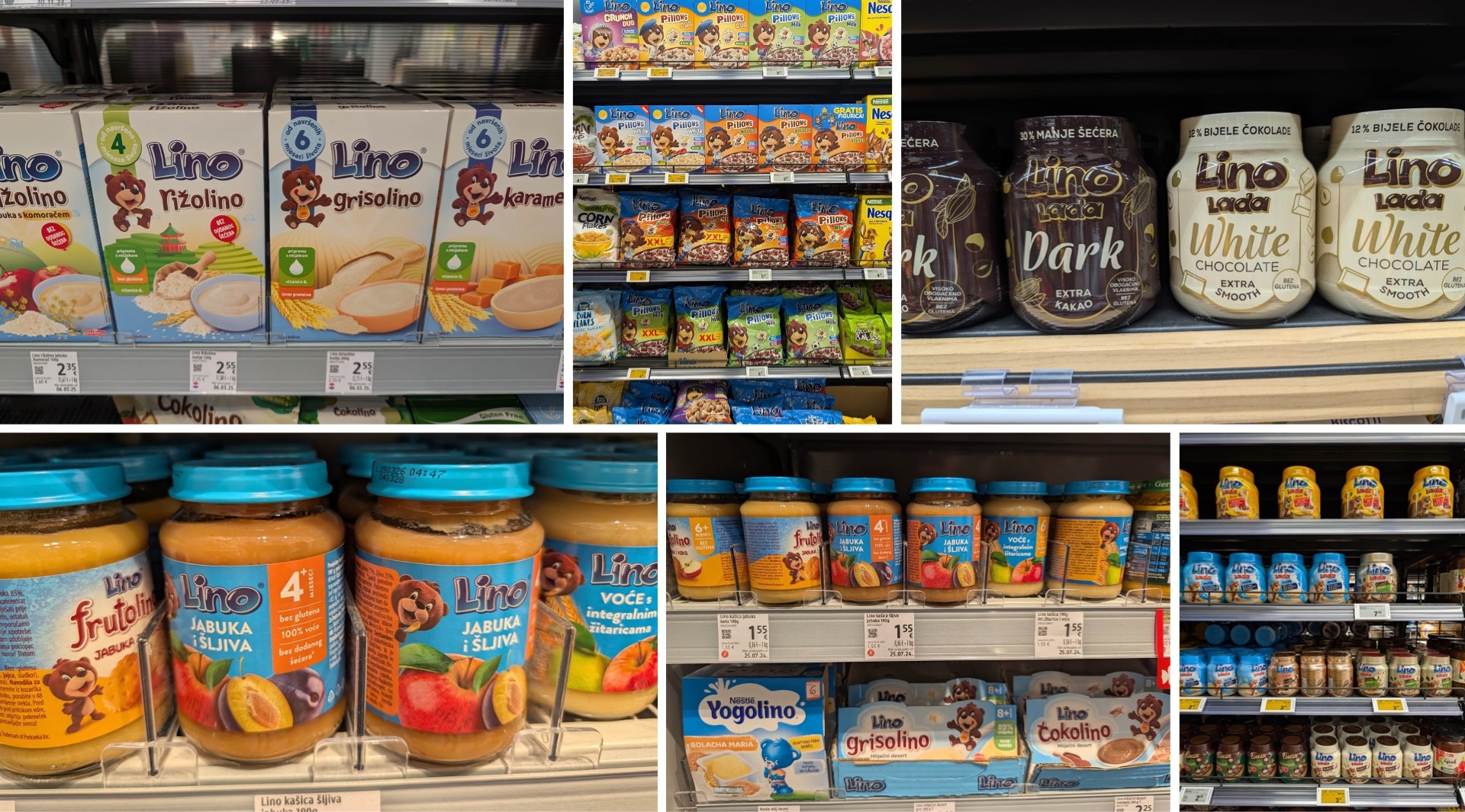
Even more fascinating is Lino’s journey. The brand, with its cute brown bear mascot, started out as baby food—the Čokolino and Keksolino varieties are still available today. Over time, this has evolved into a broad brand portfolio: The product line includes muesli for babies and children, other cereals, spreads like Lino Lada, Flips and other snacks, ice cream, and much more. Hardly any category seems safe from Lino. On the children’s food shelf, for example, Yogolinos, Grisolinos, and Čokolinos sit right next to each other.
Also interesting: Nestlé also uses a bear as an “ambassador” for certain children’s products. This bear is blue—a color that Lino doesn’t use for its own bear, but otherwise employs frequently and with gusto, such as in its logo and as a background.
What particularly impresses us: The Lino brand has successfully made the leap into the modern era without losing its identity. New product lines and flavors, a modernized design, and contemporary marketing concepts complement the familiar illustrations and the iconic mascot. As a result, the brand remains instantly recognizable across its various segments. Perhaps that is precisely what explains its enduring success: Entire generations have grown up with Lino, and the trust built up over decades continues to carry the brand to this day—a never-ending craze.
The “Eko” Niche: Croatia Eats Organic
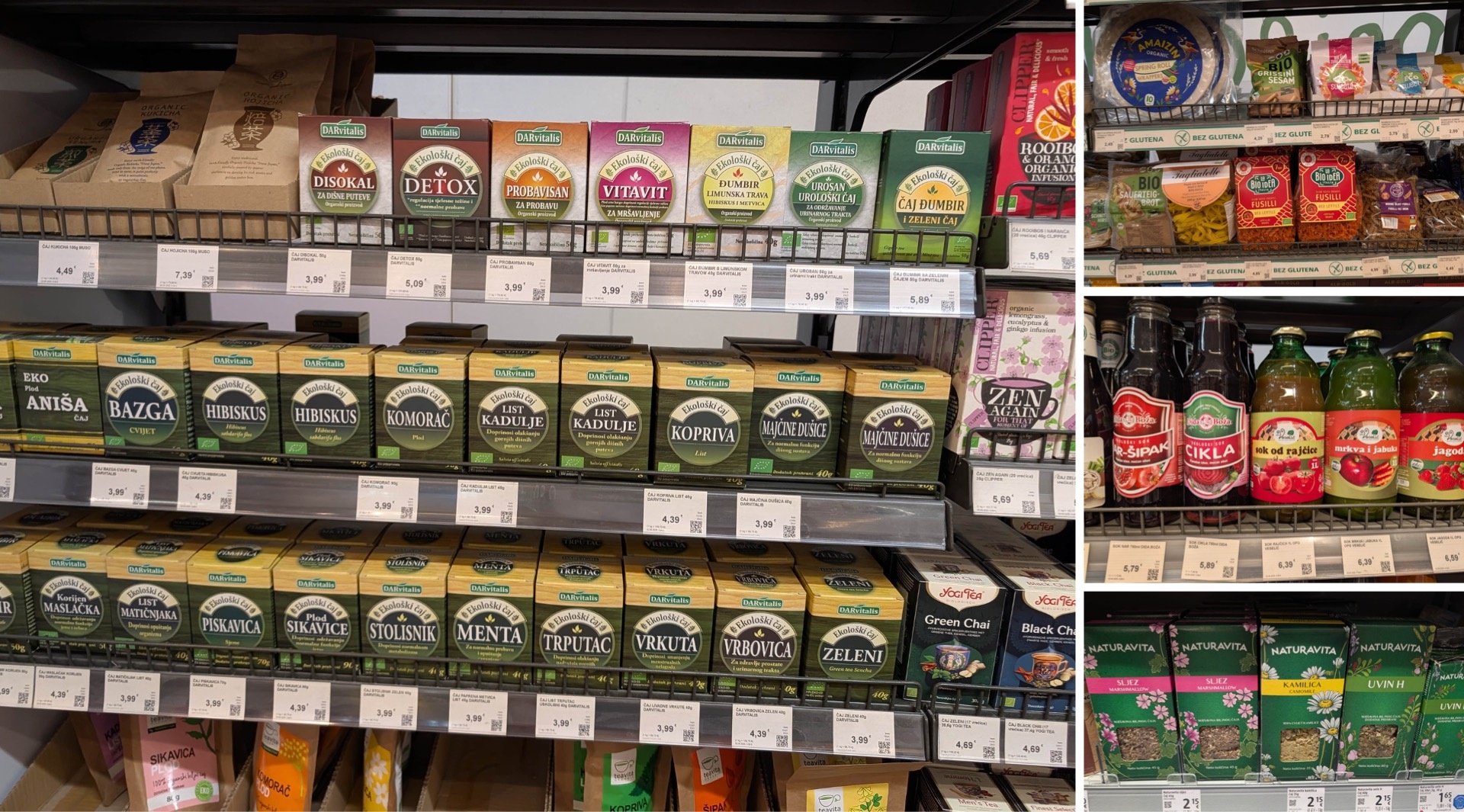
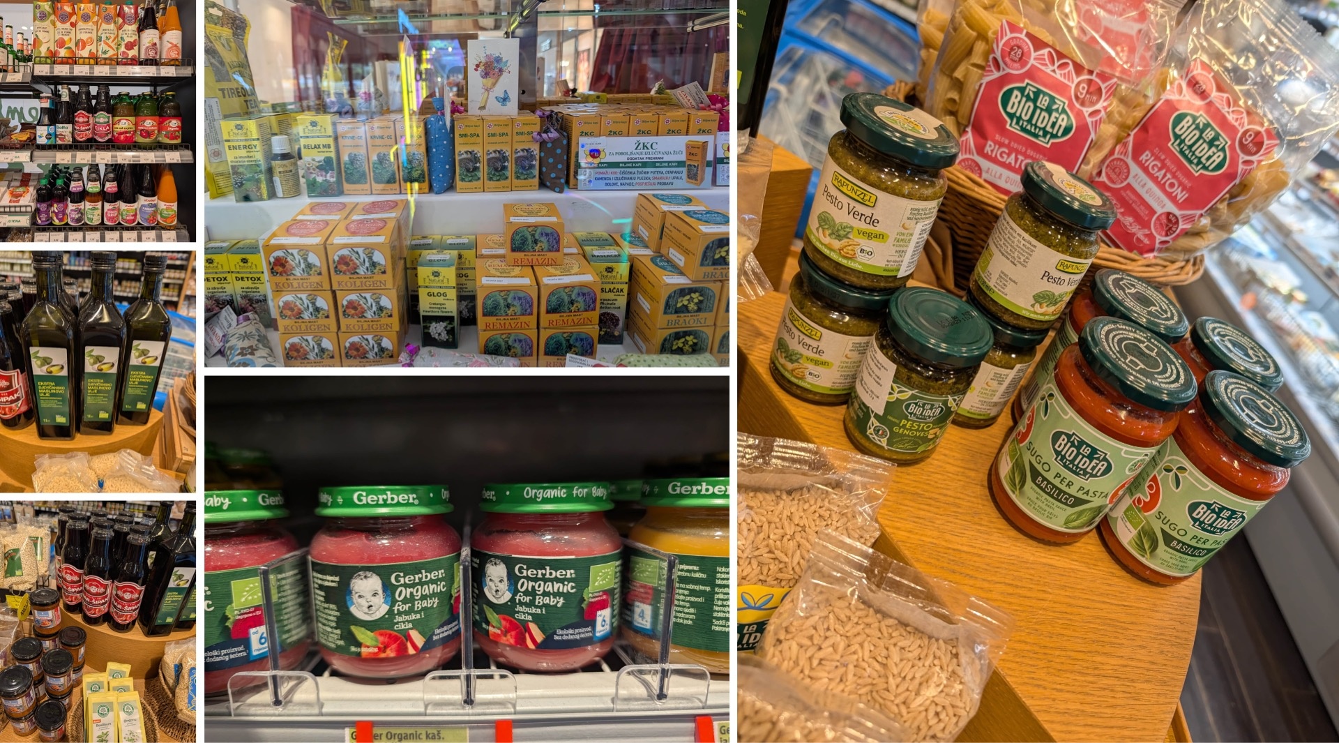
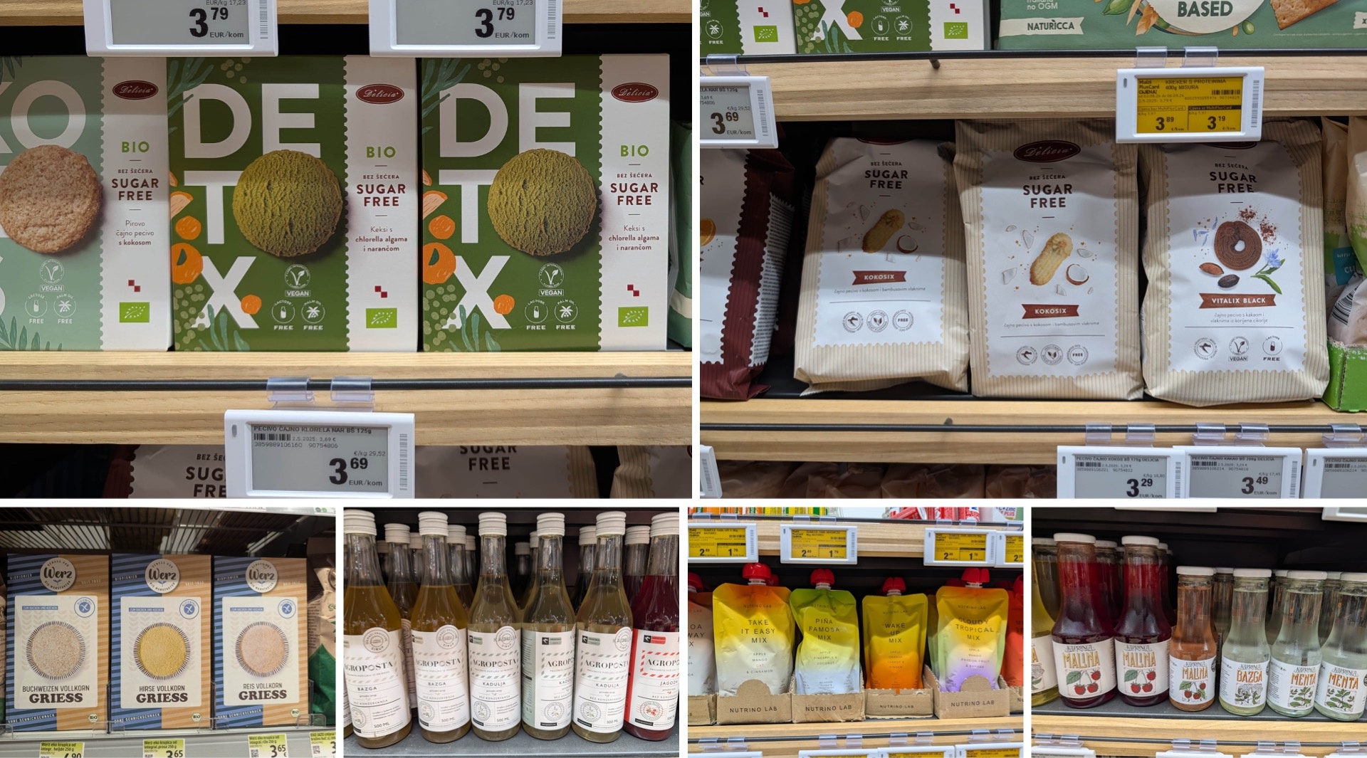
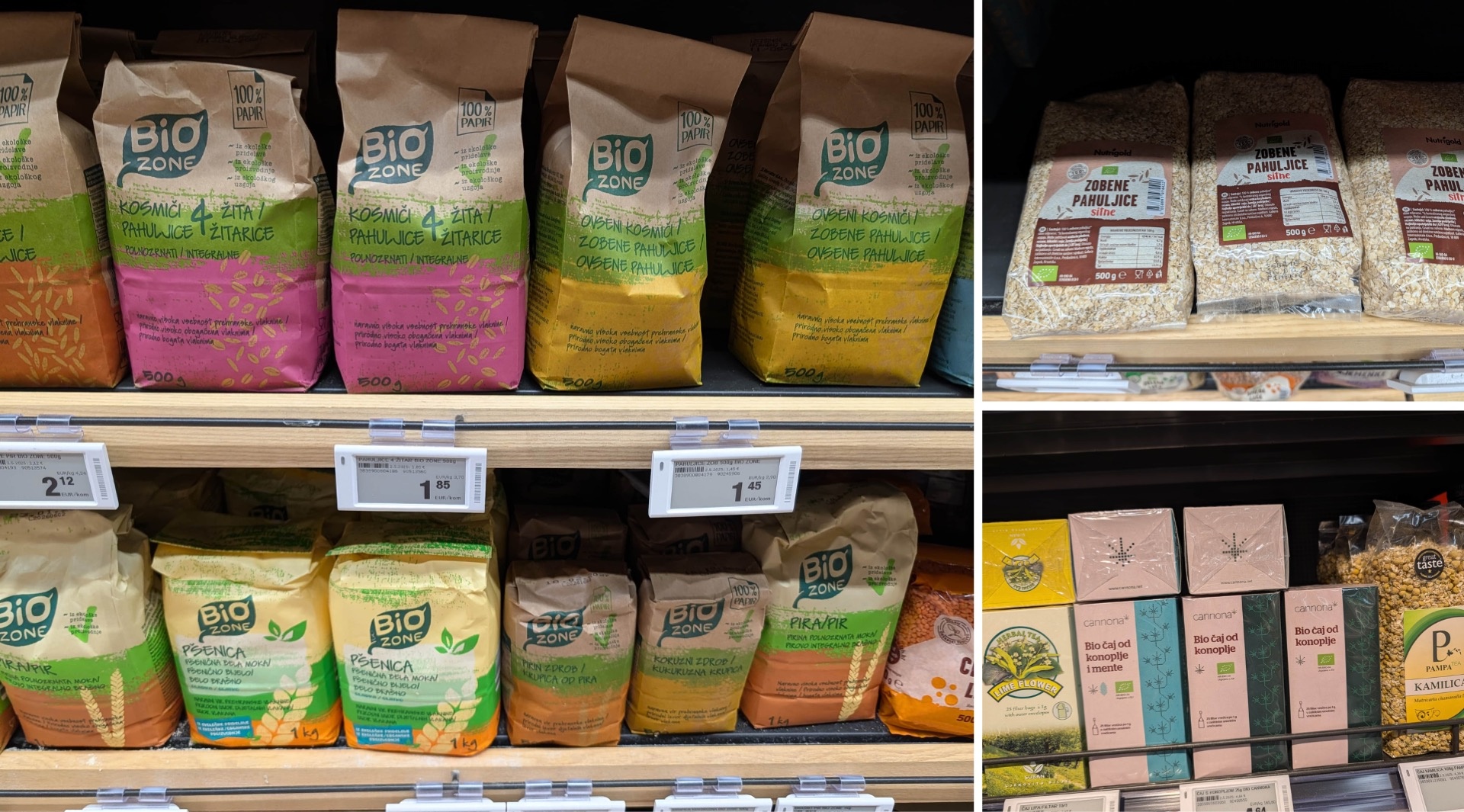
Konzum supermarkets and drugstores alike offer a very wide selection of organic products. In addition to many small producers, there are also larger brands as well as some names familiar to us from Germany. In terms of design, much of it initially resembles what we know from our own organic product shelves at home: a rather traditional look, natural materials, and plenty of recycled-paper aesthetics. However, there are also repeated attempts to reinterpret this familiar aesthetic in a more contemporary way—Bio Idea is a great example of this.
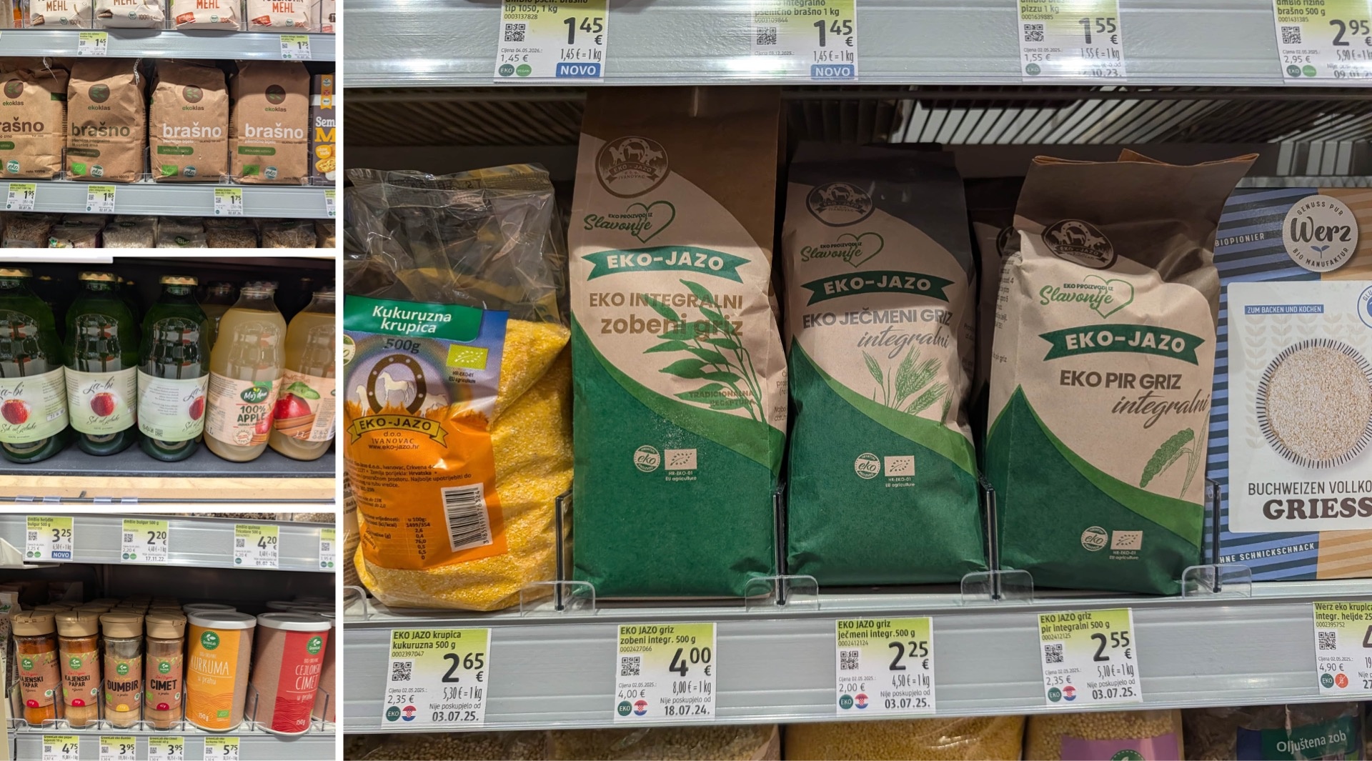
Overall, a second group of “Eko” products looks significantly more modern: functional foods. Health-conscious baked goods and detox products are frequently presented in an extremely minimalist style. Even in “ordinary” categories, such as whole-grain products, semolina, flour, or even organic spices, there is experimentation here and there—often with significantly more daring than in German retail. Curiously, some packaging even features German-language labeling, even though we can’t find some of these brands on German shelves.
The recycled-paper look mentioned above remains a striking feature and still seems to work very well in the organic segment. At the same time, however, the color palette is shifting somewhat: With hemp products, for example, we’ve come across a split-color design—a pink area serves as a unifying brand element here. Green alone is no longer enough to stand out. While the color—associated with nature and purity—was initially more or less the exclusive domain of the organic sector, manufacturers of vegan products eventually came up with the idea of using shades of green for their items as well. In the meantime, however, the vegan section is shifting further toward pastel shades and brown paper, as we’ve already seen, among other places, during our store check in Austria (link).
While we’re on the topic of color schemes: It’s particularly interesting that Croatian consumers apparently have a kind of visual perception scale when it comes to “healthy products.” The darker the shade of green used, the more the packaging conveys the impression of a pharmacy and medicinal benefits. Blue-green and turquoise shades, in particular, score points in this regard, while yellowish green tones do so less. The color usually also changes the design language, making it more traditional. We’re familiar with a similar phenomenon in Germany, for example, with Salus.
In addition, origin plays an important role. Some organic brands for syrup and/or juice, such as Agropošta, clearly communicate that their products are Croatian. In doing so, they often succeed in combining tradition and attention to detail in their design.
Let’s summarize: In the organic sector in Croatia, there’s a lot happening in terms of design. There’s plenty of room to maneuver between tradition, naturalness, and modern health communication. We discovered many new approaches during this store check.
Pet Food: Buddy with a Consistent Brand Identity
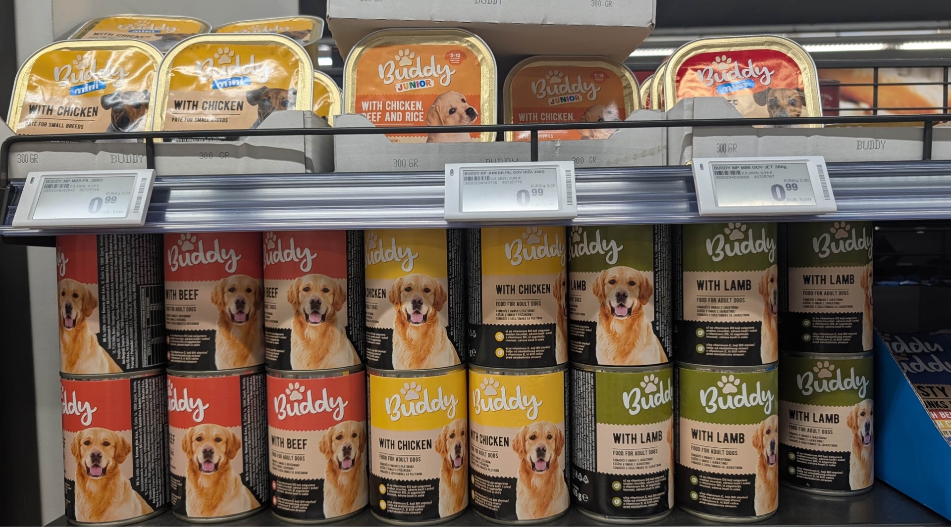
We also came across all sorts of interesting things in the pet section. One example worth mentioning is the Buddy brand, which has a very consistent brand identity. The paw serves as a recurring brand element, while different colors are used to distinguish between product varieties. Overall, it’s a clean and well-designed brand identity—even if, compared to some of our other discoveries during the store check, Buddy didn’t quite blow us away in the end.
Cosmetics: A Designer's Paradise on the Drugstore Shelves
If we had to name one section that left the strongest impression on us, it would be the cosmetics department. The incredibly wide selection ranges from countless local brands to international brands that you’d search for in vain in Germany. And in terms of design, this section is also a true land of plenty.
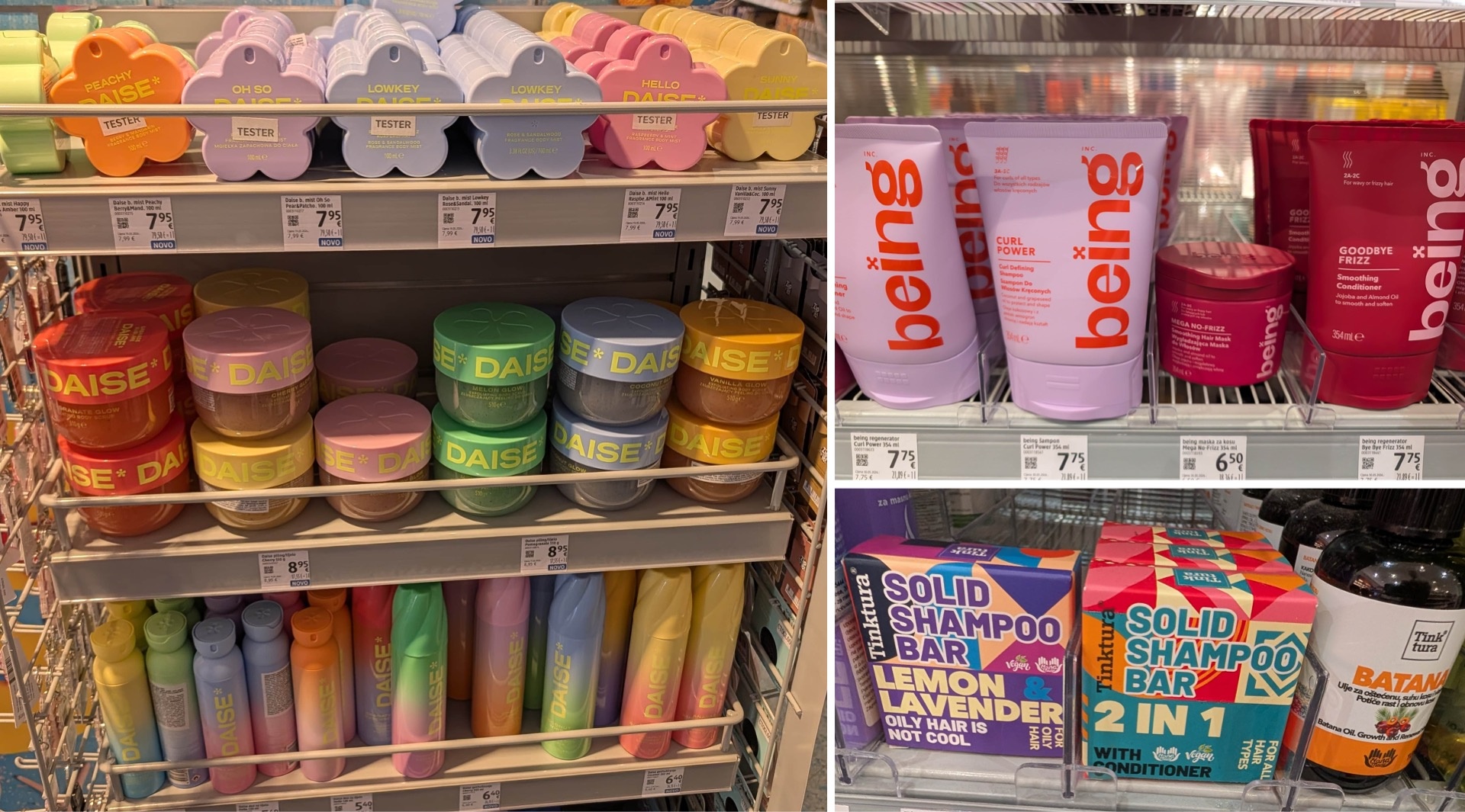
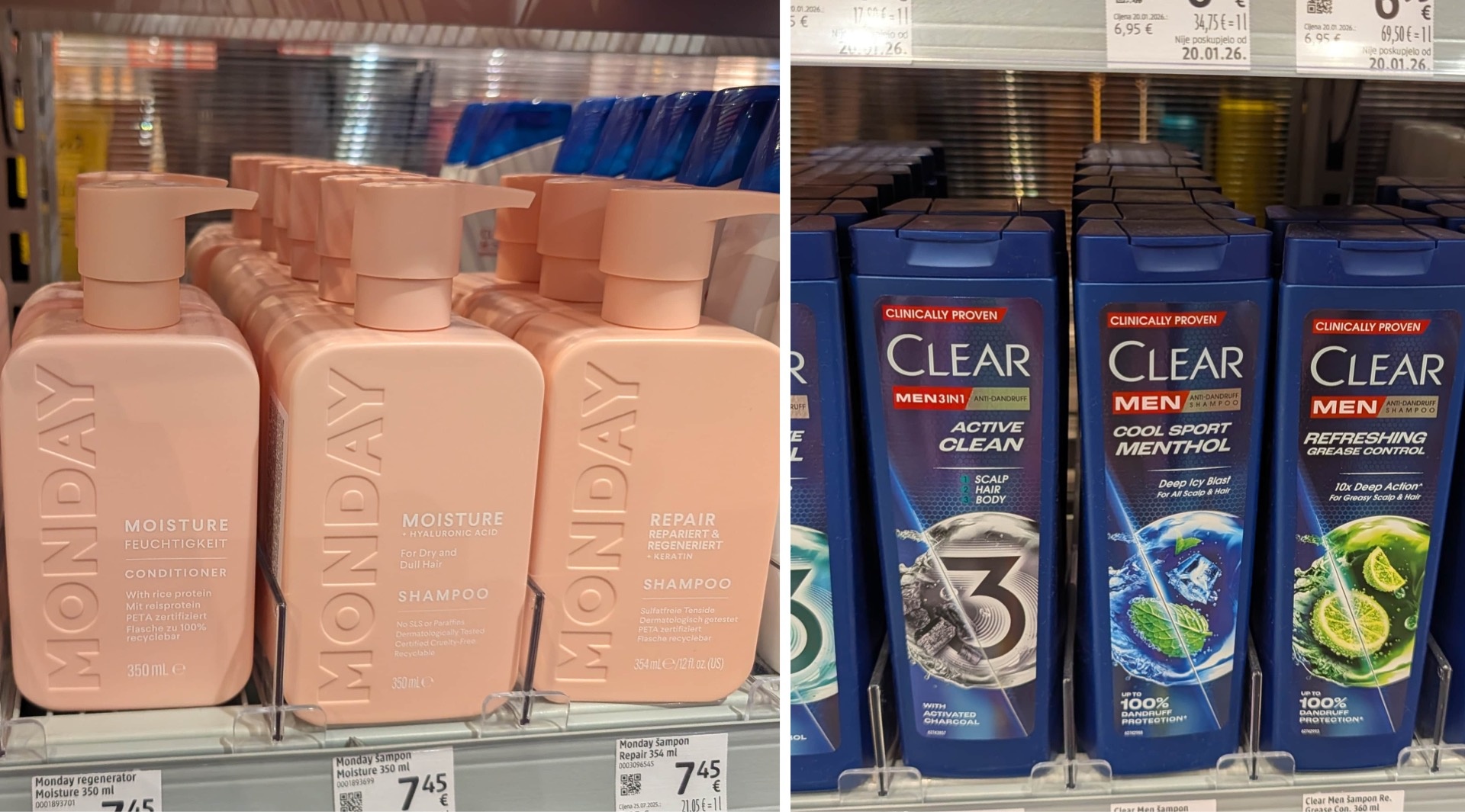
We were already familiar with some of the products, and in some cases had even named them “Packaging of the Month”—such as Daise, with its pastel-colored formulations, interesting lids and shapes, and modern color gradients—a true beauty on the shelf. Being and Monday are similarly appealing with their unusual shapes.
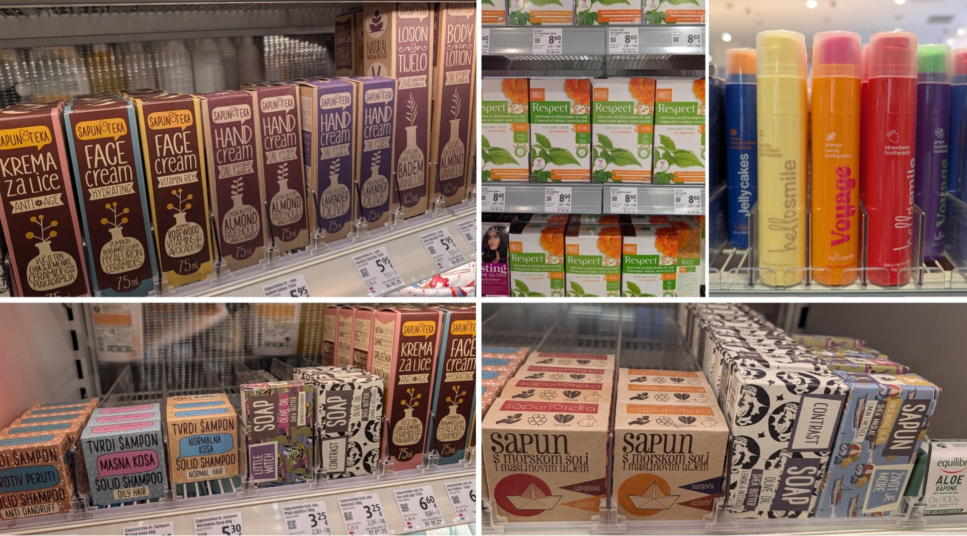
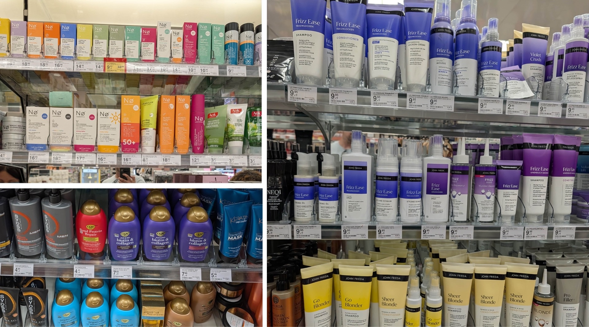
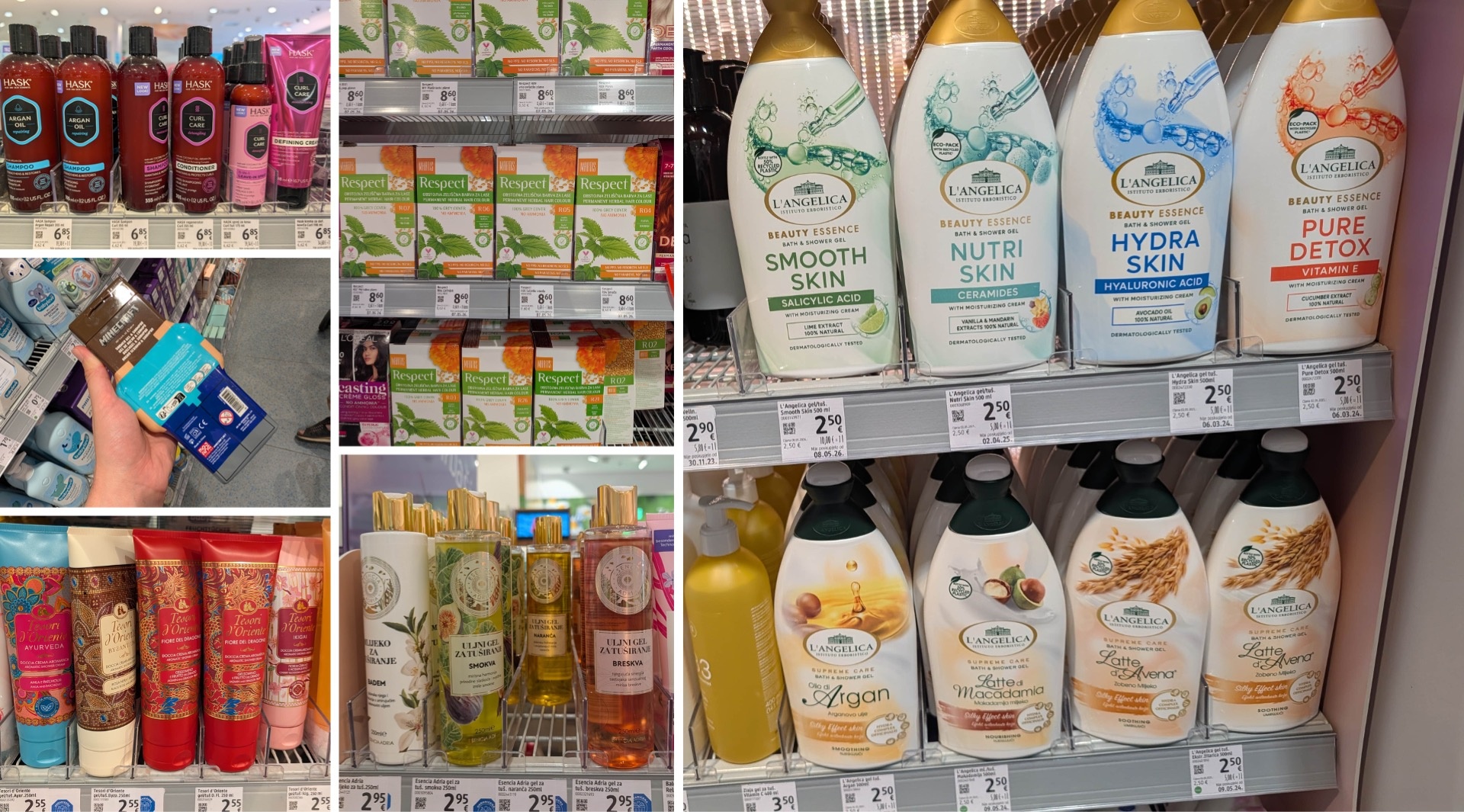
Nø from Berlin is also represented—with its distinctive logo in the top left corner and an impressive pastel palette. However, especially with very large product ranges, the question arises as to how far varieties can be differentiated solely by color: with ten different shades, this still works well, but beyond that, it becomes increasingly difficult. Respect takes a much more minimalist approach. The locally known hair color brand relies almost exclusively on numbers for variety differentiation. The packaging remains largely identical; only the number defines the respective shade.
Sapunoteka offers a particularly creative concept. Its range of soaps, face and hand creams, body lotions, and solid shampoos combines playful typography with illustrations and a subtle recycled-paper look. This creates a distinctive brand universe with high brand recognition. The brand Tinktura takes a similar approach with its solid shampoo bars, though it uses a different typeface.
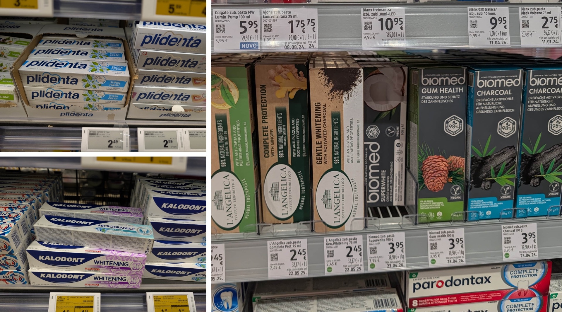
Experimentation is also taking place in the toothpaste category. Hello Smile surprises with a pump dispenser and unusual flavors like Orange Candy and Strawberry. This is complemented by a distinctly vibrant, colorful palette. In comparison, the established brands Plidenta and Kalodont appear significantly more classic and, in our view, still have some catching up to do in terms of design.
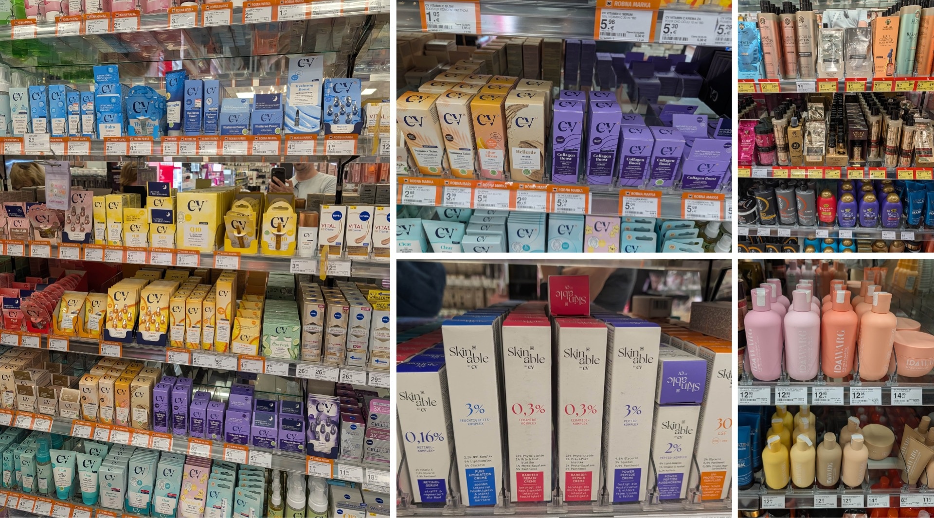
Müller’s private label Cadea Vera demonstrates just how much impact typography alone can have. The large CV logo at the top and differentiation based solely on color are enough to make the products highly visible, even without borders or additional visual elements. The sub-brand Skinable works in a similar way: an expressive serif typeface carries the brand identity almost single-handedly; small color blocks in clear tones master product differentiation with flying colors.
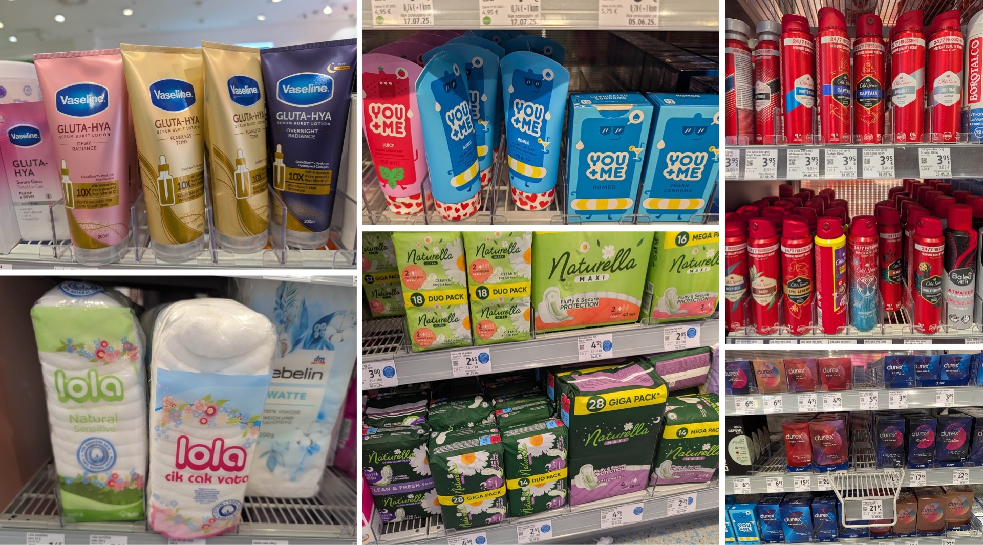
Another possible way to stand out is through materiality. La Croa, for example, uses glossy metallic finishes across its entire range—from gold to blue and magenta to green with silver. This gives the brand a distinctly luxurious look and makes it a standout on the shelf. Vaseline also uses metallic surfaces, thereby noticeably shifting brand perception from “budget” toward “upscale.”
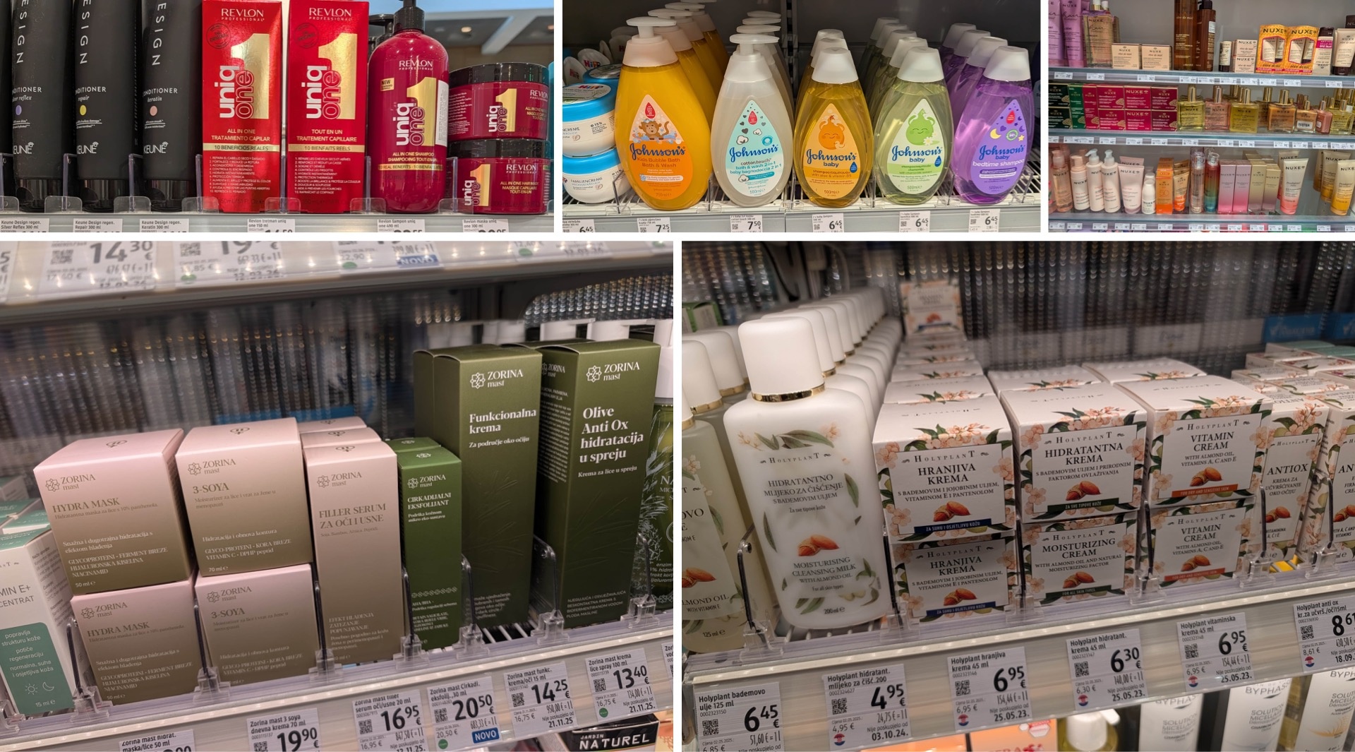
OGX proves that shape can be a strong brand anchor. The round bottles with gold caps are easily identifiable even from a distance and when viewed from above. Similarly, Head & Shoulders demonstrates how a specific packaging and cap silhouette can ensure brand recognition: even the switch from the familiar white to a turquoise finish does not compromise the brand’s identity. Johnson’s—apparently very popular in Croatia—also benefits from a distinctive bottle shape in its children’s line, one that stands out even from a distance.
Also interesting is the local brand Sabrina (please verify the name; I don’t see the corresponding products in the pictures—at first I thought they meant Zorina, but that comes up later), which has retained its traditional look but modernized it slightly. The minimalist, recognizable packaging shape, the strategically placed label, and the deliberate use of negative space give the line a contemporary look. Only the illustration styles don’t appear entirely consistent across the various product lines.
Esencia Adria uses an antique-inspired design and features a large but tastefully integrated logo. Naturavit demonstrates that even deliberately inconsistent colors can work across different product lines—provided that color blocks and logo placement serve as unifying elements.
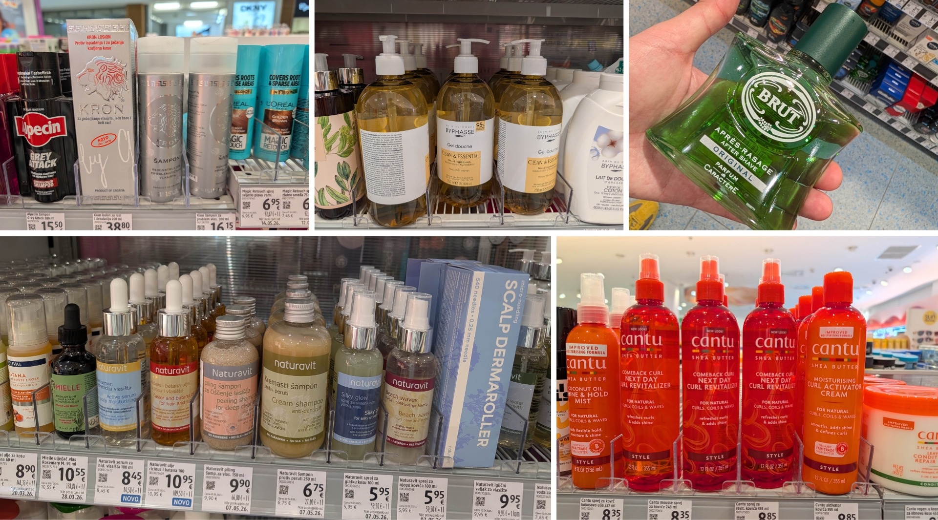
Cantu plays with transparency and a striking orange-to-red color palette, making it a real eye-catcher. Skintegra stands out thanks to the unconventional design of the letter R. Novexpert, on the other hand, uses a checkered pattern in the background, creating a pharmacy-like, medical look.
The French brand Nuxe, which appears to enjoy great popularity in Croatia, works with gold, transparencies, and metallic gradients. The prominently placed logo is always spaced sufficiently apart from the rest of the text and “pops” out accordingly.
Tesori d’Oriente—also available in German markets—demonstrates that good design doesn’t necessarily have to be minimalist. The product range, arranged side by side at full width here, features numerous embossed and finished details. So, maximalism with ornamentation can look just as high-end if the color combination is right.
Zorina, too, employs a distinctly elegant aesthetic that, in some ways, reminds us of the recent Weleda relaunch. The logo, with its traditional feel, and the serif typeface are almost enough on their own as strong design elements—here, less really is more. Holyplant takes the opposite approach and opts for a classic branding concept: a central information area is surrounded by the respective ingredients, such as almonds.
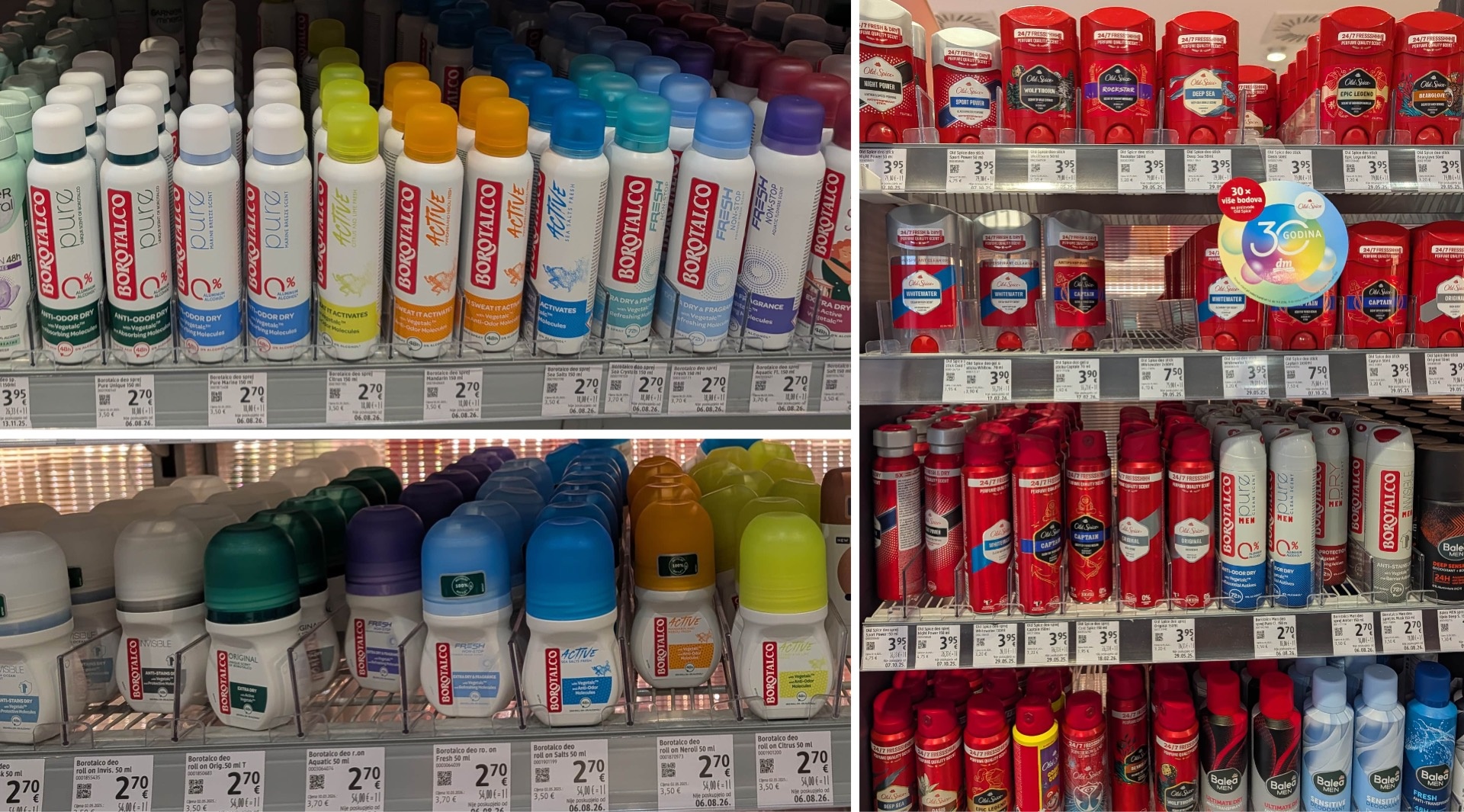
Borotalco keeps things very simple and clean with its large logo, yet maintains a high-quality look. In contrast, the brand L’Angelica—also based in Italy—conveys less of a “premium” impression with its more conventional design and more of a “budget-friendly” one.
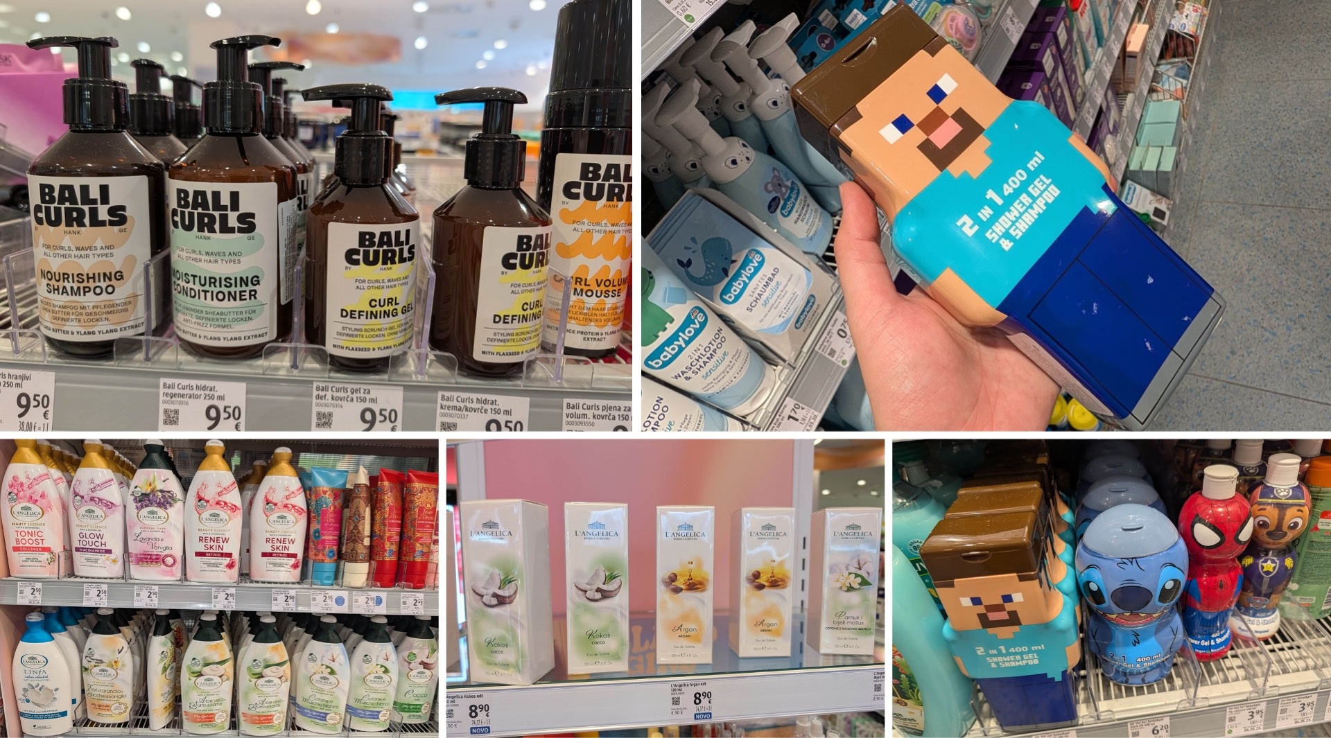
Bali Curls brings a particularly youthful and fresh vibe to the shelf. The shampoo, conditioner, and gel combine bold, expressive black lettering with color-coordinated caps and pumps. The different product varieties are distinguished by minimalist, abstract shapes in the background—a simple yet interesting solution.
Some brands stand out precisely because of their unusual or deliberately traditional appearance. As the saying goes: Many roads lead to Rome. We’ve noticed this in the men’s grooming section as well. Next to the modern Alpecin packaging, for example, sits a classic hair loss lotion from Kron featuring masculine lion motifs and Greek ornaments. While the look may seem a bit old-fashioned, it’s also what makes it stand out on the shelf.
Clear for Men relies on a typically American front-of-pack design that could date back to the late ’90s—yet this look clearly works for the brand. And then there’s the red wall of Old Spice, a brand that seems to be extremely popular in Croatia. The entire range, with a wide variety of scents, is represented on the shelf—we don’t see this level of variety in Germany.
There are also differences in condom packaging compared to the German market. Durex, for example, looks different in Croatia than it does here. However, we were unable to determine conclusively on-site whether this is a country-specific design or a relaunch. Next to it is You+Me, a less adult-oriented and more youthful, flirty alternative: The red and blue packaging with creative details is clearly intended to appeal to a younger target audience.
When it comes to children’s cosmetics, things get really playful. For example, 2-in-1 shower gel and shampoo combinations feature a Minecraft-inspired design, while other products feature characters from Lilo & Stitch or Spider-Man.

Spotlight on Cosmetics Brands: Ziaja, Olival, Bio Baza, Afrodita, and Melem
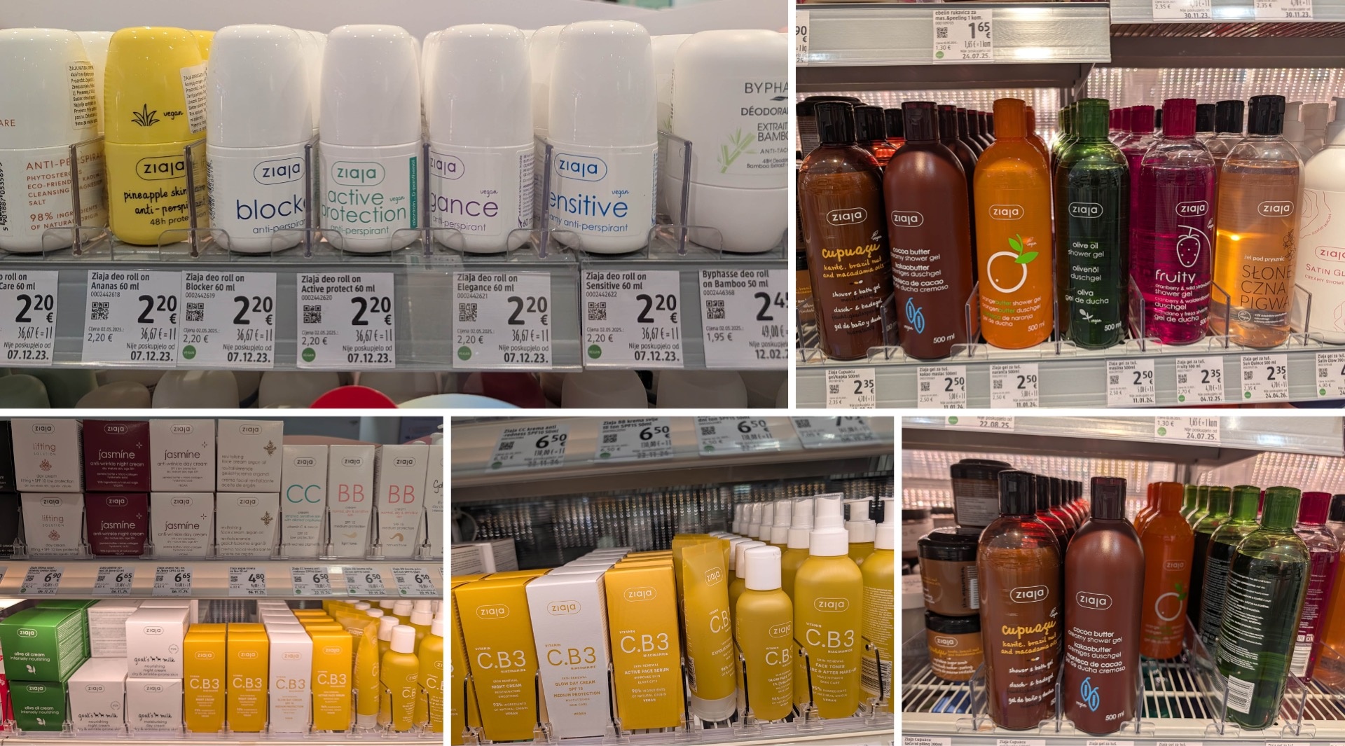
Ziaja: High-Quality Minimalism with a Distinctive Look
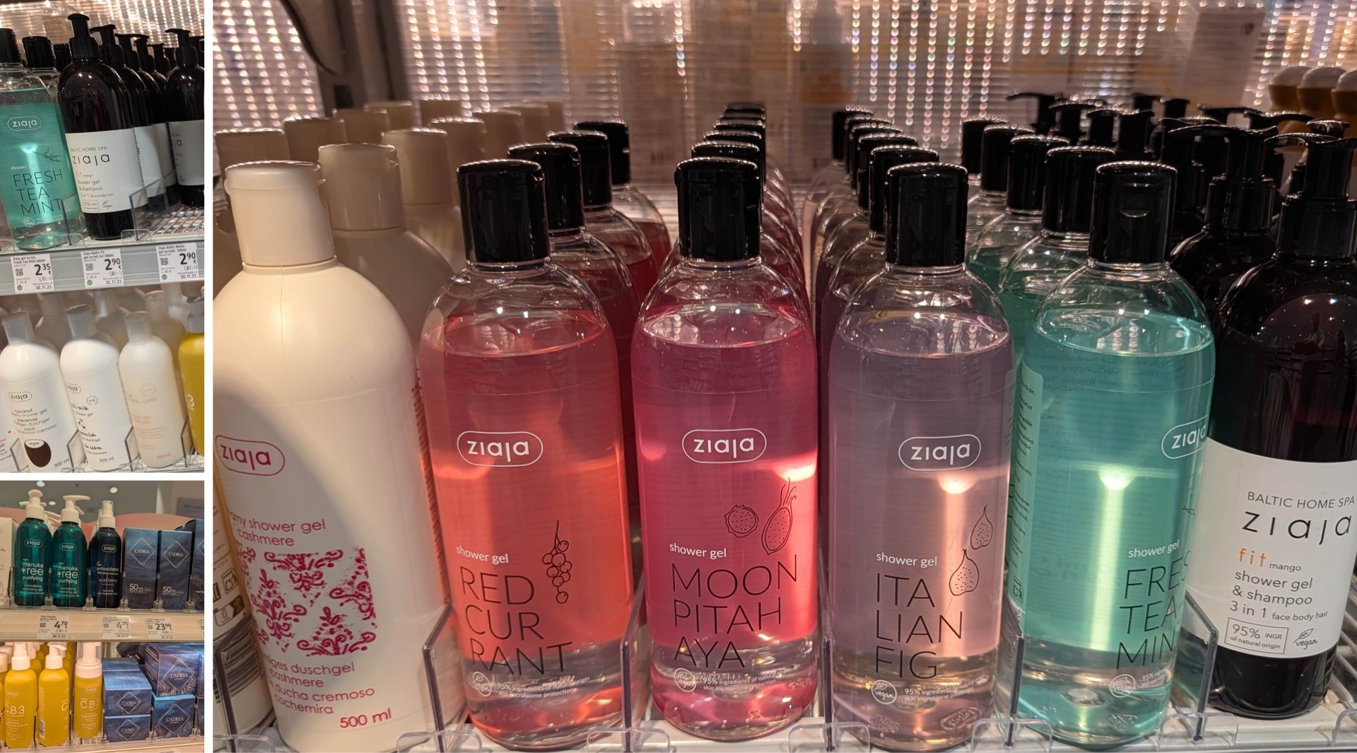
The Polish brand Ziaja, which is rarely found in German drugstores—usually only one or two shower gels are available—has a strong presence in Croatia. Its design is a great example of how much can be achieved with just a few elements: The logo is set within a frame with rounded corners; this is complemented by color, transparency, and large typography. Illustrations play almost no role; when they do appear at all, it’s as delicate outlines. Despite this minimalist approach, Ziaja’s various products are clearly recognizable on every shelf.
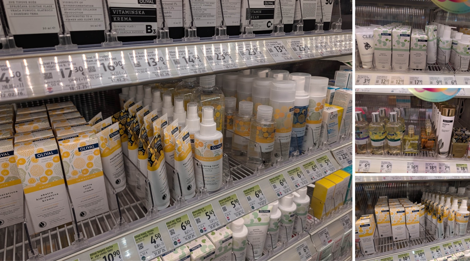
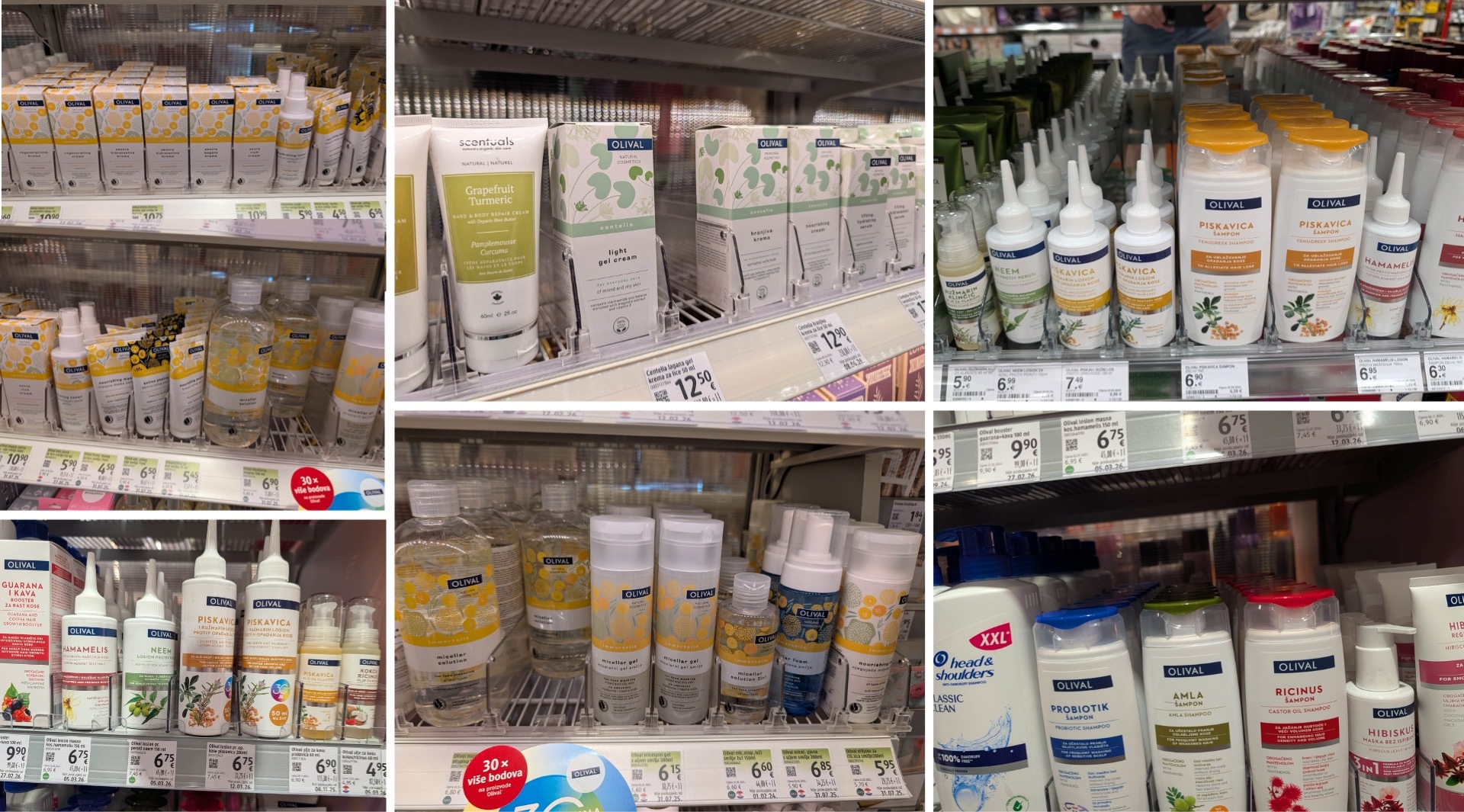
Olival: Small Changes, Big Impact
Olival is a Croatian brand whose yellow product line not only takes up a lot of space but also catches the eye without coming across as intrusive. It’s fascinating how little it sometimes takes to create a strong brand identifier: the black logo on the square color block becomes a powerful recognition element solely through its strategic placement. Positioning is, after all, a crucial factor in brand design. The newer product lines complement this principle with slightly abstract floral illustrations in pastel colors. They combine a touch of naturalness with a modern aesthetic. In direct comparison, the older shampoo line appears significantly more classic.
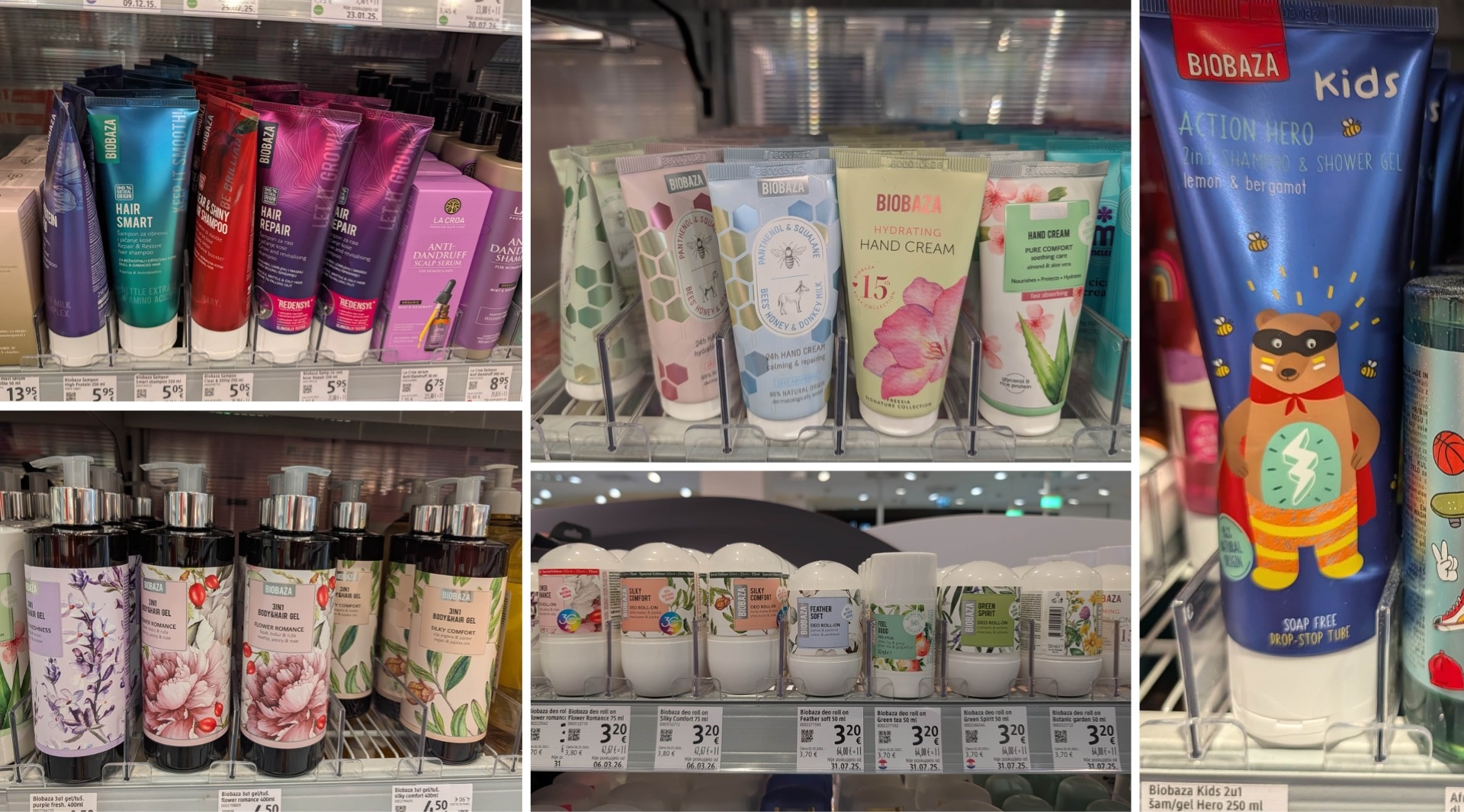
Biobaza: One Brand, Many Worlds
The Biobaza brand also has a strong presence in Croatia and covers a wide variety of product categories with its lineup. The portfolio ranges from the classic hair care line—with designs inspired by nature—to specialized lines, such as those featuring honey and their own matching symbolism, all the way to products with metallic colors and a separate kids’ line. However, this is precisely where the challenge lies: the attempt to cover such diverse categories through design while remaining true to the corporate identity is not always entirely successful. Compared to other brands, there is therefore a slight lack of consistency. Nevertheless, there are some truly interesting designs. Biobaza has become well-known in any case for its memorable name, which reflects the composition of the products—purely natural ingredients and a pharmaceutical foundation (“baza” means “basis” or “foundation”).
Afrodita: From a Classic to a Modern Beauty Brand
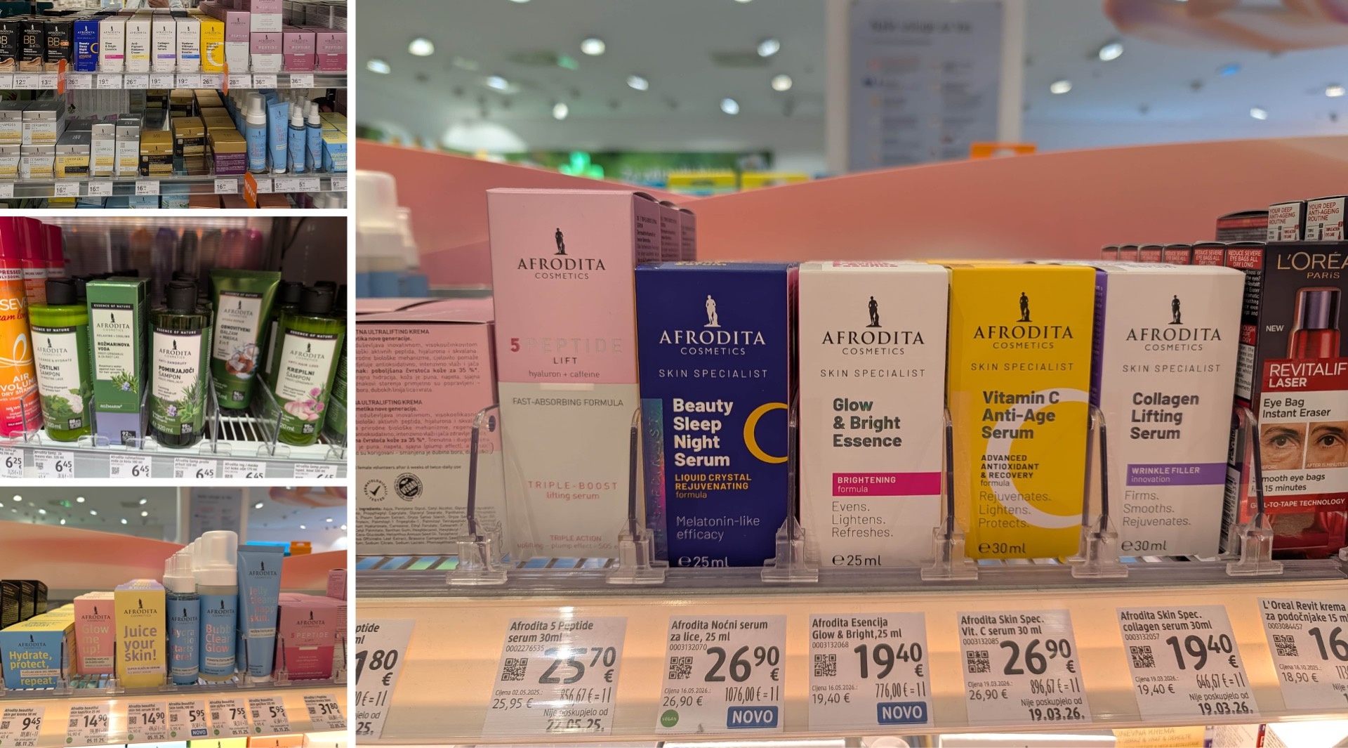
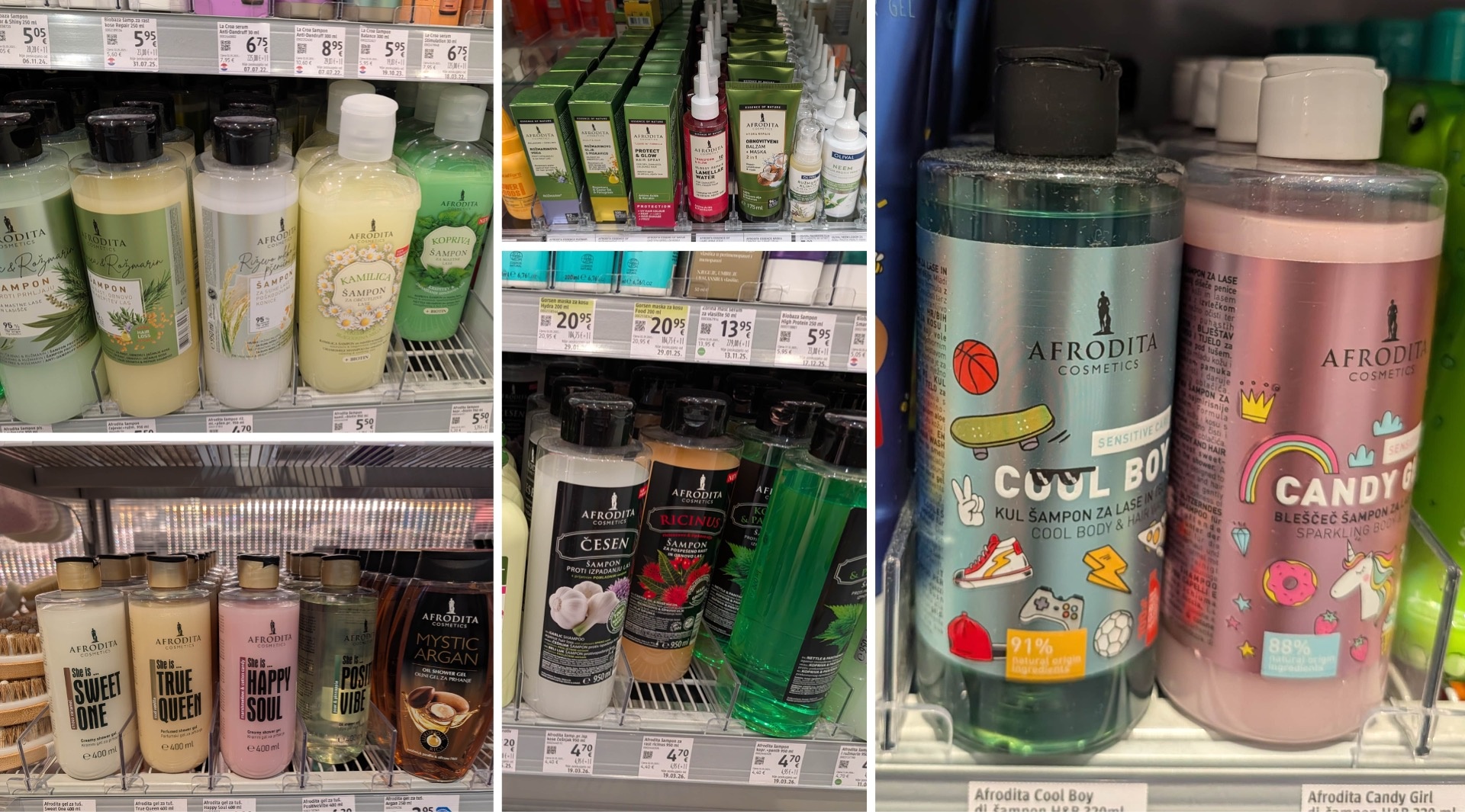
The Slovenian brand Afrodita is one of the best-known and most popular brands in Croatia and beyond. It offers an incredibly broad product portfolio. Natural and functional cosmetics are just as much a part of the lineup as night care, luxury lines, and modern Gen Z and kids’ ranges. It’s impressive how the brand remains recognizable despite all these different “facets.” The logo, which is always positioned at the top, serves as a unifying element and provides a point of reference across the entire product range—something that is by no means a given in such a vast brand universe; see Biobaza. What’s particularly exciting is that Afrodita demonstrates how a brand that seemed a bit outdated 20 or 30 years ago can continue to evolve and tap into new markets and target audiences—without sacrificing its identity.
Melem: Once a functional product, now a lifestyle brand
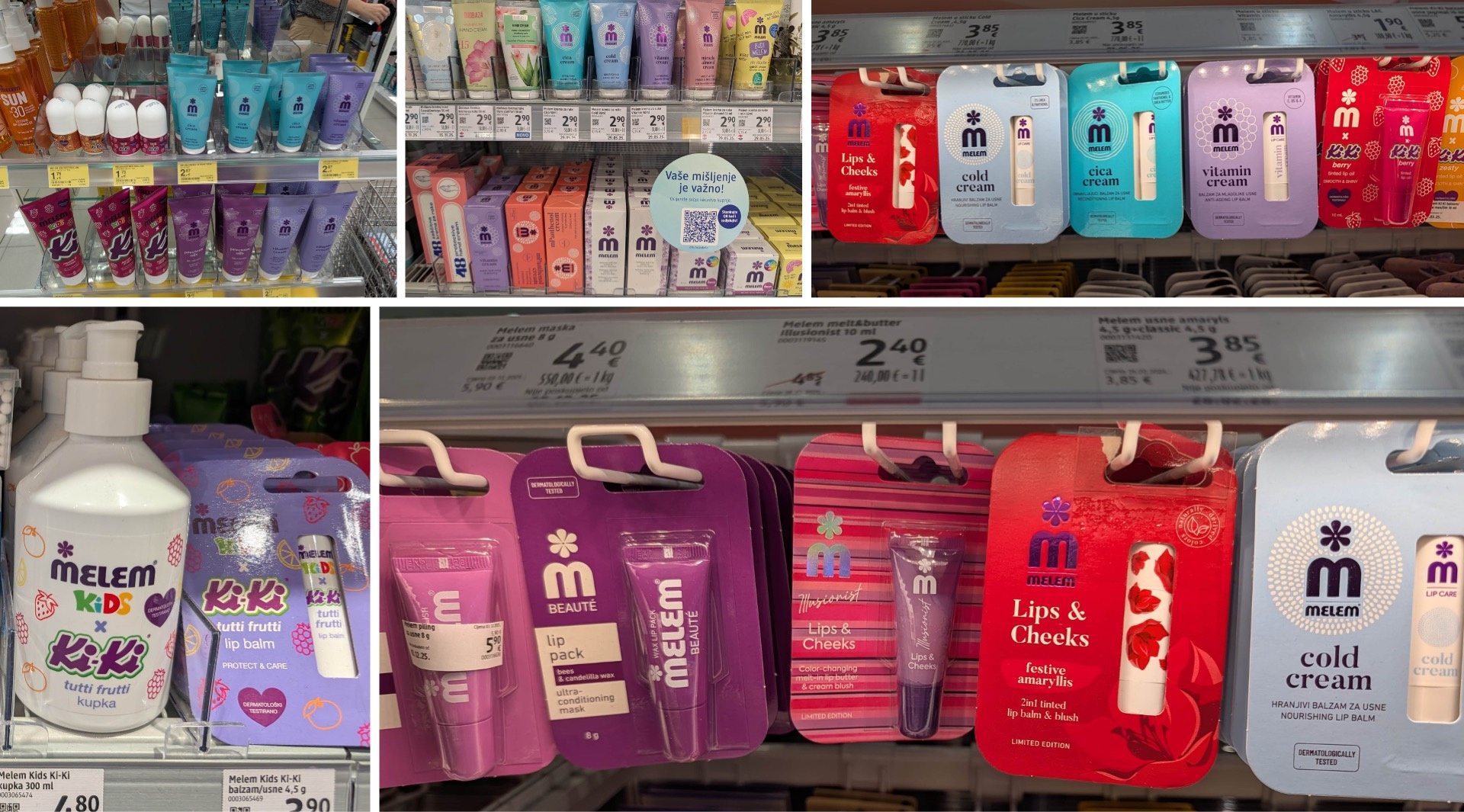
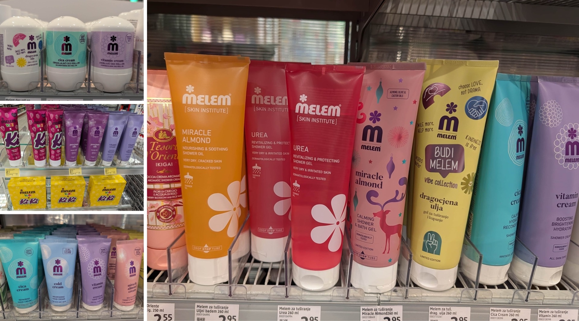
Melem has perhaps undergone the most exciting transformation. Originally, it was simply a functional ointment advertised on Croatian television before TV shows. Over time, it has evolved into a brand with a vast and, at the same time, remarkably consistent product range. A recognizable logo, modern design language, contemporary illustrations, beautiful shapes, and typefaces: Melem has made the leap from a somewhat outdated “horse balm” image to a modern brand for children and adults. Even a collaboration with Kiki candies is now part of the brand’s universe. A classic functional product has become a brand that has retained its roots while completely repositioning itself. This extraordinary development would be perfect for a branding case study.

Laundry, Cleaning, and Household Cleaning Products: Classics with a New Look
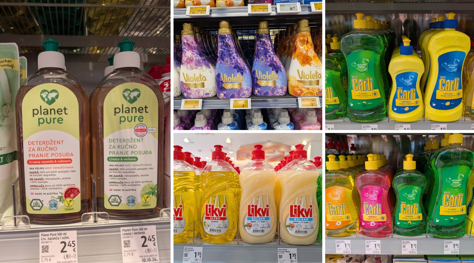
One brand that seems to be particularly popular among younger consumers is Violeta. Alongside it, two time-honored classics dominate the market: Likvi and Čarli. Both have been carefully modernized in recent years. Of particular interest is the yellow Čarli bottle with a blue label, which evokes a time when dish soap wasn’t yet routinely sold in clear bottles. A little retro revival! Brands like Planet Pure, on the other hand, clearly position themselves around sustainability and are scoring points with consumers as a result. Overall, however, the variety is more limited than in the body care category. The market continues to be ruled by the “oldies” that have been familiar in Croatia and throughout the Western Balkans for decades.
Asia in Croatia: From Trendy K-Beauty to Irresistible Mochis
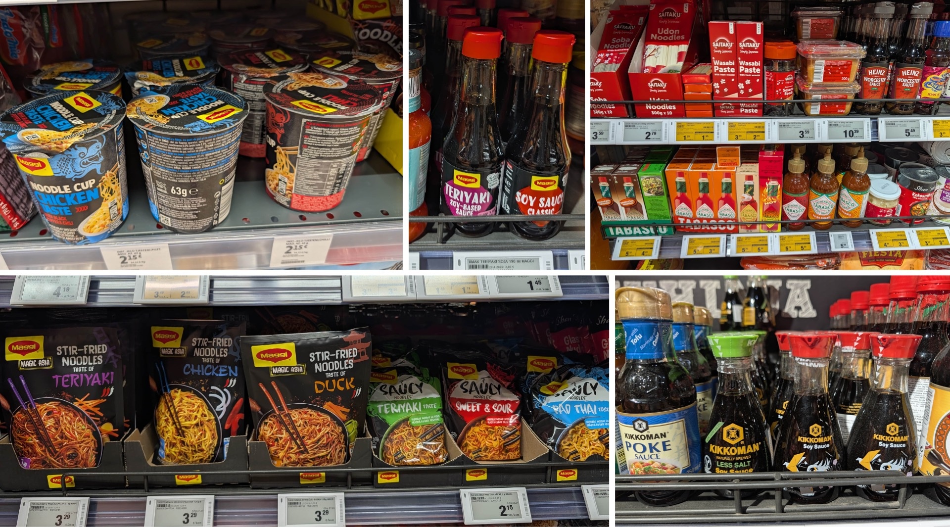
Finally, here’s another surprising observation: In Croatian drugstores and supermarkets, alongside the strong presence of domestic products, there is also an astonishing variety of Asian products.
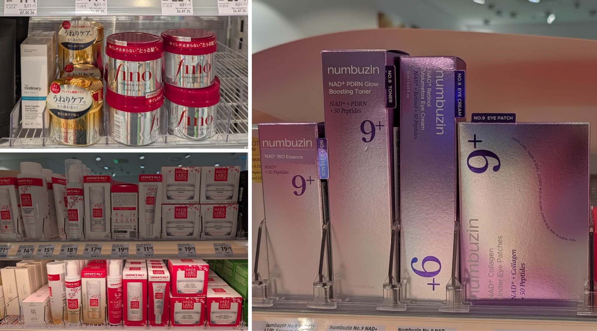
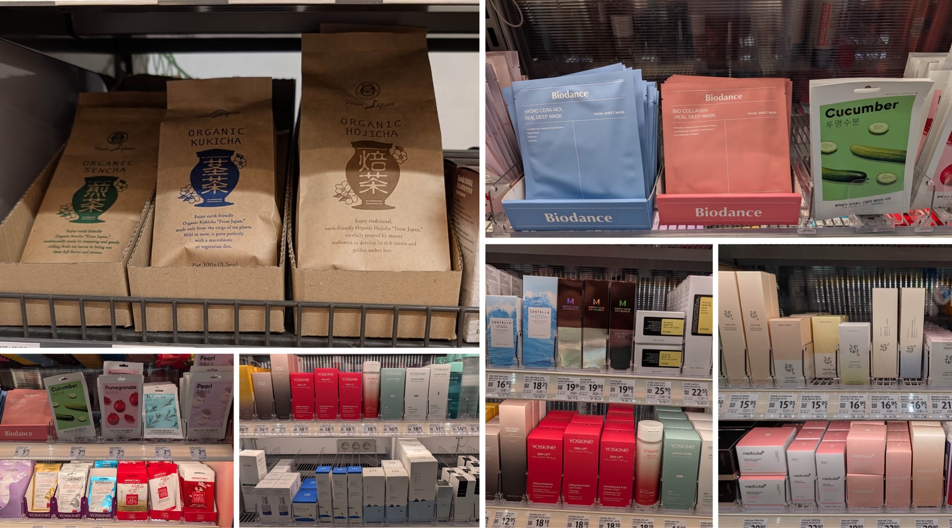
This trend is particularly evident in cosmetics. Entire product lines come directly from Korea or Japan. Alongside well-known names like Shiseido, brands such as Hada Labo Tokyo, Round Lab, Numbuzin, and Medicube are making their mark. Hada Labo confidently advertises itself as “Japan’s No. 1 Skincare” and offers an extensive product line. Numbuzin impressively demonstrates what’s possible with color gradients and metallic sheen.
Yoskine also deserves special mention: This brand, which is Polish in origin, draws heavily on K-Beauty trends and—even more so—Japanese skincare and technology, as reflected in product names such as Sake, Sakura, and Saisei. We are thus dealing with a European brand that consistently employs a primarily Japanese-inspired aesthetic and is evidently succeeding in the market as a result.
In terms of design, Asian cosmetics brands generally follow the motto: keep it as minimalist as possible. Their origin is often recognizable at first glance. Individual products, such as the Shiseido Tsubaki mask, on the other hand, strike a significantly more glamorous, almost kitschy tone, which seems somewhat out of place in the context of the otherwise drastic minimalism.
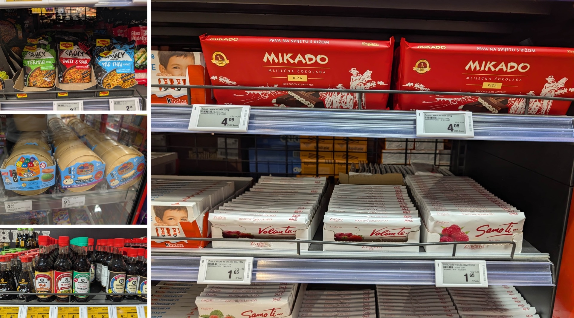
The same pattern is evident on the grocery shelves. Hojicha, sencha, and kukicha come in designs that are clearly Japanese-inspired. In addition, there are far more Asian products than just Maggi’s classic “Magic Asia” line: sauces, spices, coconut oil, and many other items we’re already familiar with from our store visit to the Asian grocery market in Berlin. Even trends like children’s dumplings and mochi have now found their way onto the shelves at Konzum and other stores. Incidentally, Asian influences aren’t an entirely new phenomenon. The traditional Croatian brand Mikado, for example, has long offered Japanese-inspired chocolate sticks with rice.
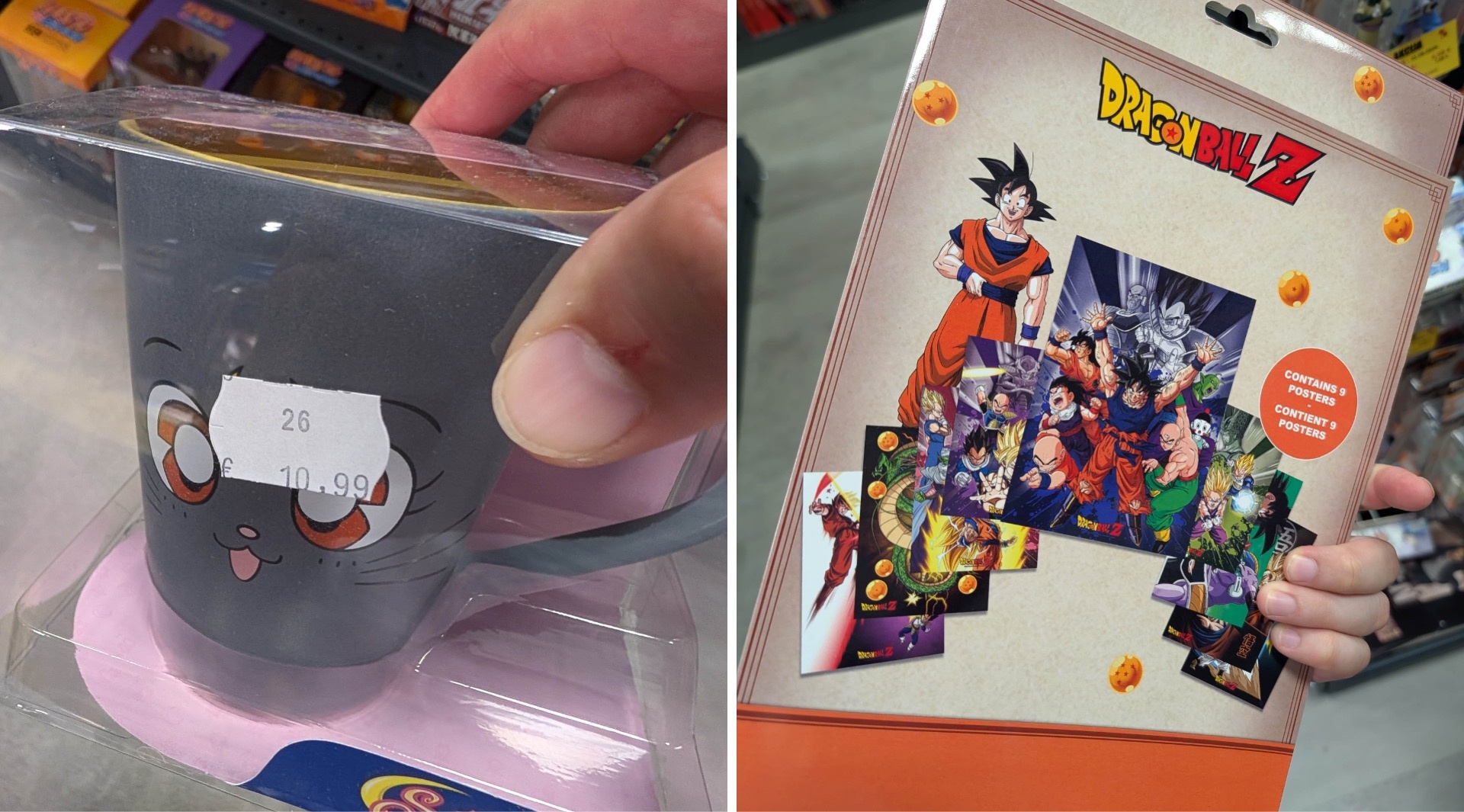
In short: It seems you can buy Asian cosmetics and food on every corner in Croatia—remarkable evidence of just how ubiquitous trends surrounding K-pop, K-beauty, J-pop, anime, and Japanese aesthetics have become.
Closing Remarks
Overall, we would describe this store visit as very exciting and surprising. We saw an enormous variety of products—especially local brands—as well as numerous truly beautiful designs, and we actually experienced a higher level of design than we had anticipated. Nearly everything appears to have been very thoughtfully conceived. The cosmetics department, in particular, proved to be a true design paradise.
But in the food sector as well, we’ve come to a key realization: When a brand has been accepted and used by the public for decades, it’s extremely difficult for a new player to establish itself alongside it. This is even more true for foreign brands. The many traditional Croatian brands largely hold the reins. They benefit from their history, their cultural roots, and a recognition factor that has grown over generations.
Other news

Packaging (Idea) of the Month: Boot-shaped metal can for canned fish
