
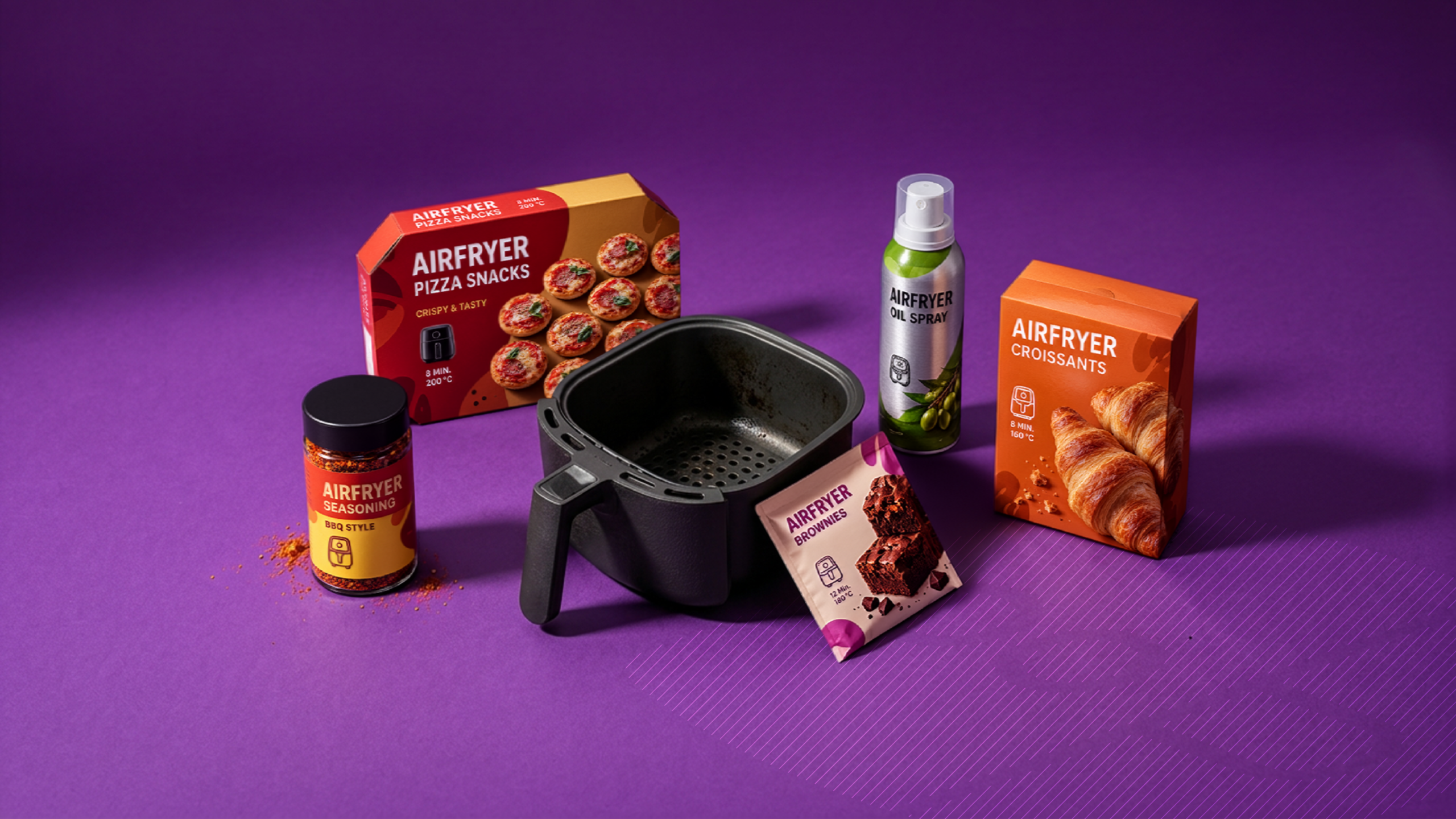
“Air Fryer” on the packaging: Is this the start of a new product category?
The air fryer has evolved from a kitchen appliance to a staple of many product lines. French fries and chicken nuggets were just the beginning. Now, specially positioned air fryer products can be found in the fish, snack, baked goods, granola, spice, and oil sections—and even among kitchen essentials like parchment paper—and, with REWE Beste Wahl’s “Air Fryer Potatoes,” now even among unprocessed raw ingredients.
As the product range grows, a distinct visual language is also emerging on the packaging. But how clear is it already? Are there typical colors, recurring design elements, or even the first established category codes?
There isn't an air fryer color code yet
With protein products, we often see black, while plant-based product lines regularly use green. With air fryers, the picture is much more varied.
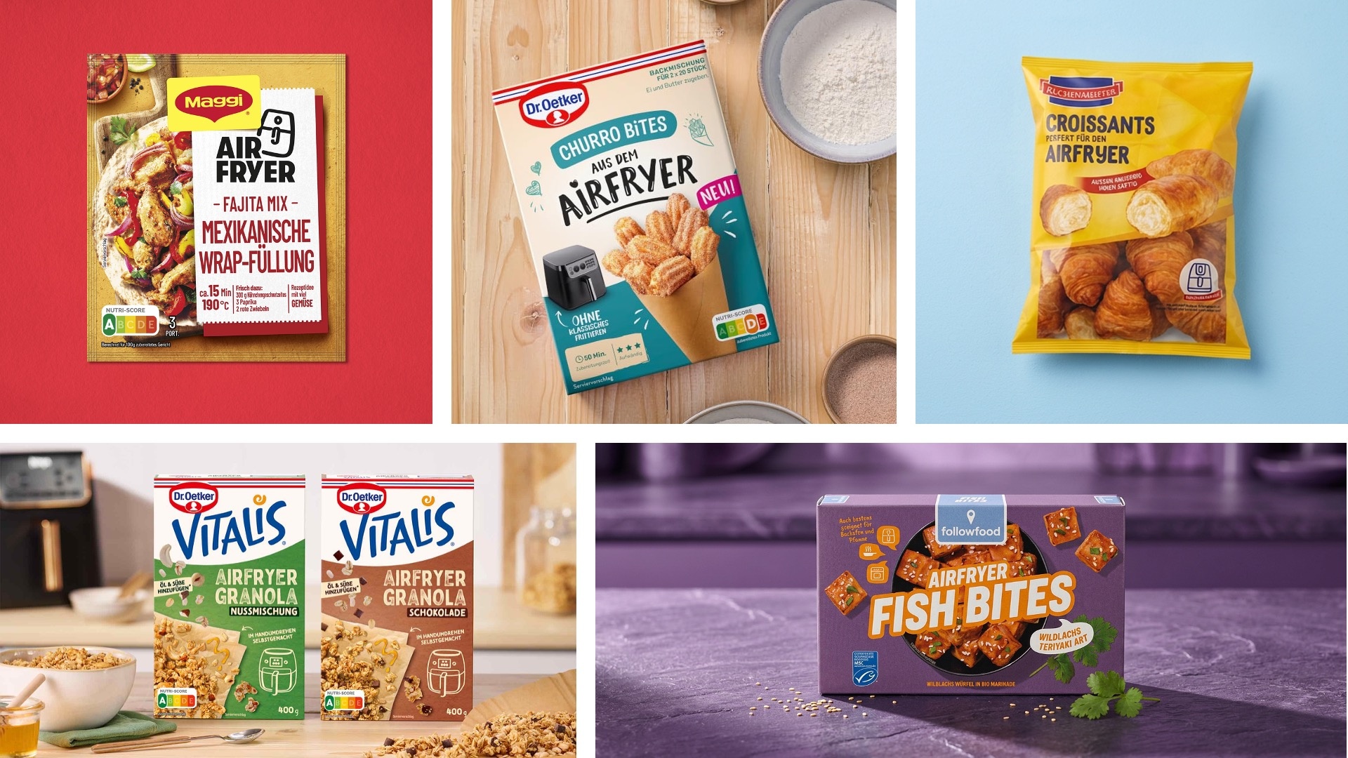
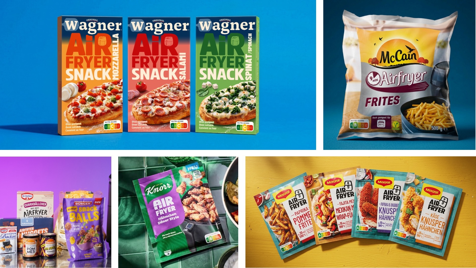
Purple, for example, appears frequently in snacks and convenience products. Yellow and orange ensure high visibility in other product lines and convey warmth, crispiness, and enjoyment. Green, red, turquoise, or natural shades also appear and are often more closely tied to the brand, variety, or product line than to the air fryer itself. The examples from Bürger, followfood, Knorr, McCain, Wagner, and Popp accordingly showcase very different color schemes.
A closer look at individual product ranges is revealing: In Maggi’s Air Fryer Fix line, the color changes from variety to variety—red, orange, turquoise, and purple. Here, color codes the specific variety, not the category. Instead, the range is unified by a consistent typographic element: the eye-catching “AIR FRYER” lettering along with the appliance icon.
Airfryer is thus currently identified less by a single color than by a set of recurring design elements.
One of the strongest identifying elements is surprisingly simple: the appliance itself.
The Airfryer icon becomes a category cue
Hardly any other element appears as consistently as the abstracted air fryer drawer or an illustration of the appliance. On some packages, it appears as a small pictogram next to the time and temperature; on others, the air fryer is integrated directly into the food shot.
This is particularly evident with Maggi, Knorr, and Dr. Oetker. Here, the appliance is not only part of the preparation instructions but also a visible feature on the front of the package. Even products whose packaging design otherwise stays firmly within the existing brand identity can thus be quickly identified as relevant to air fryers.
It’s interesting to note how many brands don’t use the icon in isolation but instead place it in a row of pictograms: At Bürger and followfood, the air fryer drawer sits alongside oven and pan symbols. The air fryer is showcased as the “hero” cooking method without excluding households that don’t own the appliance. This dual strategy shows that many brands are still playing it safe—a sign of just how new the category actually is.
This creates a visual mechanism reminiscent of other usage codes in packaging: It’s not the color alone that defines the category, but a recognizable symbol.
"Airfryer" is moving up the ranks
It’s also interesting to note the varying emphasis placed on the term on the packaging.
For some products, the air fryer remains an added benefit. The actual product is clearly the main focus, and an icon or note simply states: “also suitable for the air fryer.”
Other brands go much further. At followfood, for example, the products are called “Air Fryer Fish Bites”; Knorr places “AIR FRYER” prominently in the center of the packaging; and at Maggi, too, the term becomes one of the most important elements of the entire design.
Here, the hierarchy changes fundamentally:
Brand → Air Fryer → Product → Variety
The air fryer thus evolves from a preparation note to a selling point and, in some cases, even becomes the actual identifier of the product line.
This concept is consistently carried through to the naming level: Maggi establishes its own sub-line with “Air Fryer Fix,” Ostmann presents “Let’s Do Air Fryer” with almost the character of a sub-brand, and Dr. Oetker applies the term across its entire portfolio—from Air Fryer baking mixes to Vitalis granola, all the way to churro bites and quark balls “from the Air Fryer.” At this point, at the very latest, the air fryer is no longer just a marketing claim but a guiding principle.
Food photos need to show one thing above all else: crispiness
A recurring pattern can also be seen in food photography. Air fryer products are rarely staged in a subdued manner. Golden-brown surfaces, visible breading, roasted aromas, and bold textures take center stage.
Chicken nuggets are placed directly in the air fryer basket, fish bites look freshly browned, croissants showcase their golden surfaces, and brownies are featured large and up close. The promise here is less about “convenience” and more about the result of the preparation: crispy, crunchy, crispy on the outside, juicy on the inside.
The food shot thus serves an important demonstrative function. It shows not only what’s inside the package, but also the result the air fryer is supposed to deliver.
Quick, easy—and no deep-frying required
Another striking element is specific cooking instructions. “10 min. / 180 °C,” “approx. 15 min. / 190 °C,” or “6 minutes” are sometimes prominently displayed on the front of the package. Maggi, Knorr, Harry, and other brands visibly use this information as part of their product hierarchy.
This makes sense: The air fryer’s key value lies in its quick and easy preparation. The packaging translates this benefit directly into numbers.
But speed is only half of the value proposition. The other half is: less fat. Dr. Oetker promotes its quark balls as “without traditional deep-frying,” while the Churro Bites promise fairground-style enjoyment without a deep fryer. The air fryer allows brands to enter categories that were previously associated with guilt—deep-fried snacks, pastries, churros—while positioning them as lighter alternatives. The health aspect thus becomes an implicit category benefit that resonates on many packages, even without being explicitly stated.
In addition to the product name, this creates a second layer of relevant information: What am I getting, how quickly is it ready—and how much lighter can I enjoy it?
From the Product to the World of Air Fryers
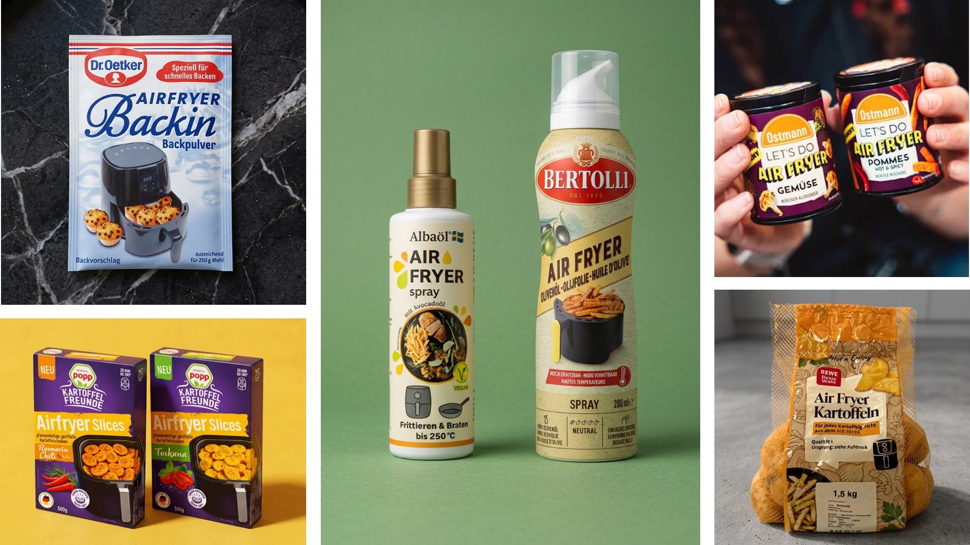
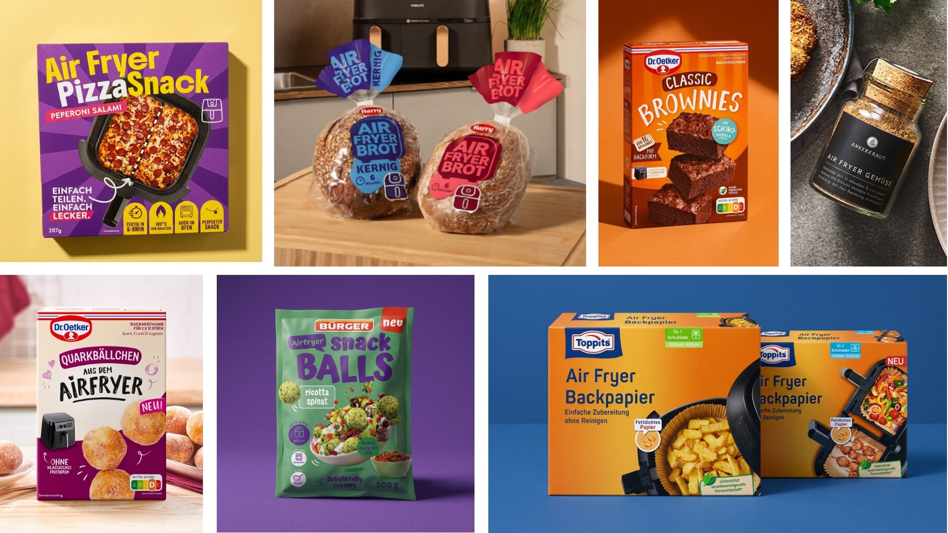
The breadth of the concepts now available is particularly interesting. In addition to classic convenience products, the selection includes baking mixes for churros and brownies, make-your-own granola, bread, croissants, spice blends, oil sprays, and specially designed baking paper.
It’s worth noting that this category is no longer limited to a single shelf section. It extends into the freezer section (McCain, Wagner, followfood), reaches the refrigerated aisle with Popps’ “Kartoffelfreunde Airfryer Slices,” occupies the dry goods section (instant products, baking mixes, granola), the non-food aisle (Toppits baking paper), and even the produce section: REWE sells plain raw potatoes under its private label “Beste Wahl” as “Air Fryer Potatoes.” This is perhaps the clearest evidence of the power of the code—an unaltered natural product becomes an air fryer item solely through its framing. And the fact that private labels now use the term as a matter of course shows just how recognizable it has already become on the shelf.
Even product formats are changing: Albaöl and Bertolli are launching oil in spray cans—a format that would hardly exist with this level of prominence without the appliance’s cooking logic.
This creates more than just a new convenience subcategory. An entire usage ecosystem is increasingly developing around the appliance.
This opens up various possibilities for brands. An existing product can simply communicate its suitability for the air fryer. A product variant can be specifically optimized for this method of preparation. Or the air fryer can serve as the starting point for an entire product line.
No uniform look yet, but clear guidelines
A consistent “air fryer” color scheme is not yet evident in the current market landscape. However, other design elements are already becoming much more prevalent: large “AIR FRYER” typography, appliance icons, specific time and temperature specifications, vivid food shots, a strong emphasis on crispiness—and, increasingly, the promise of achieving all of this without deep-frying.
It will be interesting to see how this emerging packaging language continues to evolve. The market is already providing a partial answer to the question of whether the air fryer will remain a prominent front-of-pack benefit or whether standalone product lines with clearer category codes will emerge: both are happening in parallel. While many products feature the air fryer as an additional note, brands such as Maggi, Ostmann, and Dr. Oetker are already building their own air fryer ranges with recognizable design elements.
One thing is certain: The air fryer isn’t just changing how products are prepared. It’s also beginning to change their packaging—from the icon and the hierarchy all the way to the shelf where they’re displayed.
Other news
Store Check: Croatia – Diversity with a Local Flavor
